
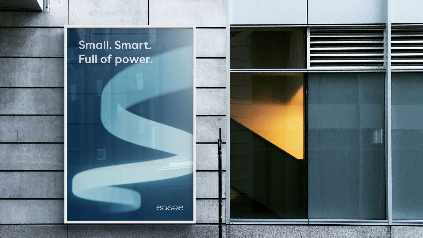
Our fifth element is not a single pattern or graphic. It is an idea. An ever-lasting and adaptable energy flow, that we can grow with and that can grow with us. It is always relevant, always up-to-date while never becoming old.
Our 5th element
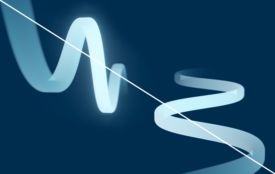
Our fifth element is an expansion of our logotype: the wave. The wave form is the base of our visual system. It connects our visual solutions creating a unified, dynamic and coherent brand expression with the possibillity to evolve and adapt for the future.

Versions
The fifth element mainly appears in 3D where the wave form comes to life as an energy flow and creates beautiful forms and compositions. There are several 3D compositions already produced and available. All versions of our 5th element are available for download in our Asset Bank.

5th element – 3D compositions
5th element – Animated
5th element – Monochrome white

5th element – Graphic shape
Colours
We have a library of core fifth elements. It can appear in Bright blue or Dark blue color schemes – and a monochrome white version. These are impactful, brand driving graphics. It should only appear in branding and communication close to the core of our brand.
Bright blue


Dark blue


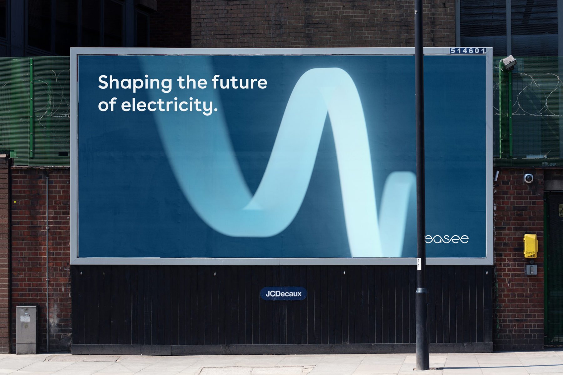
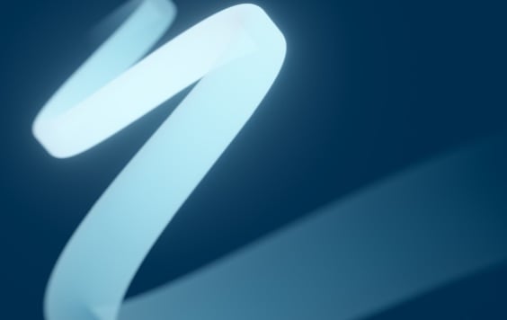
Animated
Our fifth element is available as an animation, where the wave form is sparking to life as an energy flow – moving towards the viewer. The animated fifth element is typical used in presentations, films and social-media ads and is available on a Bright blue or Dark blue background.
Monochrome white
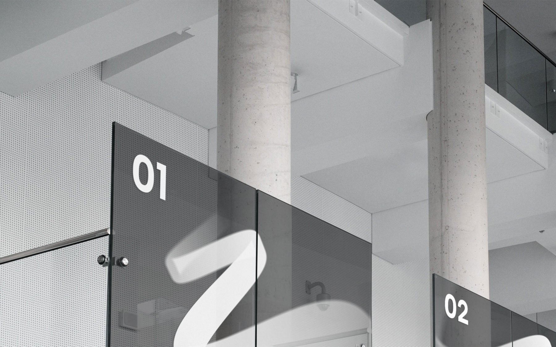
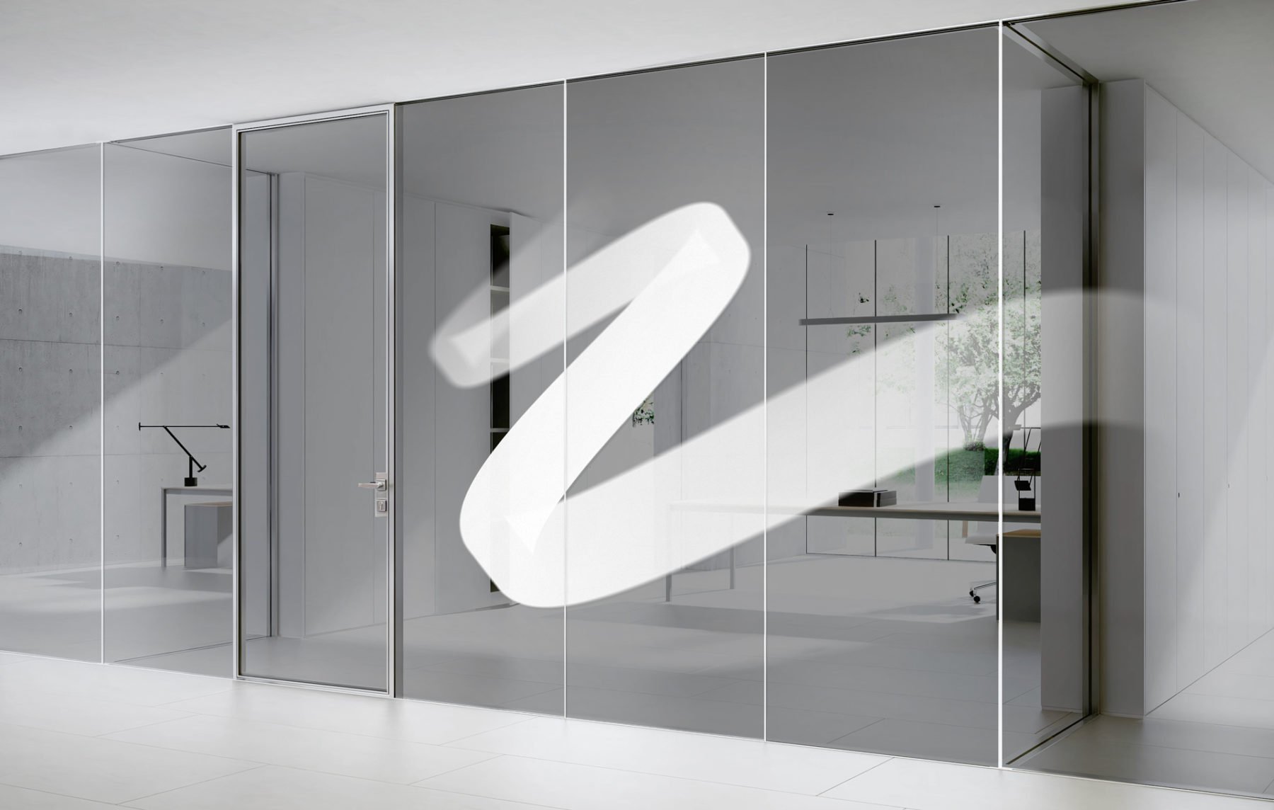
The fifth element is also available in a monochrome white version. Mainly to be used as decor foil element on glass facades in our interior/exterior design, but also on apparel.
Graphic shape
Beyond the 3D versions, the fifth element can also appear in a simpler graphical manner. A simplified version utilising only the basic sinus wave. It becomes an useful visual brand element when space or other constraints prohibits us in using the Easee logo, and gives us more flexibility and versatility. It should, however, be treated as a visual aid, that is, the Easee logo should always be present somewhere in the proximity of the sinus wave (e.g. sinus wave signage on one side of the building, Easee logo placed on the front side of the building).

5th element – Graphic shape
Keep in mind that this graphic solution should not appear in advertising or other communication close to the core of our brand, here the 3D compositions is better suited.

Signage
The 5th element – Graphic shape is used as a visual aid for our logotype on signage and must be treated according to the logo guidelines.
EXCEPTION! You are allowed to rotate the fifth element – 90° clockwise.
Usage
Our fifth element is a strong brand carrier – to maintain its strength, it should be used restrictively. Used correctly our fifth element will establish a distinct visual recognition of our brand. To ensure maximum impact and awareness it’s important to treat the fifth element according to these guidelines.
The driving element
We do not put our fifth element on everything we do. It is not an element that needs to be present on all our applications. When used, it should add value to our design and be the element that drives the design of the application, not a supporting graphic.
5th element – The fifth element drives the design.
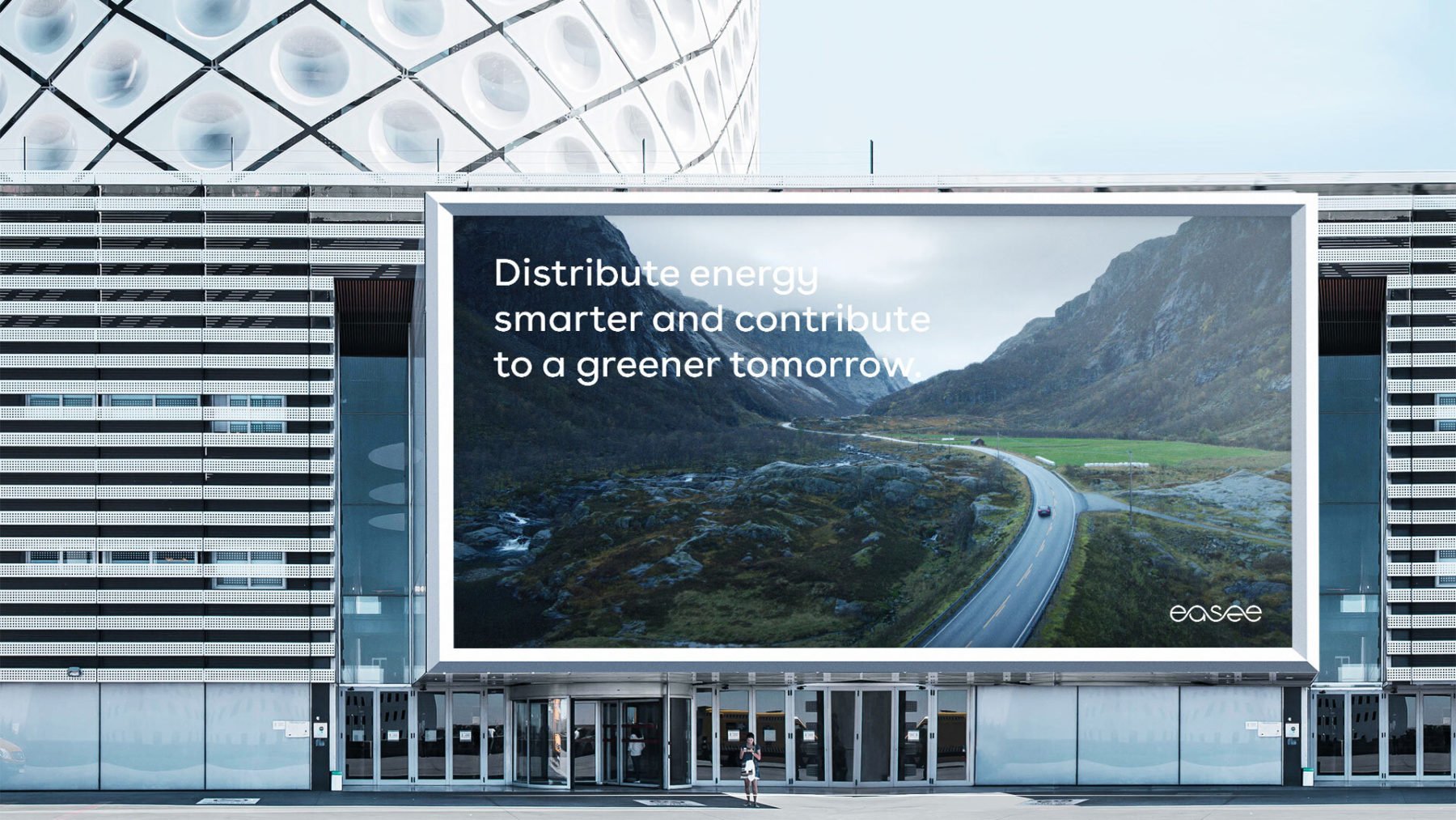
Image driven – The image drives the design.
Type driven – Typography and copy drives the design
Product driven – The product drives the design
Do not overuse it. It should not be used more than once on the same view.
Do not overuse it. It should not be used more than once on the same view.
Size
When used, the fifth element is meant to be seen. It is important that it has a strong presence in the layout. It should not be used as a small decoration, but rather be the main act of the design.

The fifth element needs to be big to have impact. The element should be at least as wide (landscape) or high (portrait) as the format.
Never use the fifth element as a small decoration.
Always avoid using the fifth element in a small way.
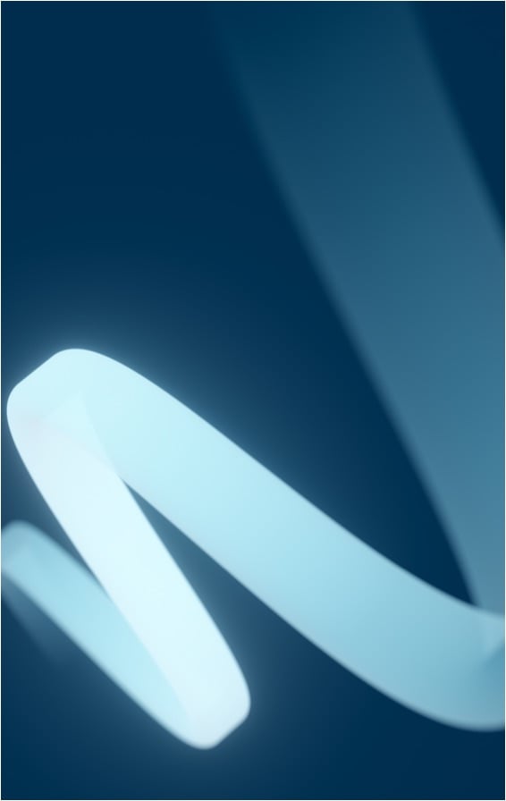
Rotation
The element can be rotated in steps of 90° and be reflected both vertically and horizontally. This enables flexibility and freedom when placing them in a layout.
0°

180°
-90°

-90° and reflected vertically
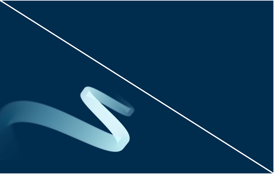
Cropping
Always make sure that the fifth element is used full bleed when placed in a layout. You can crop the element, but the wave form should be easily recognised and have a clear “direction” towards the viewer. Make sure that the wave starts inside the format and ends “outside”.

The element is either cropped or used full bleed when placed in a layout. When cropping make sure that the wave form is recognised.

1 – The start of the wave should always start inside the format
2 – The end of the wave should always go outside the format

Never crop the element so that it looses its meaning (wave-form).

Make sure that the fifth element has a clear “direction” towards the viewer.

Make sure the image is not cropped within the format.

Make sure the image is not cropped within the format.
5th element and text
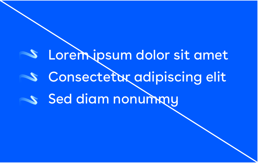
Typography applied on our fifth element should always be white. The goal is to always ensure legibility between the text and the background. Make sure that you place the white text where it gives contrast to the background colours for maximum visibility.

Always use white text on 5th element – Bright blue.

Always use white text on 5th element – Dark blue.

Make sure that you place the white text where it gives contrast to the background colours for maximum visibility.

Coloured typography should never be applied on our fifth element.
Examples
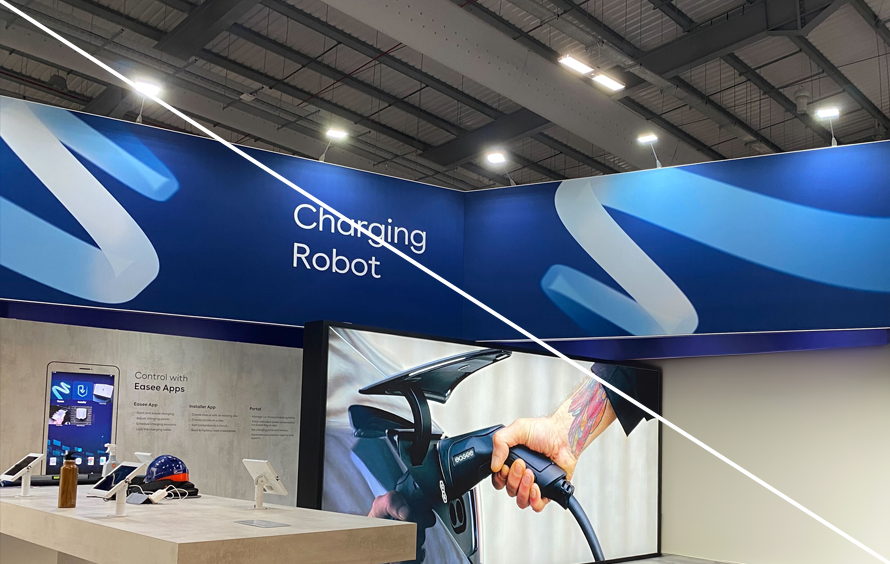
Below you will find applied examples of how the Easee 5th element are used.
Print – Board
Digital – Board animated
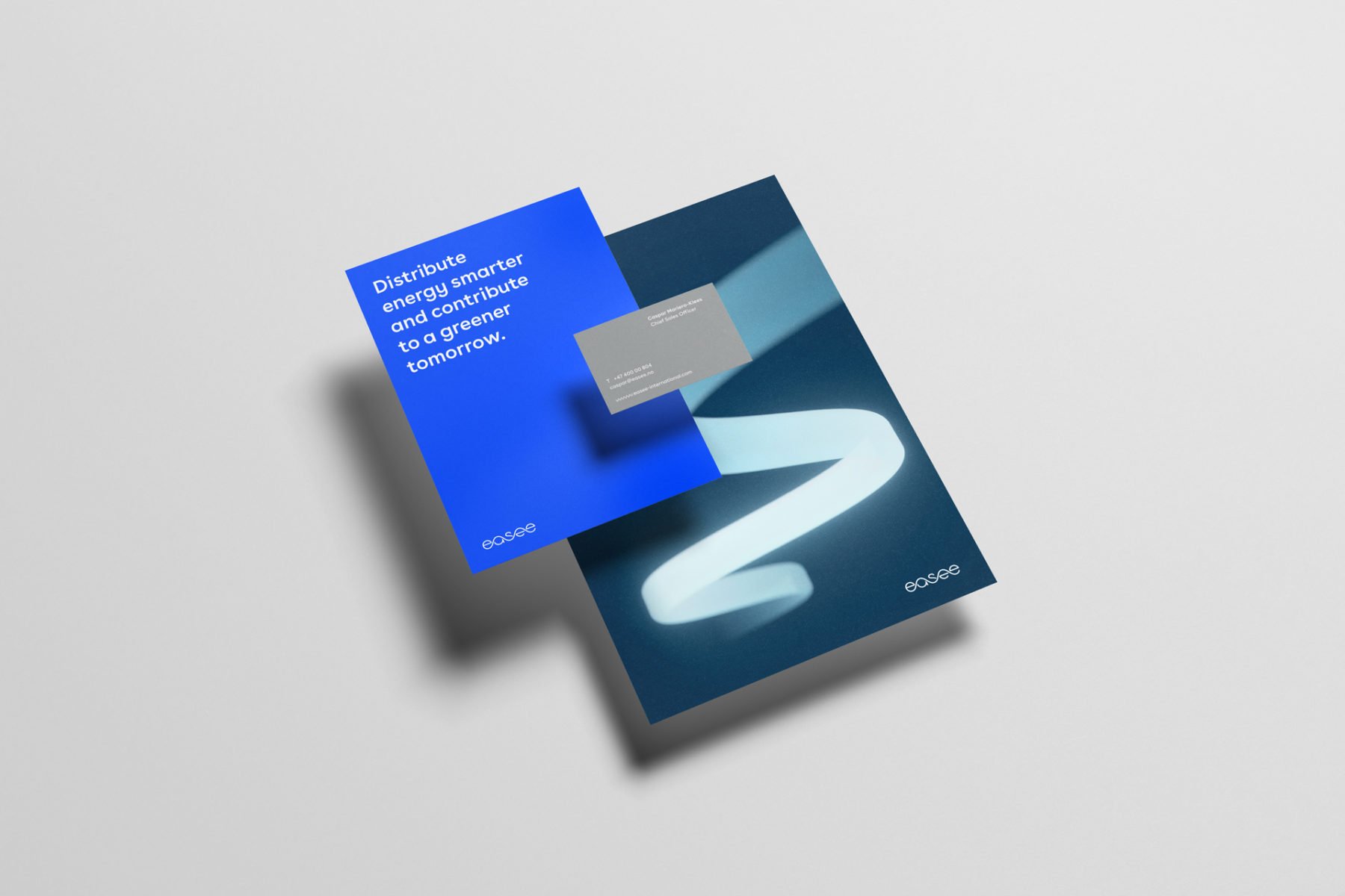
Print – Brand applications
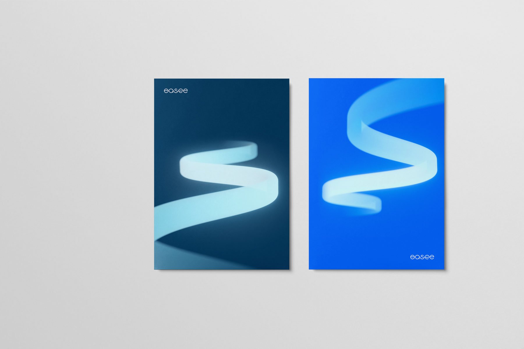
Print – Cover pages
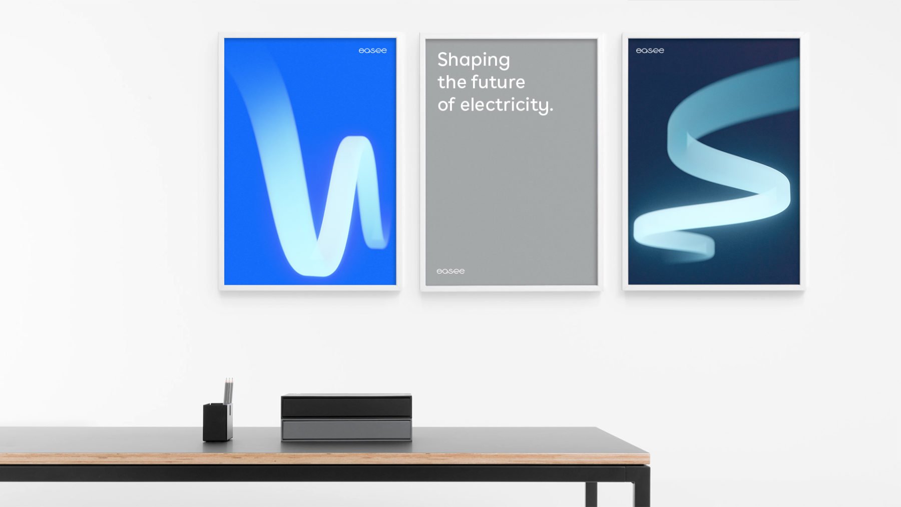
Print – Brand posters
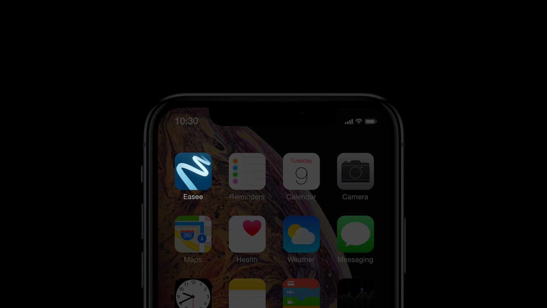
Digital – App icon / Favicon
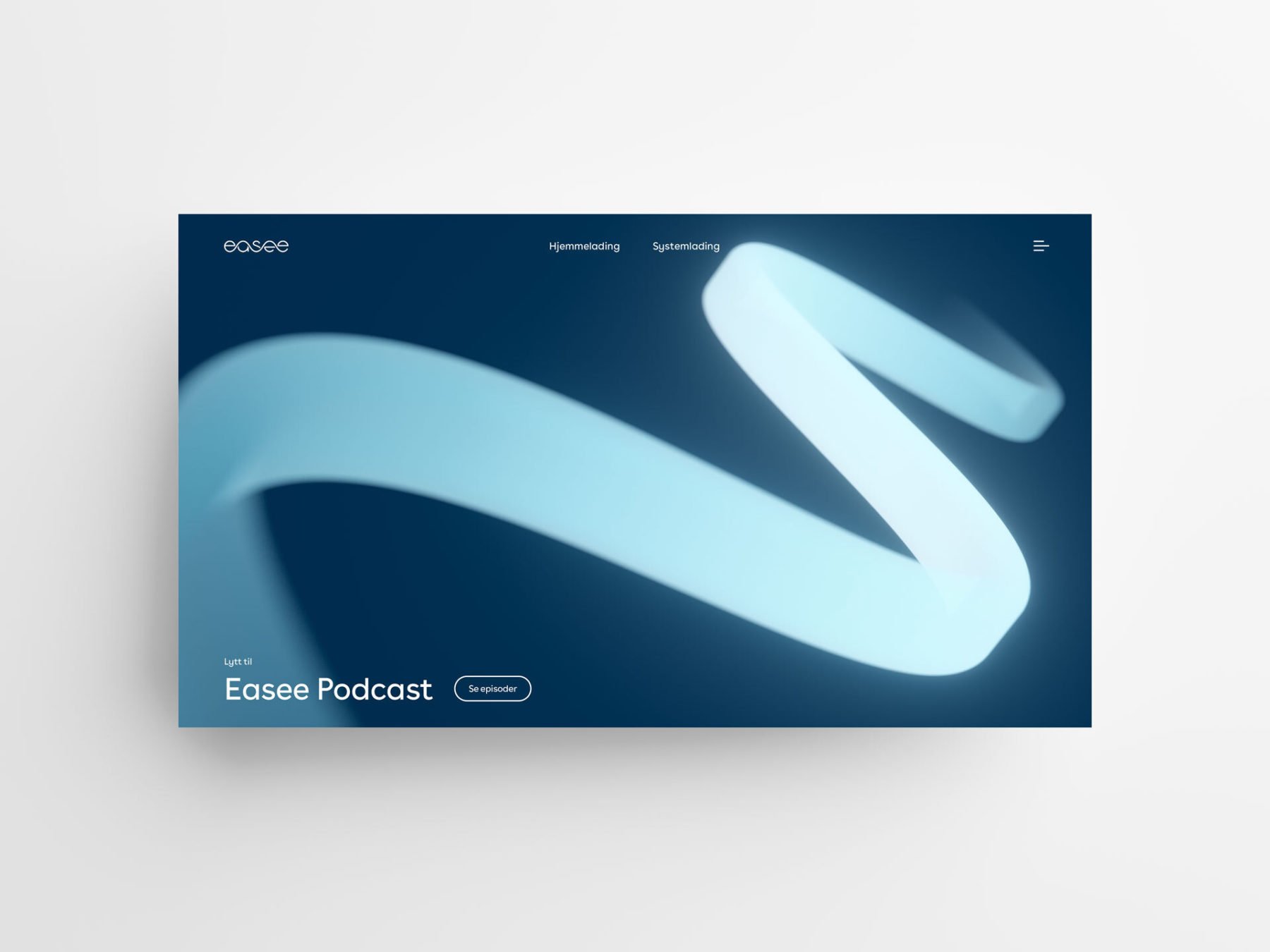
Digital – Web/Presentations
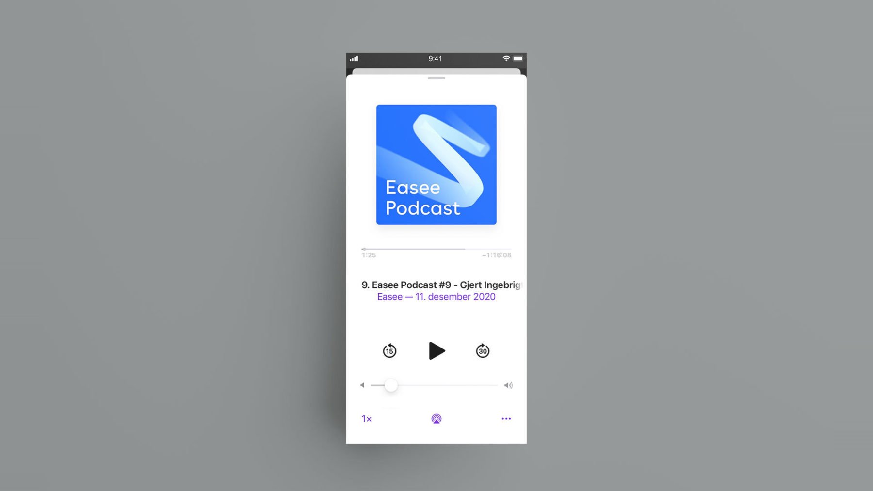
Digital – Podcast cover-art
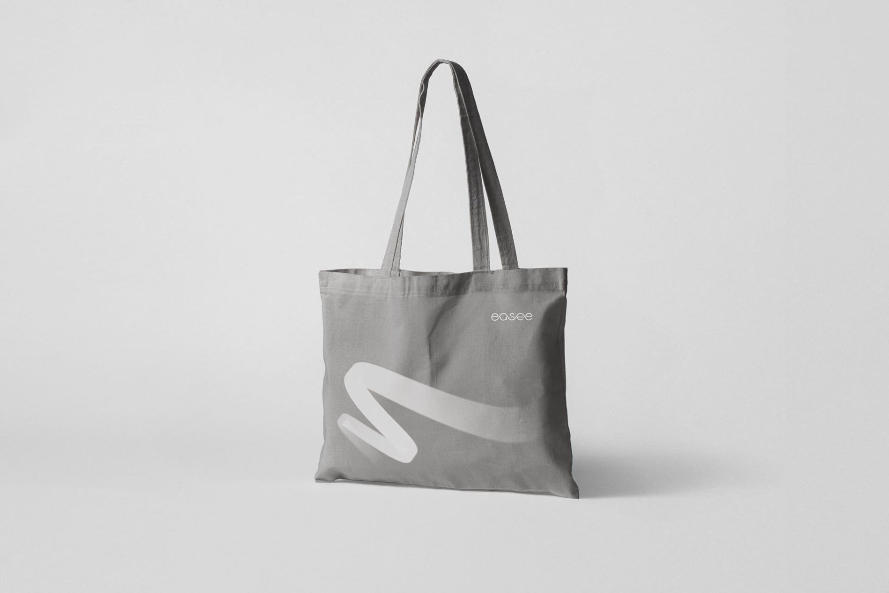
Apparel – Tote bag

Decor – Glass foil