To ensure that our template files will work correctly, make sure that you have our BuenosAires_AlternativGlyphs_V2 font installed on your computer. If you don’t have it, please ask IT to set it up (internal only).
Typography is a big part of our identity. When used correctly it helps to create a consistent and coherent look and feel. Our typeface is almost always present in everything that we do and is, therefore, an extremely important ingredient in our brand.
Our typeface
Our typeface is called Buenos Aires. Due to subtle, playful moments, the font looks friendly. Whether body text or title, the open forms appear generous. It is a typeface that reflects the values of our brand and is a big part of the Easee personality.
Say hi to
Buenos Aires
Weights
Buenos Aires is available in a wide range of weights and styles, but in order to keep things simple and consistent Easee will only use four weights: SemiBold, Regular, Book and Light.
SemiBold
Regular
Book
Light
Character overview
Buenos Aires blends aesthetics and functionality from both the classic and modern typographical eras to create a typeface with a timeless, friendly and unique expression.
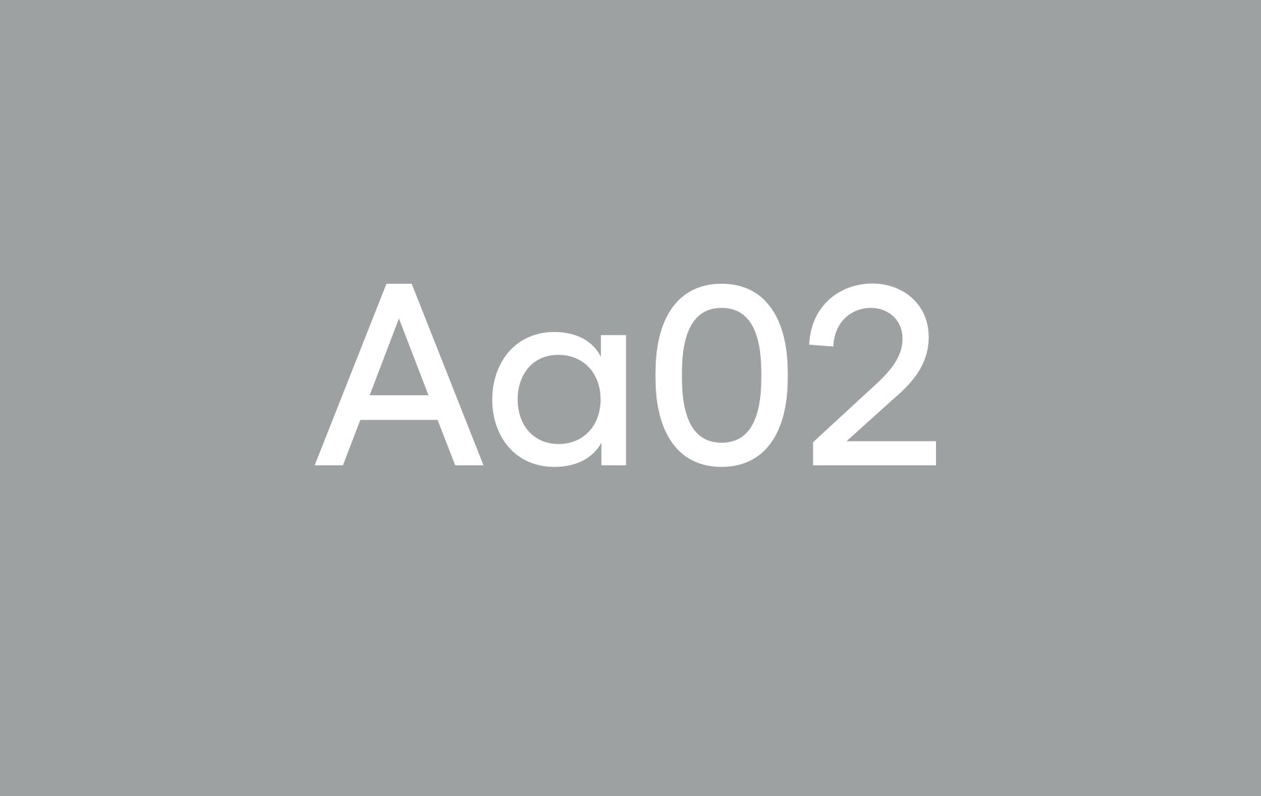
Aa02
Buenos Aires SemiBold
ABCDEFGHIJKLMNOPQRSTUVWXYZÅÄÖ
abcdefghijklmnopqrstuvwxyzåäö
1234567890!?”#%&/(:;.,)
Aa02
Buenos Aires Regular
ABCDEFGHIJKLMNOPQRSTUVWXYZÅÄÖ
abcdefghijklmnopqrstuvwxyzåäö
1234567890!?”#%&/(:;.,)
Aa02
Buenos Aires Book
ABCDEFGHIJKLMNOPQRSTUVWXYZÅÄÖ
abcdefghijklmnopqrstuvwxyzåäö
1234567890!?”#%&/(:;.,)
Aa02
Buenos Aires Light
ABCDEFGHIJKLMNOPQRSTUVWXYZÅÄÖ
abcdefghijklmnopqrstuvwxyzåäö
1234567890!?”#%&/(:;.,)
Typeface features
Buenos Aires comes with some additional basic features like ligatures as well as fractions, symbols, numerators and denominators. These can be accessed through OpenType features and glyph palettes in the standard design tools available.
Default Ligatures
Infinity Infinity
Discretionary Ligatures
Sufficient Sufficient
Tabular Lining Figures
$1024 $1024
Superscript
m3 m3
Fractions
15 / 320 15/320
Numerators and Denominators
2H5 2H5
NOTE: Easee are using a special customized version of Buenos Aires where its alternate set of lowercase-a and lowercase-l with swashes is removed.
Default Ligatures
fi ff
Discretionary Ligatures
ffi fj ffj ft fft tt tz
Symbols
@ & ¶ § © ® ™ † ‡ * ^ ℓ ℮ ◊ ↑ → ↓ ←
Currency and Math Operators
$ ¢ € £ ¥ ƒ ¤ ∞ ∫ ∏ ∑ √ ∂ N o Δ Ω μ π # ° + − ± × ÷ = ≠ ≈ ~ ¬ > < ≥ ≤ % ‰ '"
Fractions
½ ⅓ ⅔ ¼ ¾ ⅕ ⅖ ⅘ ⅙ ⅚ ⅛ ⅜ ⅝ ⅞
Superscript
1 2 3 a 0
Nominator and Denominator
0 1 2 3 4 5 6 7 8 9 0 1 2 3 4 5 6 7 8 9
Default Proportional Figures
0 1 2 3 4 5 6 7 8 9
Tabular Lining Figures
0 1 2 3 4 5 6 7 8 9
Type tester
We have included a type tester so you can play with Buenos Aires and explore all its styles and weights. The typeface really comes to life once it’s set in words or paragraphs, so feel free to type away!
Heavy boxes perform quick waltzes and jigs.
Type basics
Typography creates purposeful texture. It guides users to read and understand the hierarchy of information. The right typographic treatment and the controlled usage of type styles helps manage the display of content, keeping it useful, simple and effective. To ensure a consistent look and good readability always use the treatment as described.
Using weights
Typographical weights are a powerful tool to build hierarchies. Used correctly they will help strengthen our words and communication as well as establish a distinct visual recognition of our brand. Examples of how to differentiate titles and subtitles by weight or contrast change are shown here. It’s important to keep it simple and not create titles that are too long.
Headline
Headline – Buenos Aires Regular
We are mainly using Buenos Aires Regular for our headlines on both digital experiences and printed matters.
Headline
in semibold
Headline – Buenos Aires Semibold
The Buenos Aires Semibold weight is ideal when you want to emphasize the title and add contrast.
Headline
in regular
Identifier/Supertitle in regular
Supertitle – Buenos Aires Regular
To organize and guide users we have the option of using a supertitle/identifier above our headline.
Headline
in semibold
Identifier/Supertitle in regular
Example for 60% smaller:
Headline size * 0.40 = Supertitle size
Supertitle – Buenos Aires Regular
The supertitle/identifier should be 50 – 60% smaller than the headline size and always set in Regular weight. You can use another proportion size as long as the supertitle is legible, but never less than 50% of the headline size. Remember to round off to nearest digit.
Identifier/Supertitle in SemiBold
Supertitle – Buenos Aires Regular
To organize and guide users we have the option of using a supertitle/identifier without a headline. When standing alone the supertitle should always be set in SemiBold.
Body text
Lorem ipsum dolor sit amet, consectetur adipiscing elit. Etiam at odio velit. Mauris congue, magna eget vulputate gravida, risus lorem condimentum tellus, vitae vulputate turpis odio eu ex. Nullam non tincidunt turpis. Nunc dignissim blandit magna, consectetur rutrum justo lacinia a. Nullam risus augue, laoreet sed nisi sit amet, lacinia congue purus. Maecenas hendrerit erat eget nisl volutpat sodales. Aenean sit amet est elementum, commodo elit eget, sodales justo. Nullam ipsum massa, placerat in sem non, ultricies tincidunt urna. Vestibulum sed luctus nunc. Lorem ipsum dolor sit amet, consectetur adipiscing elit. Curabitur viverra ligula non massa gravida volutpat.
Nulla pretium varius urna, eget mattis felis dictum ac. Mauris imperdiet odio eu commodo pharetra. Integer volutpat odio eget felis blandit, et porttitor lectus vulputate. Quisque fermentum bibendum gravida. Praesent mollis semper tellus in lacinia. Donec sed efficitur nisl, ullamcorper congue purus. Nunc interdum tortor id scelerisque pellentesque. Ut cursus massa non est mollis gravida. Aliquam nec sodales dolor. Aliquam erat volutpat.
Duis nec mi faucibus, maximus augue nec, dictum sapien. Cras vestibulum metus at tempus luctus. Donec pretium turpis in fermentum vehicula. Ut felis metus, malesuada facilisis erat ut, congue efficitur arcu. Maecenas in posuere felis. Aliquam venenatis in nulla dignissim tincidunt. Ut a arcu molestie, posuere risus in, elementum ligula. Nullam pellentesque tellus pulvinar, maximus metus sed, ullamcorper lacus. Nulla facilisi. Nunc luctus accumsan ex at sollicitudin. Cras fringilla eros in arcu gravida, ac facilisis nunc interdum. In eleifend erat vel orci maximus, ut volutpat elit lobortis. Aenean pretium convallis posuere. Quisque id ullamcorper dolor.
Aenean ac molestie ligula. Vivamus vulputate, diam id ultrices suscipit, ipsum urna gravida lectus, et pharetra magna lectus sit amet ex. Suspendisse potenti. Aenean venenatis enim a arcu fringilla elementum. In hac habitasse platea dictumst. Class aptent taciti sociosqu ad litora torquent per conubia nostra, per inceptos himenaeos. Nam viverra leo non enim posuere dapibus. Mauris vulputate dignissim cursus.
Body text – Buenos Aires Book
Buenes Aires Book is used for body text and longer text on both digital experiences and printed matters.
Pull out text or preamble. Lorem ipsum dolor sit amet, consectetur adipiscing elit. Vestibulum id lacus turpis. Proin arcu ante, imperdiet quis sollicitudin non, scelerisque sit amet usto. Phasellus vitae vestibulum arcu, sed tempor quam.
Lorem ipsum dolor sit amet, consectetur adipiscing elit. Etiam at odio velit. Mauris congue, magna eget vulputate gravida, risus lorem condimentum tellus, vitae vulputate turpis odio eu ex. Nullam non tincidunt turpis. Nunc dignissim blandit magna, consectetur rutrum justo lacinia a. Nullam risus augue, laoreet sed nisi sit amet, lacinia congue purus. Maecenas hendrerit erat eget nisl volutpat sodales. Aenean sit amet est elementum, commodo elit eget, sodales justo. Nullam ipsum massa, placerat in sem non, ultricies tincidunt urna. Vestibulum sed luctus nunc. Lorem ipsum dolor sit amet, consectetur adipiscing elit. Curabitur viverra ligula non massa gravida volutpat.
Nulla pretium varius urna, eget mattis felis dictum ac. Mauris imperdiet odio eu commodo pharetra. Integer volutpat odio eget felis blandit, et porttitor lectus vulputate. Quisque fermentum bibendum gravida. Praesent mollis semper tellus in lacinia. Donec sed efficitur nisl, ullamcorper congue purus. Nunc interdum tortor id scelerisque pellentesque. Ut cursus massa non est mollis gravida. Aliquam nec sodales dolor. Aliquam erat volutpat.
Duis nec mi faucibus, maximus augue nec, dictum sapien. Cras vestibulum metus at tempus luctus. Donec pretium turpis in fermentum vehicula. Ut felis metus, malesuada facilisis erat ut, congue efficitur arcu. Maecenas in posuere felis. Aliquam venenatis in nulla dignissim tincidunt. Ut a arcu molestie, posuere risus in, elementum ligula. Nullam pellentesque tellus pulvinar, maximus metus sed, ullamcorper lacus. Nulla facilisi. Nunc luctus accumsan ex at sollicitudin. Cras fringilla eros in arcu gravida, ac facilisis nunc interdum. In eleifend erat vel orci maximus, ut volutpat elit lobortis. Aenean pretium convallis posuere. Quisque id ullamcorper dolor.
Aenean ac molestie ligula. Vivamus vulputate, diam id ultrices suscipit, ipsum urna gravida lectus, et pharetra magna lectus sit amet ex. Suspendisse potenti. Aenean venenatis enim a arcu fringilla elementum. In hac habitasse platea dictumst. Class aptent taciti sociosqu ad litora torquent per conubia nostra, per inceptos himenaeos. Nam viverra leo non enim posuere dapibus. Mauris vulputate dignissim cursus.
Preambles – Buenos Aires Light
Buenes Aires Light can be used in pull-out text or preambles.
“Self-doubt kills more dreams than failure ever will”
Quotes – Buenos Aires Light
Use Buenes Aires Light when quoting someone.
Sizes
Typography should be used in a dynamic way to create hierarchy and set a strong identity. When combining font sizes, be sure to set a proper size difference between them.
Headline
Print – 24 pt / Digital – 48 px
Headline 2
Print – 16 pt / Digital – 32 px
Headline 3
Print – 13 pt / Digital – 26 px
Supertitle
Print – 8 pt / Digital – 16 px
Body text 1 – Lorem ipsum dolor sit amet, consectetur adipiscing elit. Vestibulum id lacus turpis. Proin arcu ante, imperdiet quis sollicitudin non, scelerisque sit amet justo. Phasellus vitae vestibulum arcu, sed tempor quam. Curabitur pretium, libero ac molestie iaculis, elit urna luctus libero, a efficitur lorem neque a augue.
Print – 9 pt / Digital – 16 px
Body text 2 – Lorem ipsum dolor sit amet, consectetur adipiscing elit. Vestibulum id lacus turpis. Proin arcu ante, imperdiet quis sollicitudin non, scelerisque sit amet justo. Phasellus vitae vestibulum arcu, sed tempor quam. Curabitur pretium, libero ac molestie iaculis, elit urna luctus libero, a efficitur lorem neque a augue.
Print – 8 pt / Digital – 14 px
Use a clear relational size system when choosing font sizes. Try using at least a 150% difference in sizes, e.g. 10pt base size, would imply the minimum next size to be 15pt.
NOTICE! The sizes in the examples above should be seen as general recommendations. Different formats and contexts require different sizes.
Left-aligned
We primarily use left-aligned typography. Aligned left and ragged right is the most readable alignment – it creates strong alignments for the eye to follow. It is our standard for all typography. Make sure the lines aren’t too long. Try to aim for maximum 8-12 words or 45-65 characters per line.

Always use left-align text

Don’t use right-align text

Don’t use center-align text

Don’t use justified text
Centered expectations
In some cases, centered text is allowed. This is usually in digital contexts or in situations where it helps to present information in a more logical way than left-aligned text. This is only suitable for shorter texts or single words.

Leading
To ensure high readability a leading or line space of approx. 120–150% of the font size is recommended. Larger font sizes need smaller leading and smaller font sizes need larger leading. It should never be to open or too tight which makes reading difficult and unpleasant for the reader.

Leading is the space between baselines. It should be approximately 120-150% of the font size. In this case 32pt text with 42pt leading is 130%.
NOTICE! When using programs such as Word, Pages, Powerpoint or Keynote use leading/line space between 1,15 – 1,5 pt.
Case
We always use sentence case text. This means that the capitalization is just like a standard sentence e.g. “Welcome to our home”. Avoid the use of all uppercase or “all caps” in your typography, especially for paragraphs or text.


Tracking & Kerning
Tracking is the adjustment of horizontal space between letters in a block of text. Our typeface requires space to breathe comfortably within text and headlines. It’s lighter in appearance and is more legible when spaced appropriately. Kerning should always be set to optical.
This is comfortable.
This is uncomfortable.
This is too comfortable.
Rags, orphans
and widows
Always look for opportunities to create improved rags, or ragged edges on the right margin. Watch out for orphans and widows and adjust line lengths with a writer to solve awkward breaks which can affect reading quality.

A good rag goes in and out from line to line in small increments.

A poor rag creates distracting shapes of white space in the margin.

A widow is a single word or short line at the end of a paragraph. Widows create too much white space in between paragraphs and break the reading pattern.

An orphan is one word or short line at the beginning of a page or column. Although less common than widows, they still affect readability.
System font
We use Arial as a system font. A system font is a typeface that is available on all computers. When sending open documents, such as Word or PowerPoint documents, always use Arial as replacement font.
Buenos Aires Semibold/Regular
Arial Bold
Buenos Aires Book
Arial Regular
Examples
Below you will find applied examples of how the Easee typeface should be used.
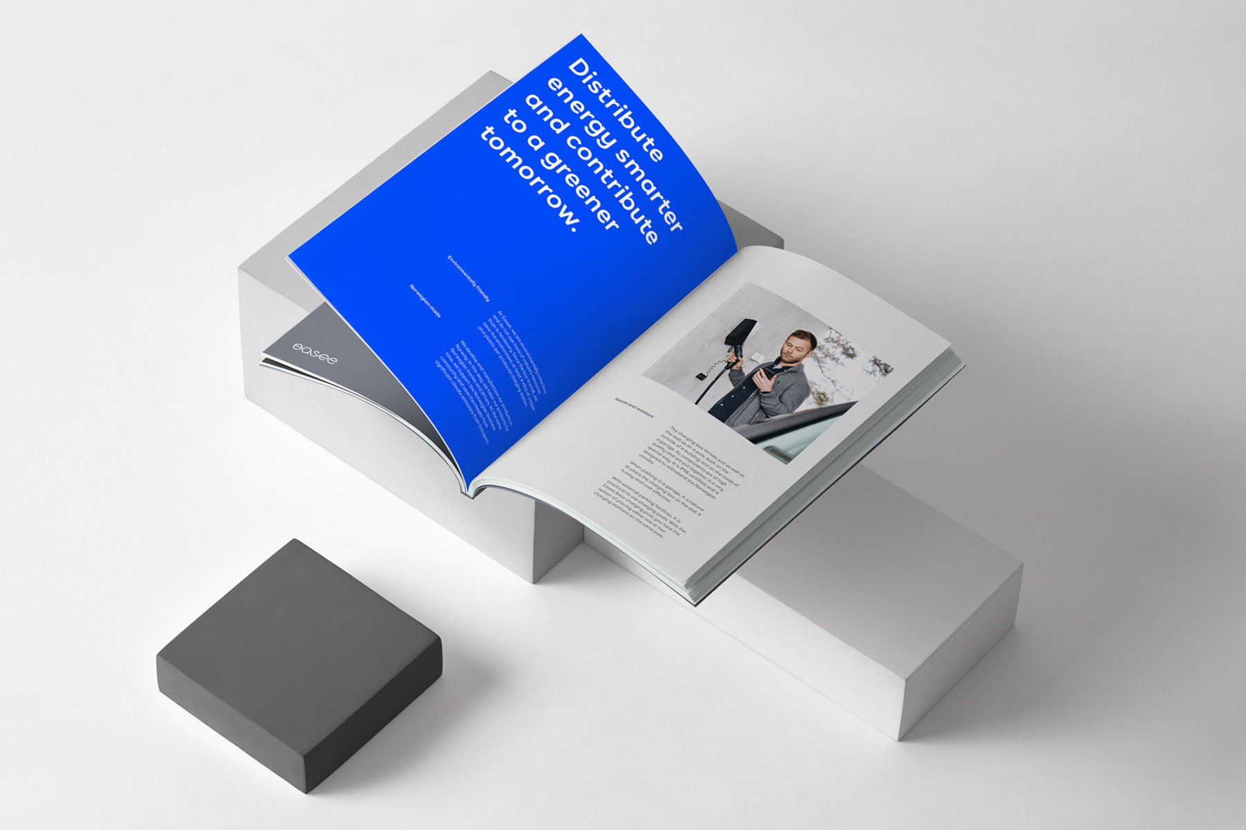
Print – Brochure
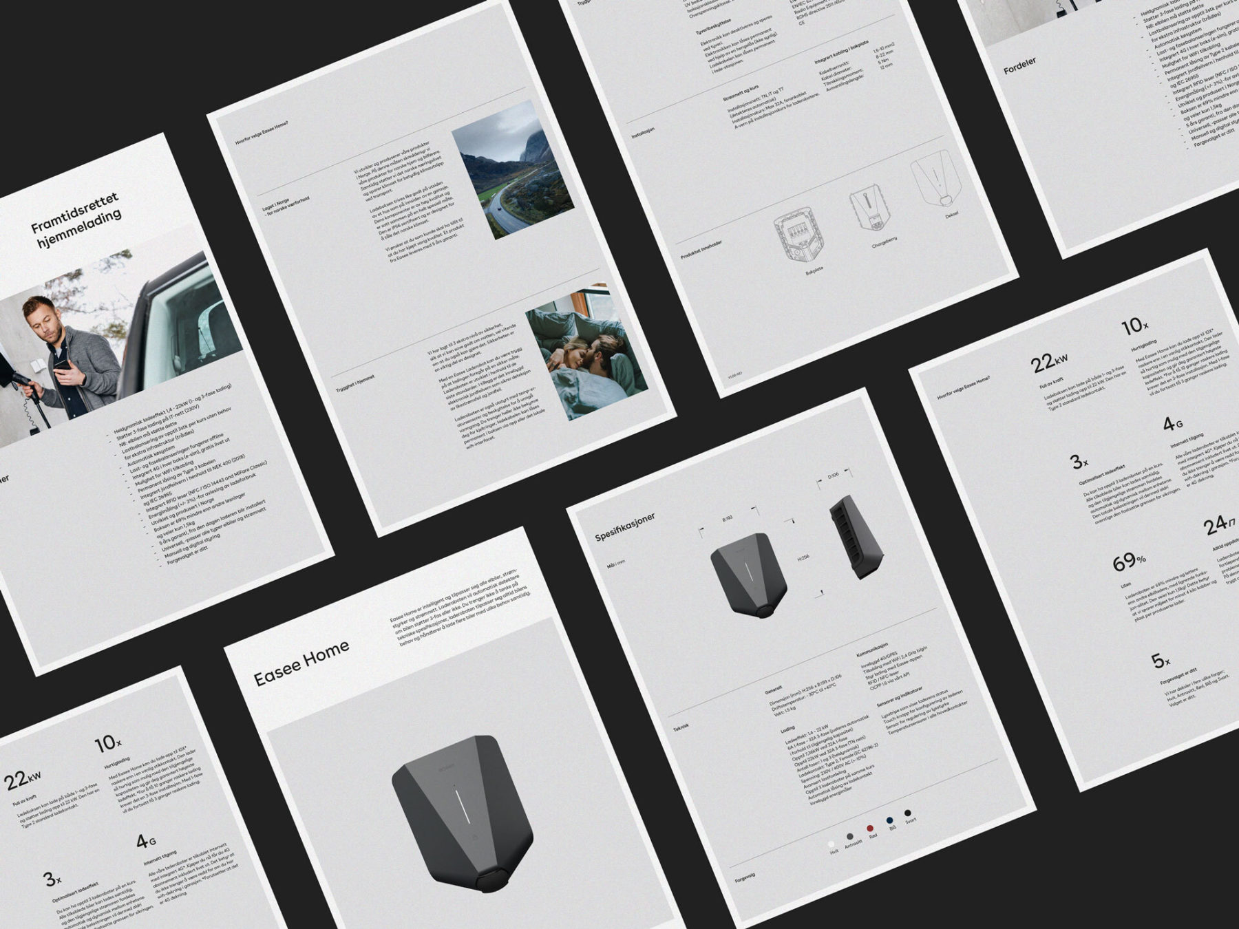
Print – Product sheet
Download
Download the Easee font (not available).
Buenos Aires Font-family – Package