Our colours
Our brand palette connects colors in bold and dynamic ways. The colors are selected to work against light and dark background to create opportunities for variation. Bright blue is our brand’s signature colour — the colour that helps set Easee apart.
Black
White
Bright blue
Dark blue
Light grey 1
Light grey 2
Grey
Dark grey
Primary colours
Below you find the colour codes for all of our primary colours. Our colours should always be reproduced according to these specified values. Use RGB or Hex (#) for digital, CMYK or Pantone® for printed matter, and NCS or RAL for physical objects.
Black
Copy HEX to clipboardNCS: S 9000-N
RAL: 9011
PMS: Black 6
C:100 M:61 Y:32 K:96
R:0 G:0 B:0
#000000
White
Copy HEX to clipboardNCS: S 0300-N
RAL: 9003
PMS: White
C:0 M:0 Y:0 K:0
R:255 G:255 B:255
#FFFFFF
Bright blue
Copy HEX to clipboardNCS: S 3560-R90B
RAL: 5005
PMS: 2935
C:100 M:50 Y:0 K:0
R:0 G:90 B:255
#005AFF
Dark blue
Copy HEX to clipboardNCS: S 7020-R80B
RAL: 5003
PMS: 7463
C:100 M:53 Y:0 K:72
R:0 G:44 B:78
#002C4E
Light grey 1
Copy HEX to clipboardNCS: S 0603-R80B
RAL: NA
PMS: 5315
C:5 M:4 Y:4 K:0
R:245 G:245 B:245
#F5F5F5
Light grey 2
Copy HEX to clipboardNCS: S 1002-B
RAL: 7047
PMS: 427
C:12 M:8 Y:8 K:0
R:230 G:231 B:232
#E6E7E8
Grey
Copy HEX to clipboardNCS: S 3502-B
RAL: 7040
PMS: 422
C:40 M:29 Y:31 K:8
R:157 G:161 B:161
#9DA1A1
Dark grey
Copy HEX to clipboardNCS: S 7502-B
RAL: 7011
PMS: 7540
C:68 M:56 Y:47 K:43
R:75 G:80 B:88
#4B5058
Extended palette
In our digital touch points and user manuals we use a wider extended palette for functional reasons. As we need to distinguish information, illustrations and signal colours indicating a warning or if something is correct/connected.
Local operation
Copy HEX to clipboardR:125 G:0 B:255
#7D00FF
Glowing blue
Copy HEX to clipboardR:0 G:135 B:255
#64DCFF
Information
Copy HEX to clipboardR:118 G:134 B:146
#768692
Attention
Copy HEX to clipboardR:255 G:204 B:0
#FFCC00
Error
Copy HEX to clipboardR:236 G:75 B:57
#EC4B39
Confirmation
Copy HEX to clipboardR:83 G:174 B:54
#53AE32
Material colours
Below you will find the NCS colours codes for all our physical material colours used in our Easee products. Our colours should always be reproduced according to these specified values.
Black
Copy HEX to clipboardNCS: S 9000-N
Anthracite
Copy HEX to clipboardNCS: S 7502-B
White
Copy HEX to clipboardNCS: S 0603-R80B
Red
Copy HEX to clipboardNCS: S 2570-Y90R
Blue
Copy HEX to clipboardNCS: S 7020-R80B
Combinations
Care should be taken when combining our colours. Our sophisticated and dynamic visual expression is achieved by using only one or maximum two of the primary colours for each application. We never use all of our colours at the same time.
Examples
Below you will find applied examples of how the Easee colours should be used and combined.

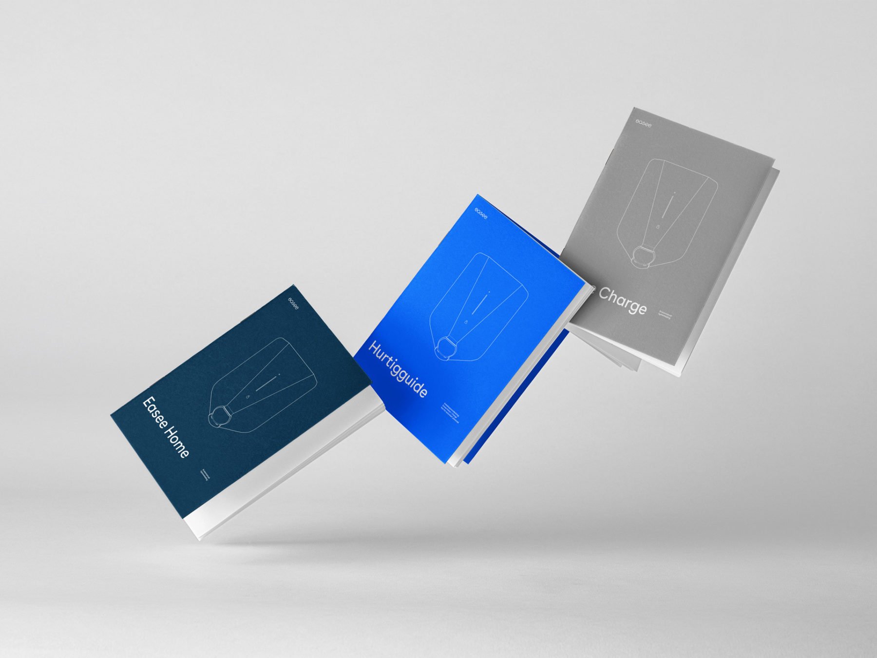
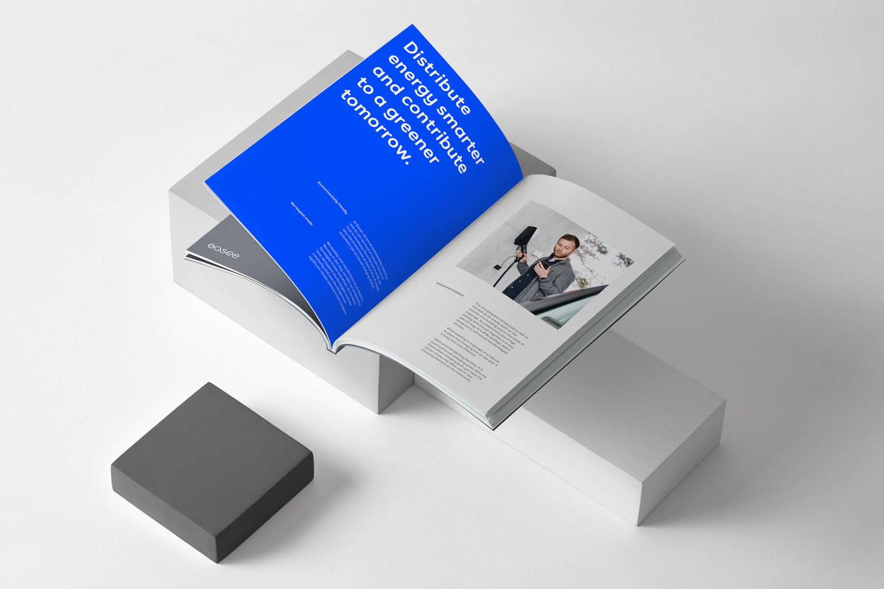
On printed materials you can use one of our single primary colour as background on each application.

On printed materials you can use a combination of our primary colours as background on different pages to make the layout more dynamic.

Digital
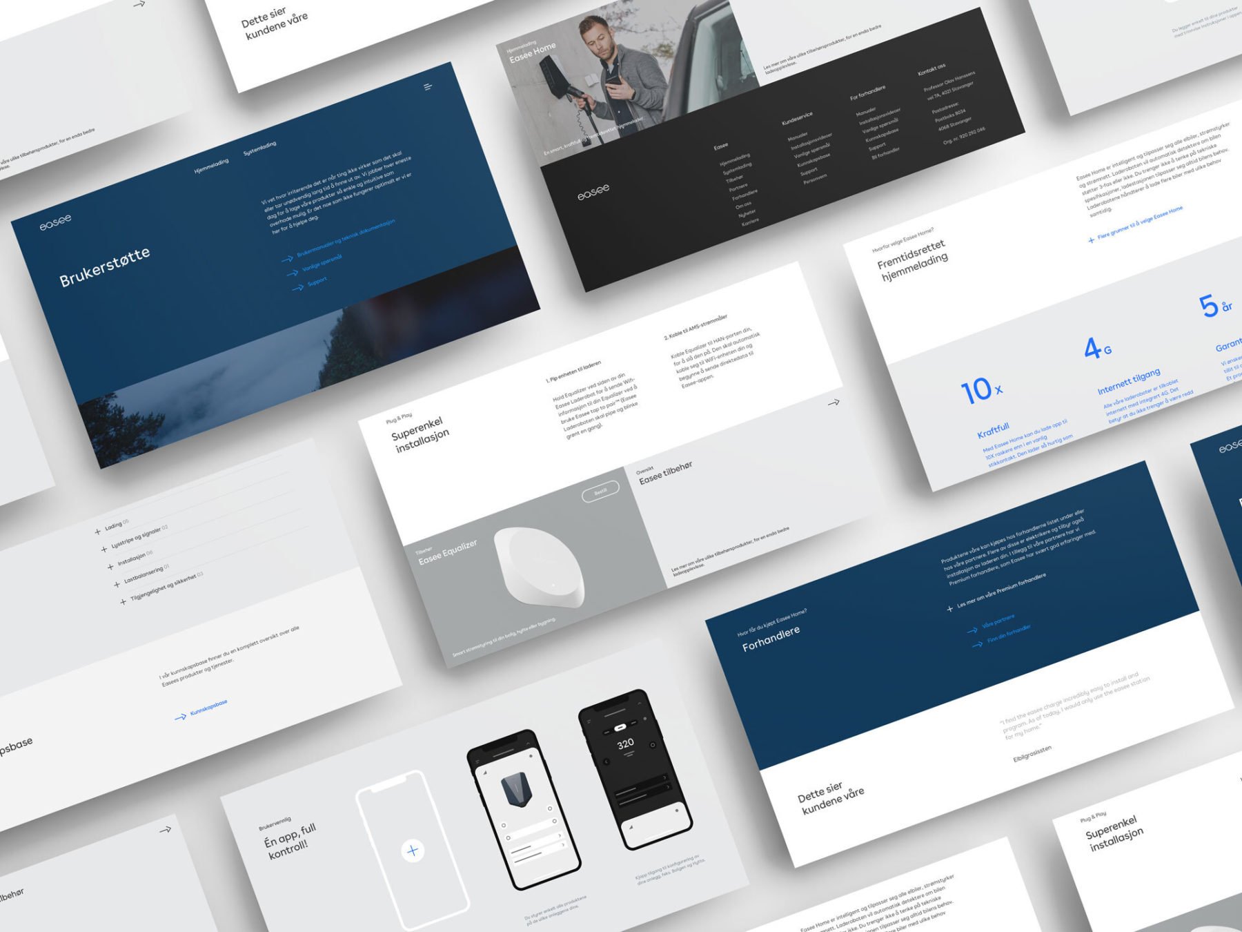
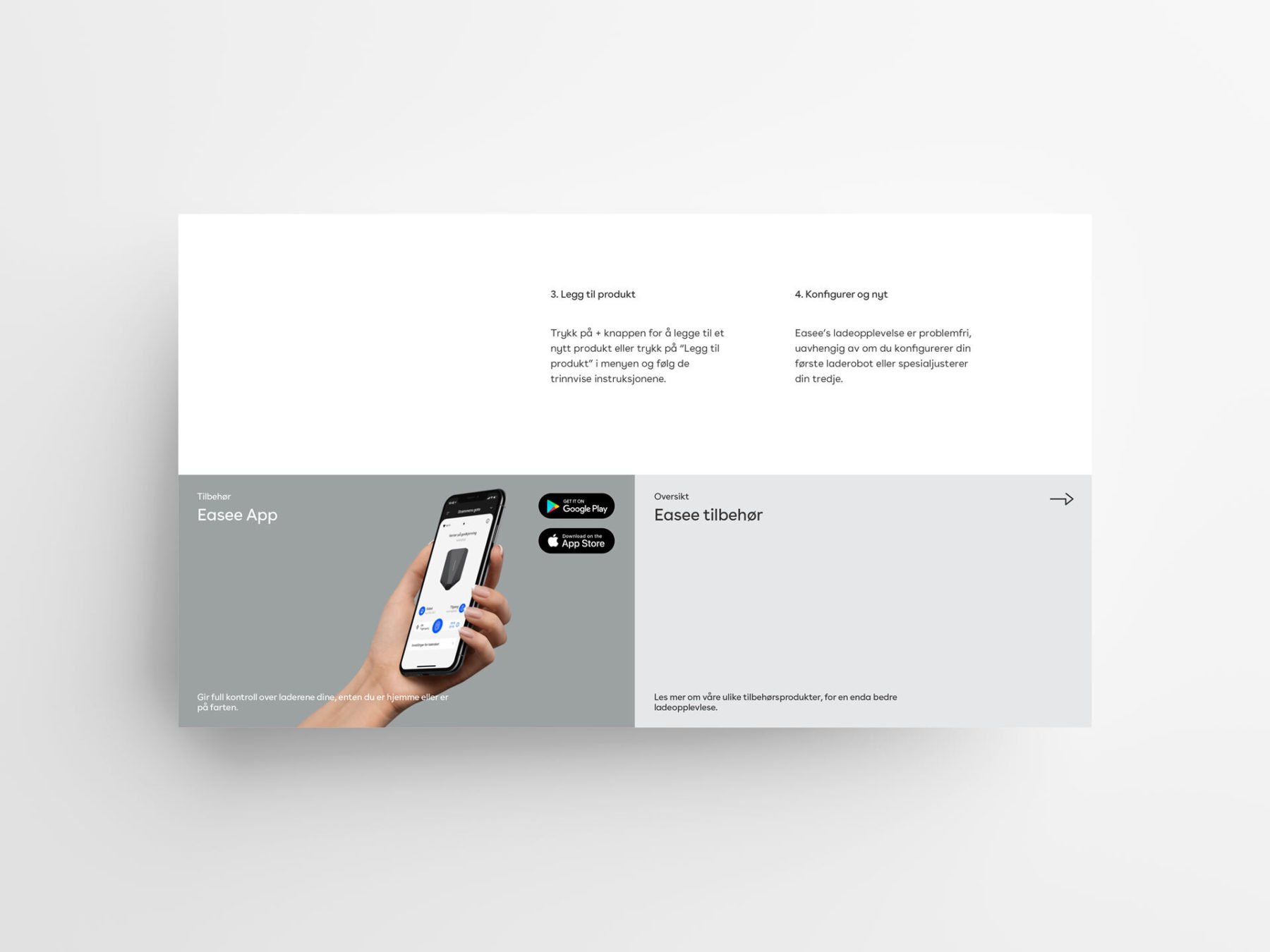
On digital touchpoints you can use one of our single colours or use our recommended colour combinations to give structure and organize content. This will ensure a unified and recognizable consistency to our digital products and interfaces.

Digital
White and the different gray colours we have is dominant in our UI to help organize content into distinct zones. The Bright blue has been designated as the primary action color across all products and experiences, ensuring our color aesthetic is a part of every interaction.
Colour and text
Black or White is our preferred colour for all copy depending if its placed on a light or dark background. Bright blue beeing the exeption. The most important function of text is to be readable. Always ensure that the pairing of colours achieves adequate contrast, for maximum visibility and legibility.
Black text
White or light backgrounds
As a main rule we use black typography on white/light backgrounds. To add variation and a dynamic visual expression you can use Bright blue on light grey backgrounds.
White text
Black or dark backgrounds
As a main rule we use white typography on black/dark backgrounds. To add variation and a dynamic visual expression you can use Bright blue D, see Bright blue exception.
Bright blue text
Light grey background
Bright blue typography can be used on light grey backgrounds.
White text
Bright blue background
Always use white typography on Bright blue background. We don’t combine coloured typography with coloured backgrounds.
EXCEPTION: You can use Bright blue D on top of Dark Blue when needed to add variation and a dynamic visual expression.
Bright blue exception
When applying Bright blue on a dark background, for maximum visibility and legibility always ensure that you use Bright blue D (dark mode) from the extended palette . This applies both for graphics and text.
Use
Bright blue D
Always use Bright blue D on black background.
Use
Bright blue D
Always use Bright blue D on dark backgrounds.
Don’ts
Do not go overboard with the colours – remember the neutrals and make sure not to use more than one (plus black or white) on a single surface. The colours should never be modified or appear in any other way than stated in these guidelines.
Never use different colors than shown in these guidelines
Don’t use all our colours at once.
Don’t use Bright blue on dark blue backgrounds.
Always make sure there is enough contrast between the text colour and the background colour.
Always make sure there is enough contrast between the text colour and the background colour.
Don’t combine coloured typography with coloured backgrounds.
EXCEPTION: You can use Bright blue D on top of Dark Blue when needed to add more dynamic to the layout.

