The Easee Logo is our most important identity asset.
It is our signature and distinguishes us from others.
It’s our primary identification marker and the very DNA
of our brand. The logotype will appear as a sign-off or endorsement on all of our communication and reinforces the values of our brand.
Our logo
Our logotype is the single most effective tool when it comes to the recognition and identification of our brand. To ensure maximum impact and awareness of the Easee brand, it’s important to treat the logotype according to these guidelines.
Trademark®
In a majority of cases, Easee’s logotype should be used with a registered trademark symbol.

Versions
Our logotype is the single most effective tool when it comes to the recognition and identification of our brand. To ensure maximum impact and awareness of the Easee brand, it’s important to treat the logotype according to these guidelines.
Logo – white
Logo – black
Colours
The logotype can appear in different color schemes on different coloured backgrounds. We are using black on a light background or image. Conversely, the white is used against a dark background or image.
Use White on Bright Blue
Use White on Dark Blue
Use Black on Light Grey 1
Use Black on Light Grey 2
Use White on Grey
Use White on Dark Grey
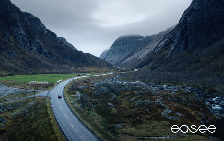
Image treatment
When applying the logotype to imagery always make sure legibility and visibility is taken into consideration.
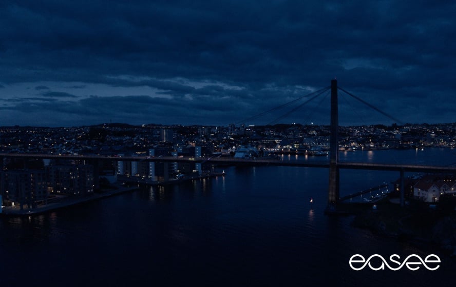
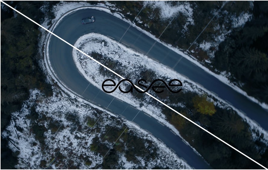
Dark background image
Dark background image
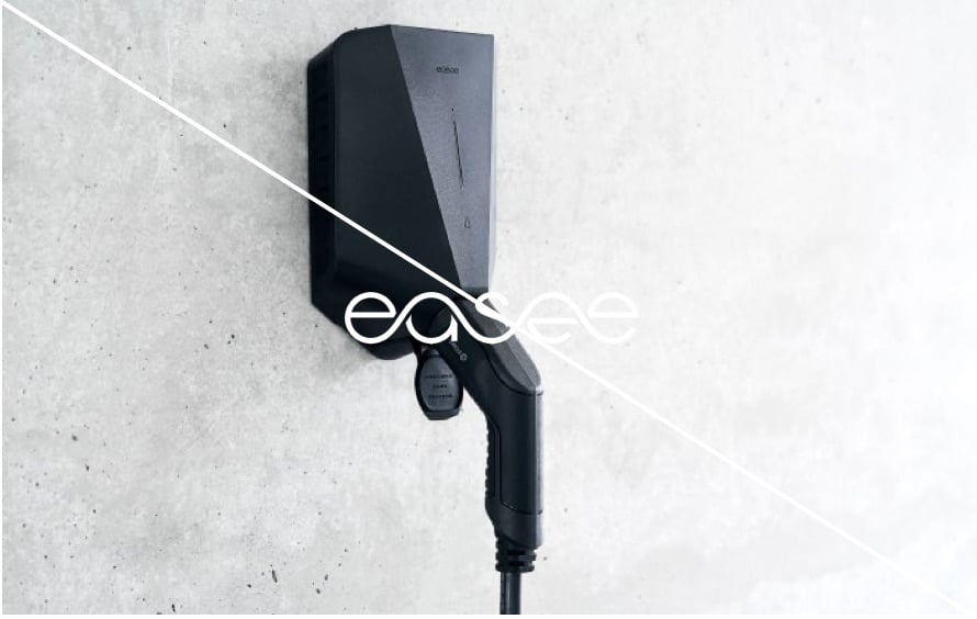
Light background image
Light background image
Animated
Easee’s logotype is available as a logo-animation, where the wave form is sparking to life as an energy flow – drawing the logo-letters. The animated logo is typical used in presentations, films and social-media ads.
Clearspace
To ensure maximum visibility a minimum clear space has been set.
The Easee logo should always be surrounded by sufficient clear space in order to appear as clear and distinct as possible. The clear space (X) is based on height of the logo.
This measurement is the minimum space allowed around the logotype and should always be applied in all instances. It is important to point out that the defined clearspace is a minimum, it is of course allowed and recommended to go above this in order to create clear and consistent designs.
Placement
To ensure consistency and brand alignment a set of prioritized logotype placements have been set.

These recommended positions help us to create a consistent visual expression and provide flexibility for individual situations.
Depending on the format, layout and content, the placement of logotype should always be placed in either the top or bottom corners.

The lower left corner is our primary placement on a landscape format.

Exceptions can be made on both landscape and portrait formats when it comes to web, displays and extreme formats.

The lower right corner is our primary placement on a portrait format.

In some cases a centered placement and sized logo provides the most impact. For instance when there is no other element except logotype present in the foreground. Examples of these are in film and social-media ads where the logo acts as an sign-off or endorsment. See Supersize rules here.
Size
Using a set of recommended sizes for the Easee logotype aims to create a visual standard and minimize variation.

Logotype size – Print
The size of the logo varies with the format. Above is the recommended logotype sizes for the standard A formats.
A-formats (logo width)
A2 70 mm
A3 35 mm
A4 25 mm
A5 25 mm
A6 25 mm
Aspect ratio
The aspect ratio of an image/video defines the proportion between its width and height. It is always expressed as two numbers separated by a colon (x:y). The first number always refers to the width, and the second number refers to the height. A 1:1 aspect ratio, for example, is a square. Read more about Aspect ratio here.

1:1

4:5

16:9

9:16
Logotype size – Image/Video
Depending on the format/ratio, we use a defined procentage size of the logo width. To ensure coherence and absolute brand recognition through all platforms, these recommended sizes should always be used.
Aspect ratios (logo width)
| 1:1 | 25% (1/4) | Used by Instagram and FB |
| 4:5 | 25% (1/4) | Used by FB |
| 16:9 | 10% (1/10) | Presentation slides, TV/monitors. |
| 9:16 | 20% (1/5) | Instagram live stories |
Supersize
When there is no other elements except logotype present in the foreground, there is an opportunity to maximize the size in relation to the format. Examples of these are in film and social-media ads where the logo acts as a centered sign-off or endorsement (end frame).

1:1

4:5

16:9

9:16
Logotype supersize – Image/Video (end-frame)
Depending on the format/ratio, we use a defined procentage size of the logo width. A supersized logotype should always be centered on the surface.
Aspect ratios (logo width)
| 1:1 | 50% (1/2) | Used by Instagram and FB |
| 4:5 | 50% (1/2) | Used by FB |
| 16:9 | 20% (1/5) | Presentation slides, TV/monitors. |
| 9:16 | 33% (1/3) | Instagram live stories |
Minimum size
To ensure that our logo is always visible, and stands as a clear sender of our brand, a minimum size has been set. The logotype should never be used in smaller sizes than specified here.

On printed matters, the minimum size for the Easee logotype is 25mm (width).

Digital
In a digital context, the minimum size for the Easee logotype is 18px (height).
Don’ts
The logotype should never be modified or appear in any other way than stated in these guidelines. Always make sure there is enough contrast between the logotype and the background. The logotype can never appear in any other colour than black or white.

Always use black or white logotype

Never use different colors than shown in these guidelines
Always make sure there is enough contrast between the logotype and the background.
Always make sure there is enough contrast between the logotype and the background.

Never outline the logotype

Never add effects to the logotype

Do not stretch the logo

Make sure that the logotype has enough space towards edges or other objects.

Never place the logotype vertically

Never rotate or in any way distort the logotype.
Examples
Below you will find applied examples of how the Easee logotype should be used.
Print – Bottom right corner

Digital – Upper left corner