Our imagery
Imagery is a direct and effective tool in portraying our product and services as well as establishing personality and tonality in communication. It is a way for us to portray our operations and daily business. With a distinct style, the Easee imagery can be an efficient tool for consistent communication, regardless of situation, locality or target group.
Our imagery consists of our own images, imagery created by partners and some stock photos. However, to secure consistency and alignment we will adhere to a framework of categorisation and treatments. These guidelines will be the foundation of how Easee will create their own imagery that in time will replace our partner and stock images – to strenghten our brand recognition.
Look and feel
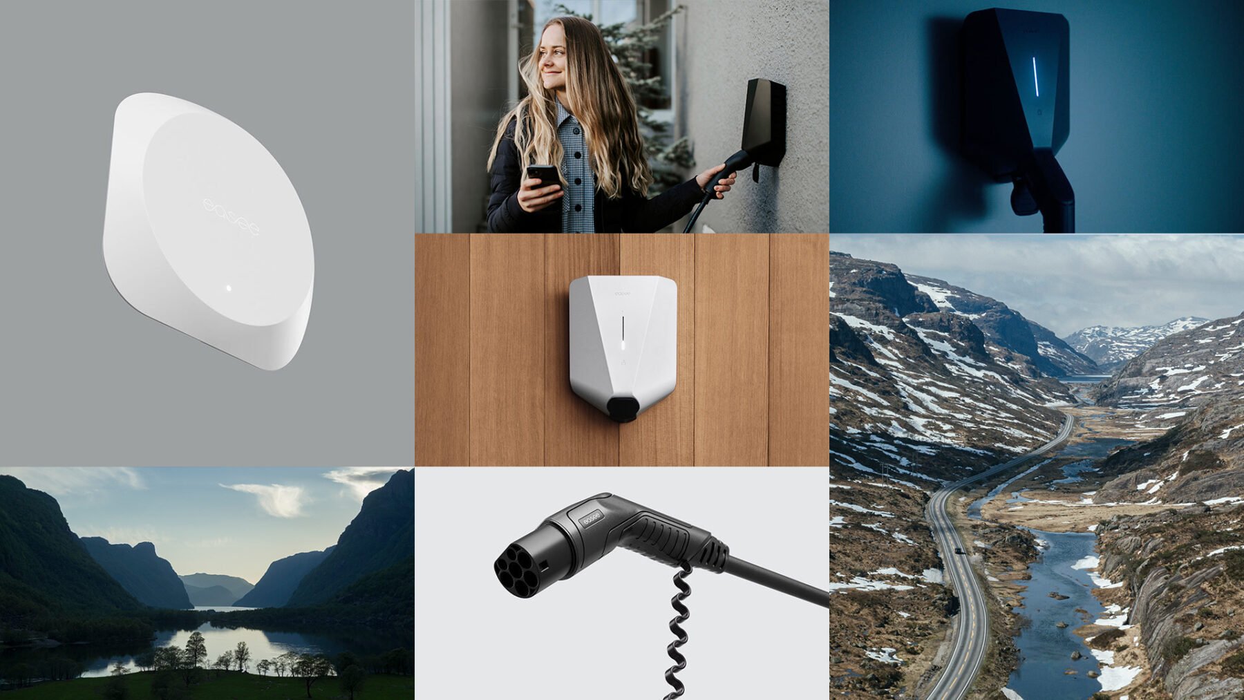
The general tone of the images is calm and elegant.
The light is natural and soft, creating smooth shadows. Non-saturated colours create a sophisticated and natural expression. We create interesting and exciting compositions by mixing conventional solutions with more unexpected angles. The compositions have clear lines and focal points.
Categories
Our imagery is divided into six image categories. These categories give guidance as to how we portray different kinds of subjects and environments, and is our foundation for creating or adding images to our Image bank. This is useful when giving instructions to photographers or when searching for stock images.

Heritage
Our Norwegian heritage is an important part of who we are – and what we stand for. This category describes how we portray the nature and landscapes around us.

People
Autheticity defined through diversity, professionalism, collaboration, caring and warmth. The personality of Easee. This category describes how we portray people.

Product
The result of what we do; groundbreaking solutions for a greener tomorrow. Our product renders are set against a clean background to convey simplicity and give a clear contrast to the product.
Environment
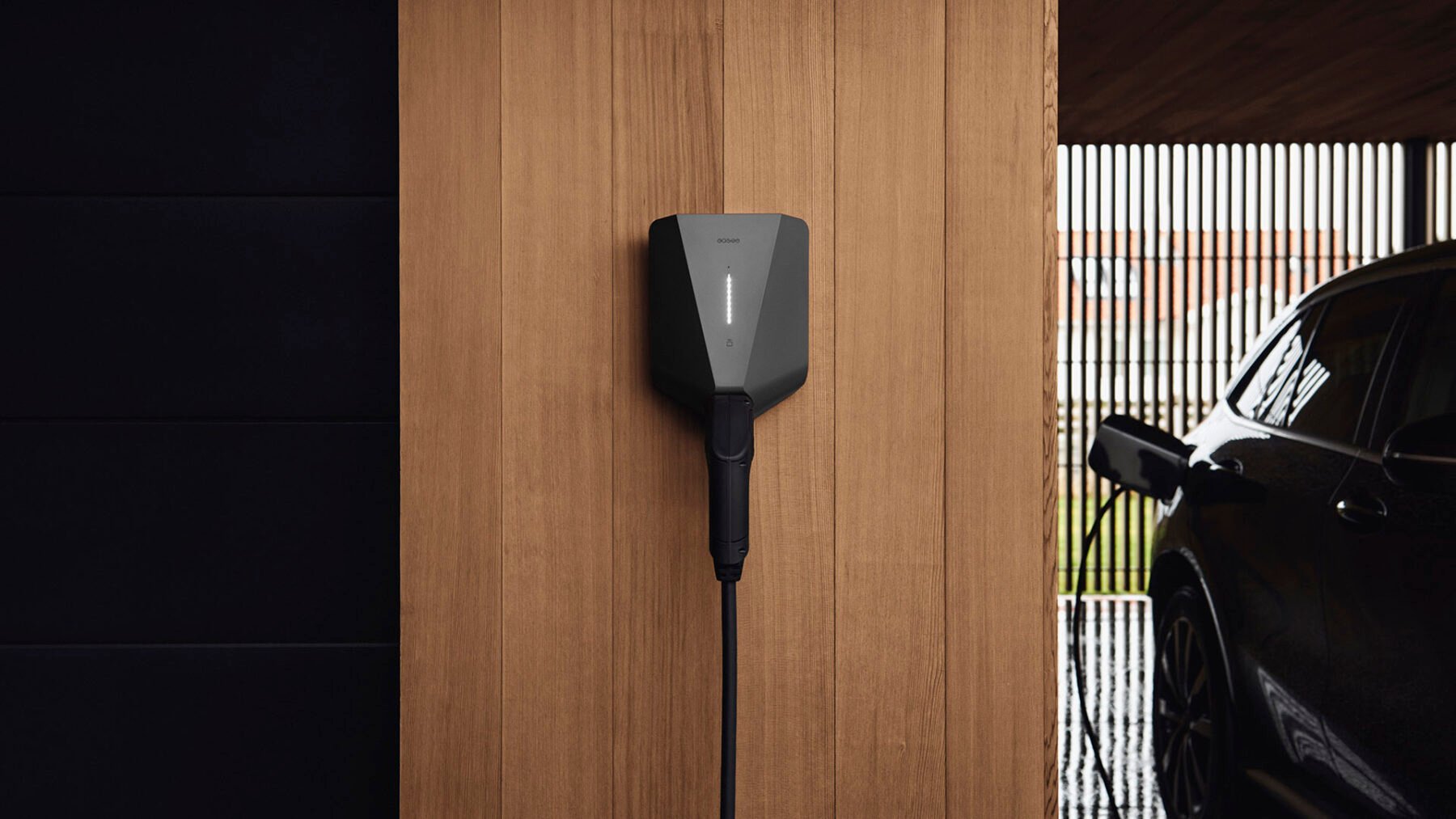
This category describes how we portray our products in the world around us. From the homes we live in, the offices we work at, to the cities we walk in.

Customers/Users
Images showing situations relating the positive aspects of our products; satisfied/healthy customers interacting with our product.
Manufacturing
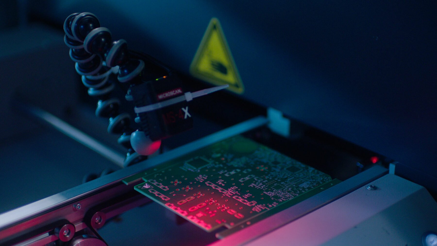
Associated with a certain task and/or business unit. Expertise defined through precision, quality, safety and reliability.
Heritage
Our norwegian heritage is an important part of who we are – and what we stand for. Instead of focusing on people and situations, we zoom out to a broader context and grander views. Imagery of our nature and landscapes become representations or symbolic on a larger scale. The viewer is captivated by nature’s power and relentless ability to fascinate and engage us.


Epic scenery
- Grand views of natural scenery creates mood setting images. Displaying different seasons of the year and different parts of Norway.
- The compositions are often dramatic and artistic.
- Natural soft-light, typically captured at the break of dawn or late afternoon.
- The weather is calm as we avoid photographing in strong sunlight or stormy weather.
- The surounding is clean and focuses on a set of clear subjects.
- The images can be general or more specific through obvious details.
People
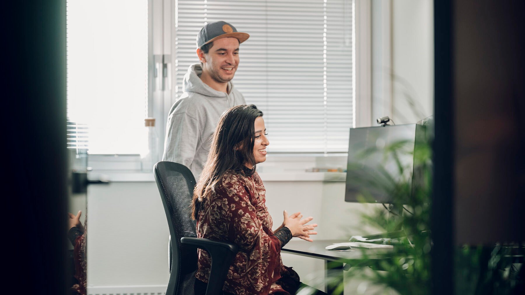
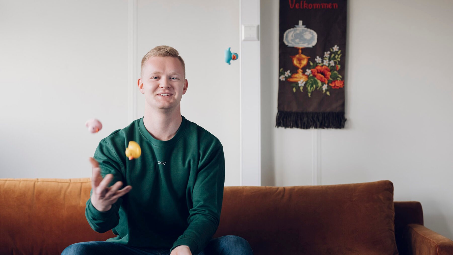
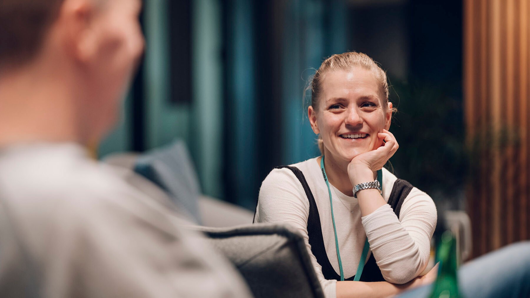
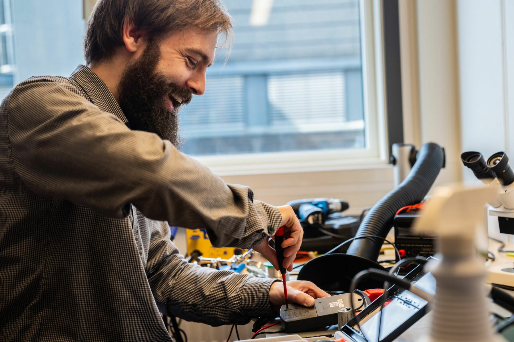
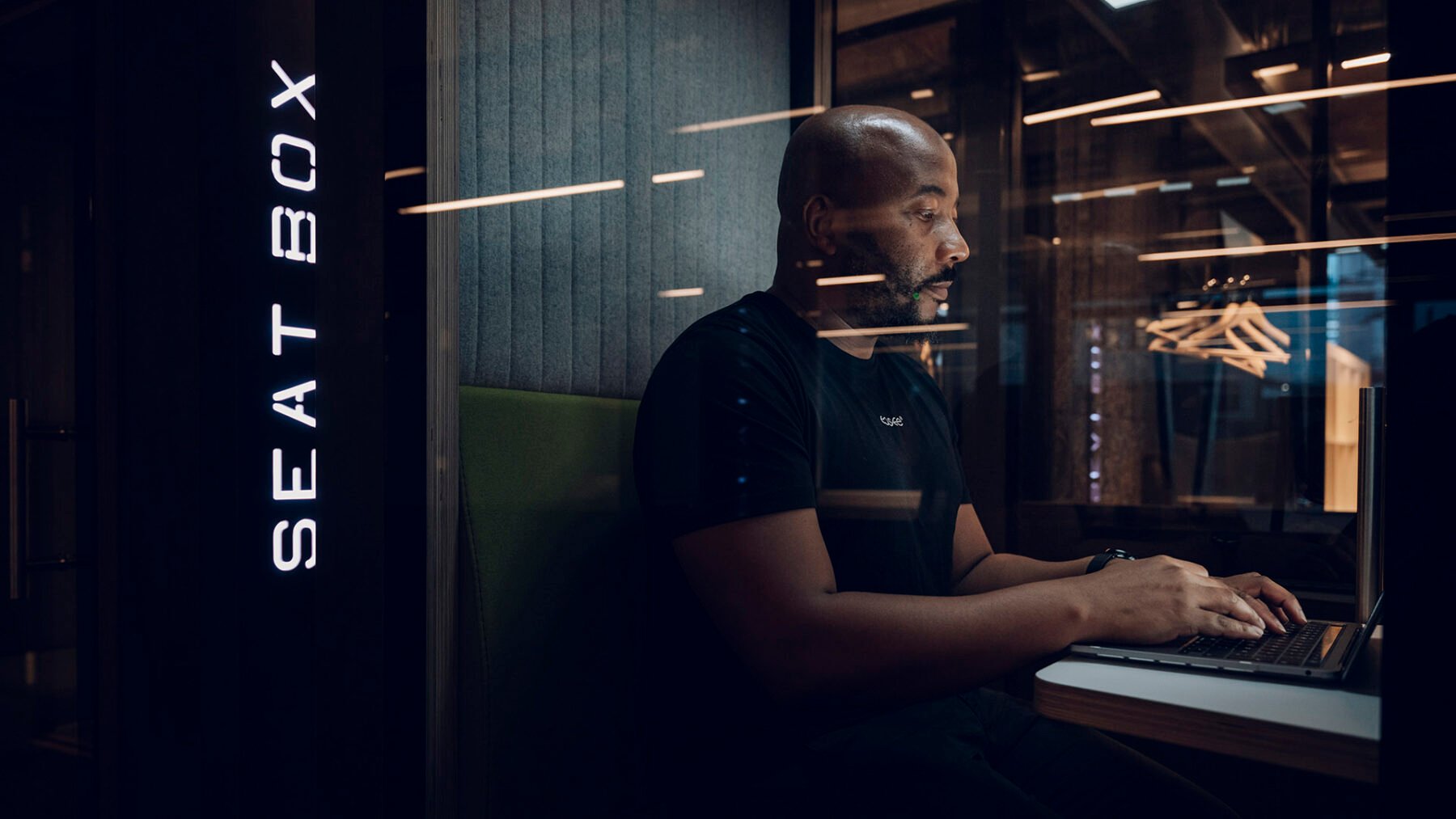
Our people is the personality of Easee – and nothing is more important. We highlight the people and process behind our products, from natural work situations to social gatherings. People are depicted both in groups and alone. We aim to use natural lighting and warm colours in our images to create consistency in the look & feel.

Individuals/Portraits
- We show individuals in natural working situations and behaviour.
- We often get close to our subjects to create intimate and personal portraits.
- The person can either be aware of the camera or not.
- For traditional posed portraits the people we portrait are natural in their facial expression and pose.
- In some instances, the frame should focus on the activity rather than the person. This will help to create pace, and focus on the technological aspects of the business.
- Natural light with a warm tone is used over flash light.
Group photos
- We show people in groups interacting with each other.
- They can be in either a business or social situation.
- The subjects should appear unaware of the camera presence giving an authentic and natural feel.
- Images can focus on people or close in on the task being performed together to show collaboration and teamwork.
- Focus on dynamic, intelligent and unexpected crops
- Natural light with a warm tone is used over flash light.
Product
Our product renders are always set against a clean background to convey simplicity and give a clear contrast to the product. Always show front and side view of the product. By adhering to these simple points, we create better conditions for our imagery to work together.
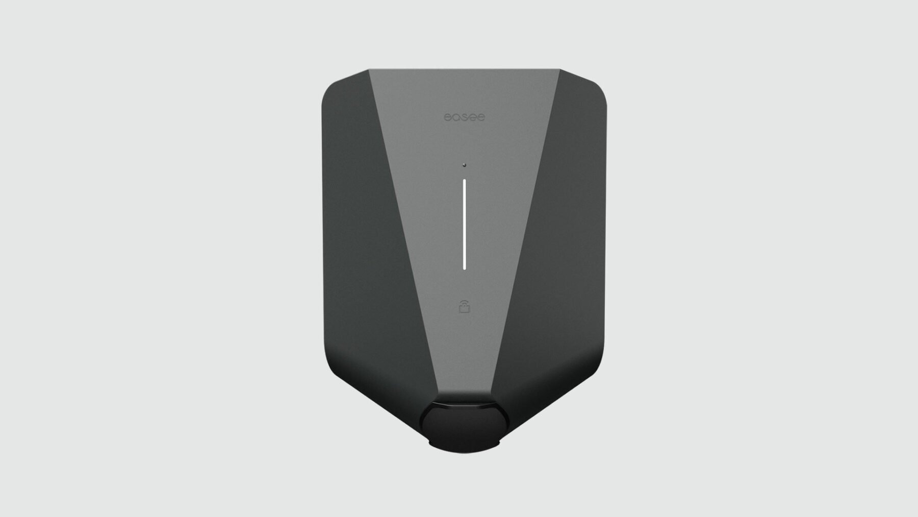
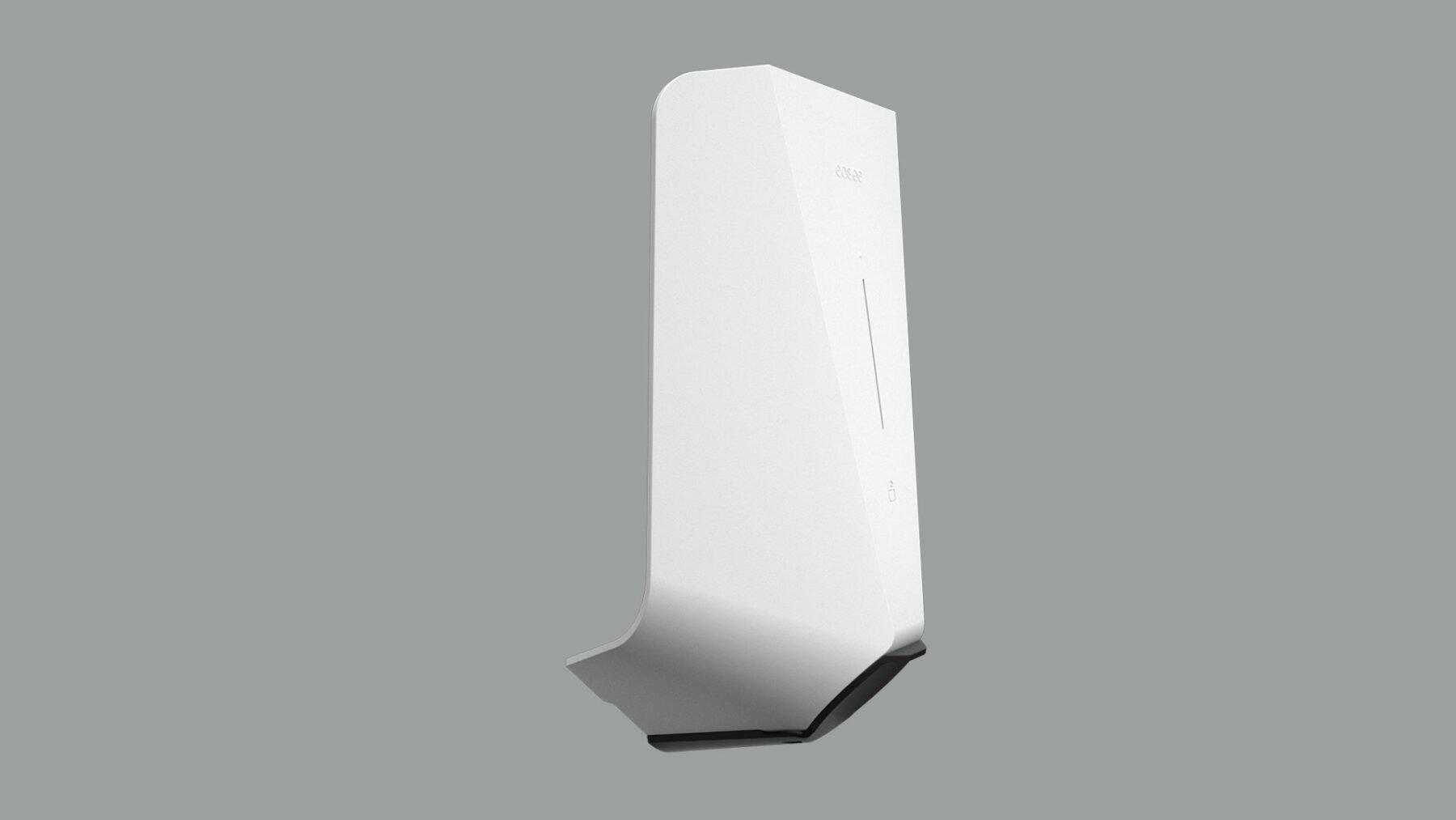
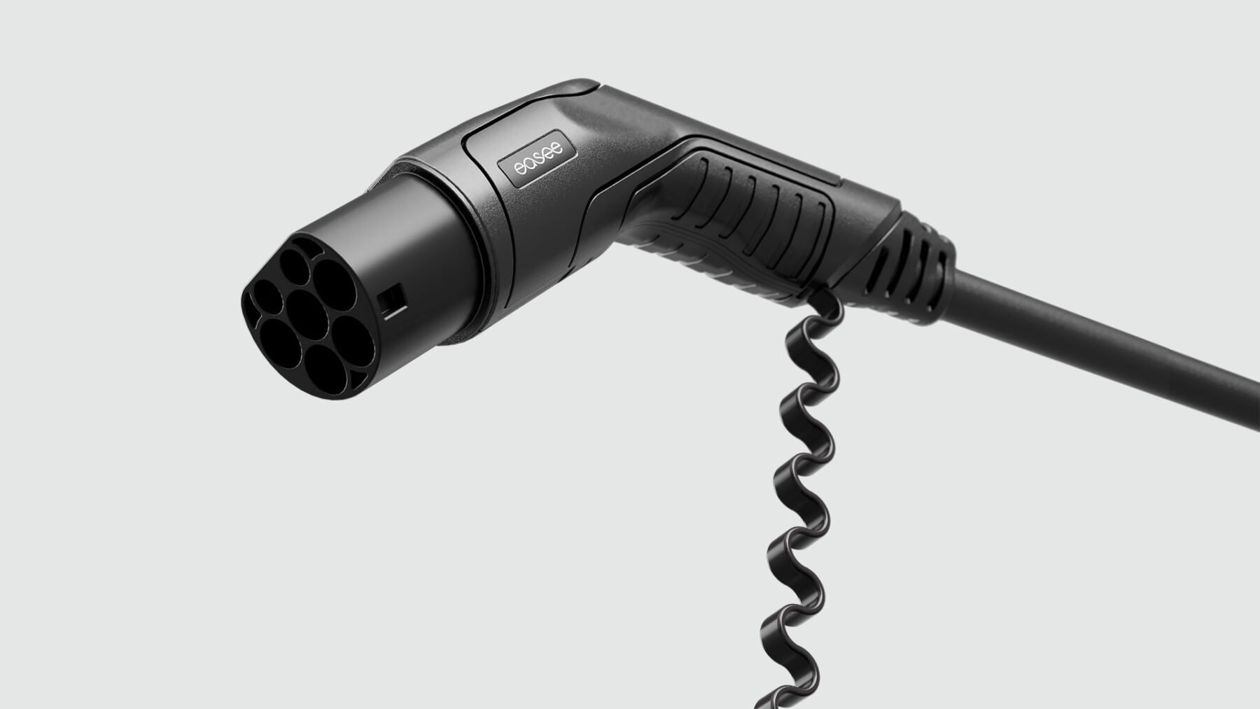

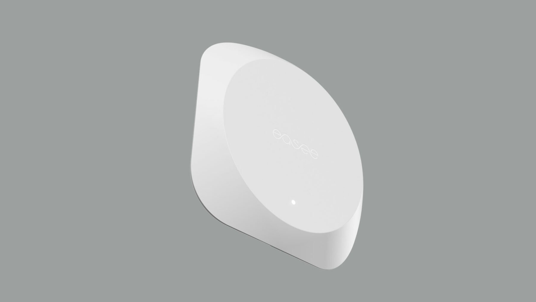
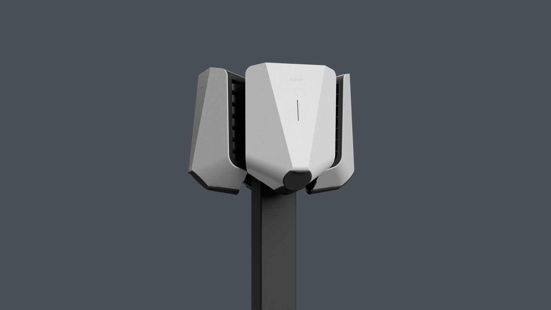
Product renders
- Our product renders are set against a light or dark background to convey simplicity, and gives a clear contrast to the product.
- Care should be taken when deciding on a background colour, use one of our neutral primary colours.
- Don’t use Bright blue as a background colour, as it takes to much attention from the product.
- We use a mix of different views and arrangements to highlight features of the product.
EXCEPTION: When showcasing our Easee App or Portal UI you can use Bright blue as background colour when needed to add variation.
Environment
Our environment images capture the essence of our products in the real world. We depict a range of environments ranging from private homes, to workplaces, appartment blocks and car parks. It is important to adhere to a few points of consistency. Backgrounds are neutral or toned down in order to put our products in focus. Always keep the angle straight, from the front or side of the product.

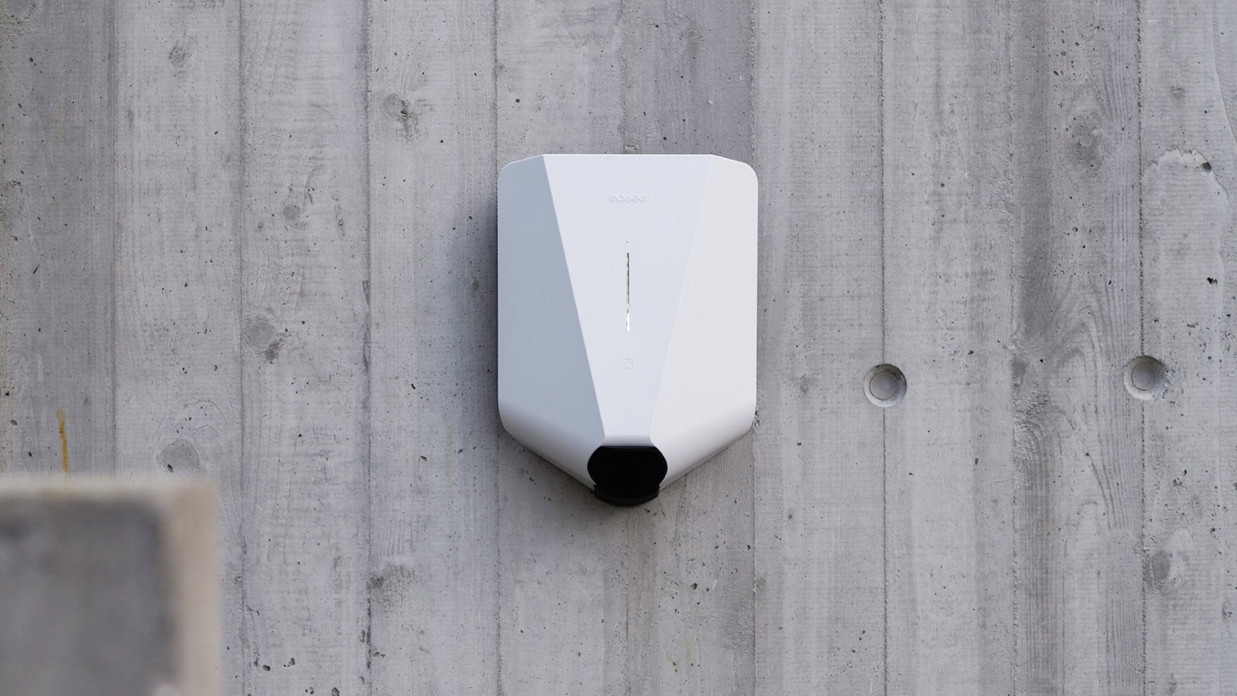
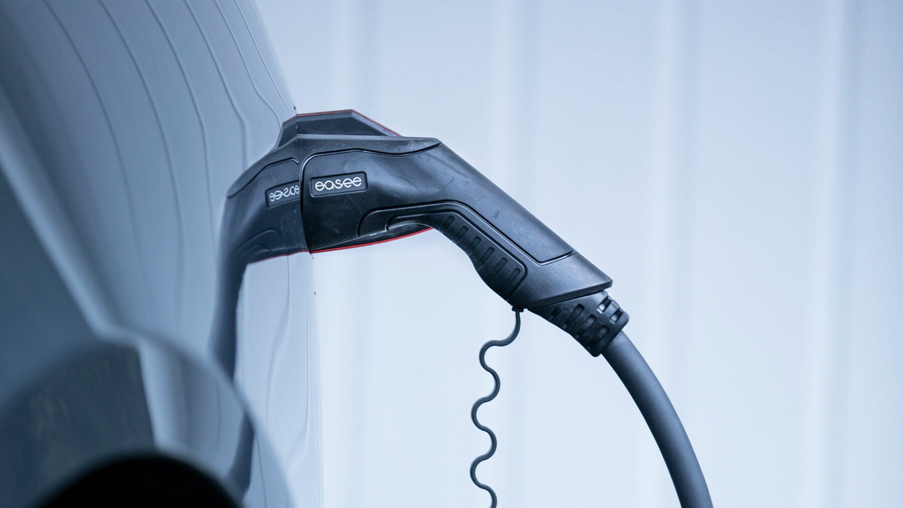
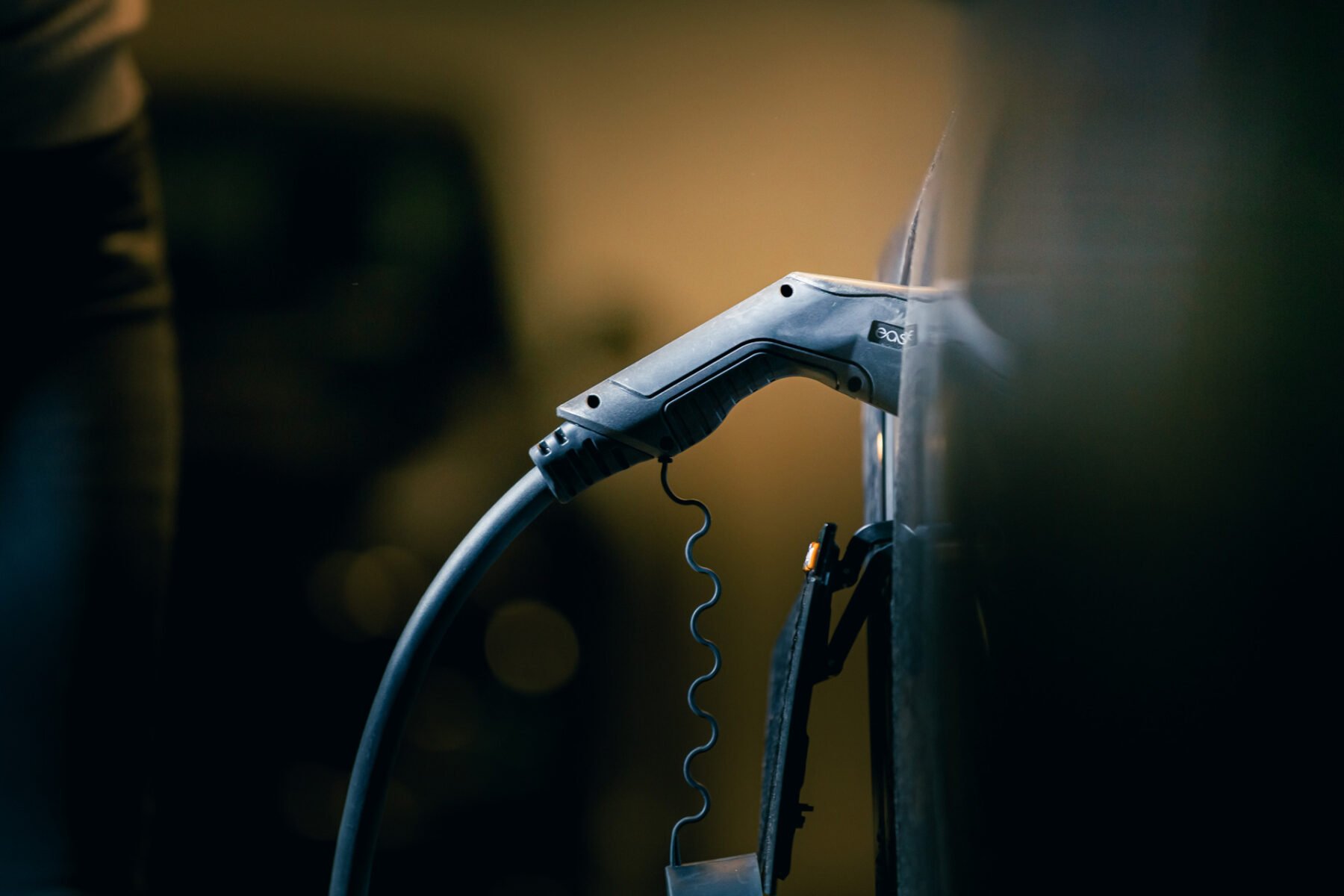
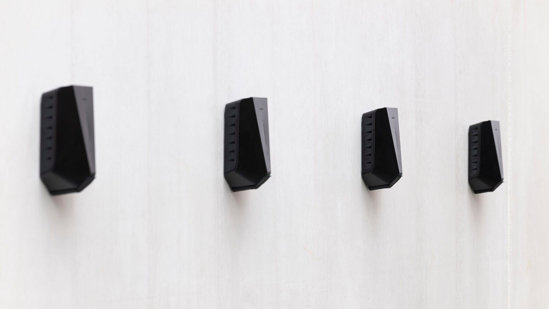
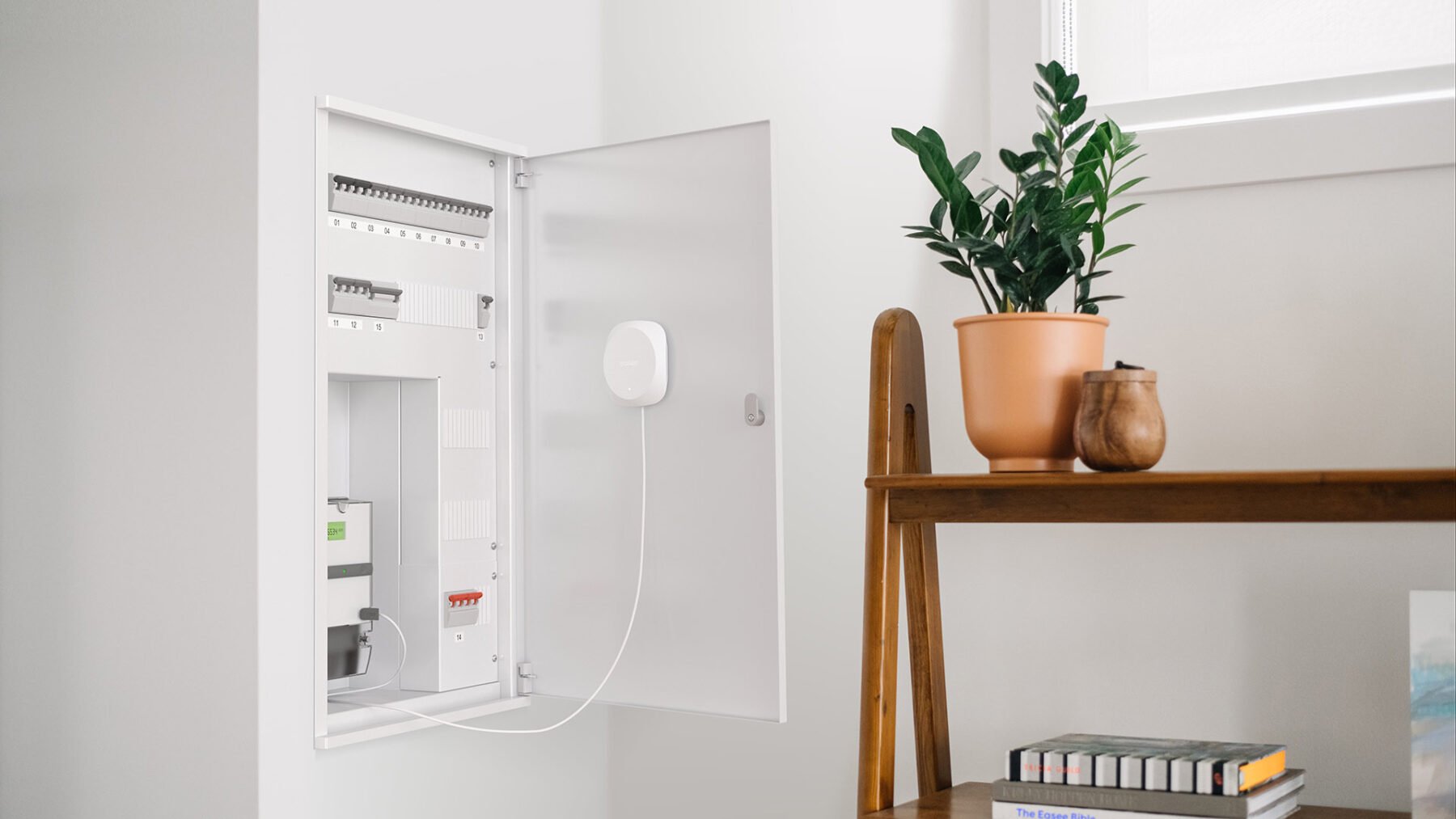
Environment
- The product(s) in the image are clear and obvious.
- Backgrounds are neutral/contextual and toned down in order to put our product(s) in focus.
- We use a mix of different views and arrangements to highlight features of the product.
- Getting close to details creates abstract and interesting compositions.
- Ensuring enough distance from the product so that the context is understood.
- We use a combination of close ups and shoots taken further away, to create variation and flexibillity.
- Whenever possible use natural light, and find open and light locations where our products are present.
Customers/Users
Our care for the customers are at the core of who we are and what we do. They play a central role in our imagery – and in communicating our brand. We are showing satisfied customers using our products in different natural situations and contexts.

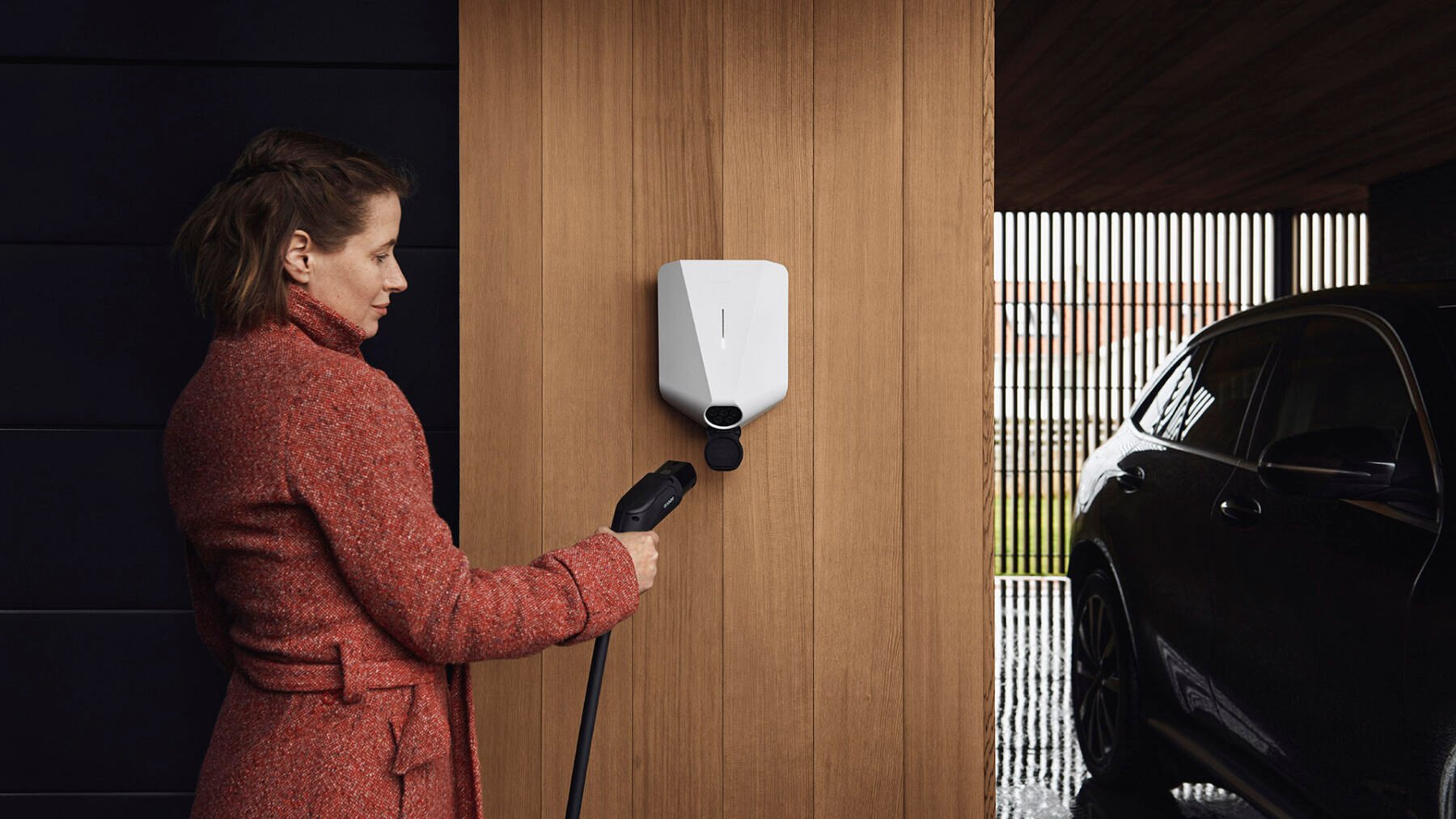
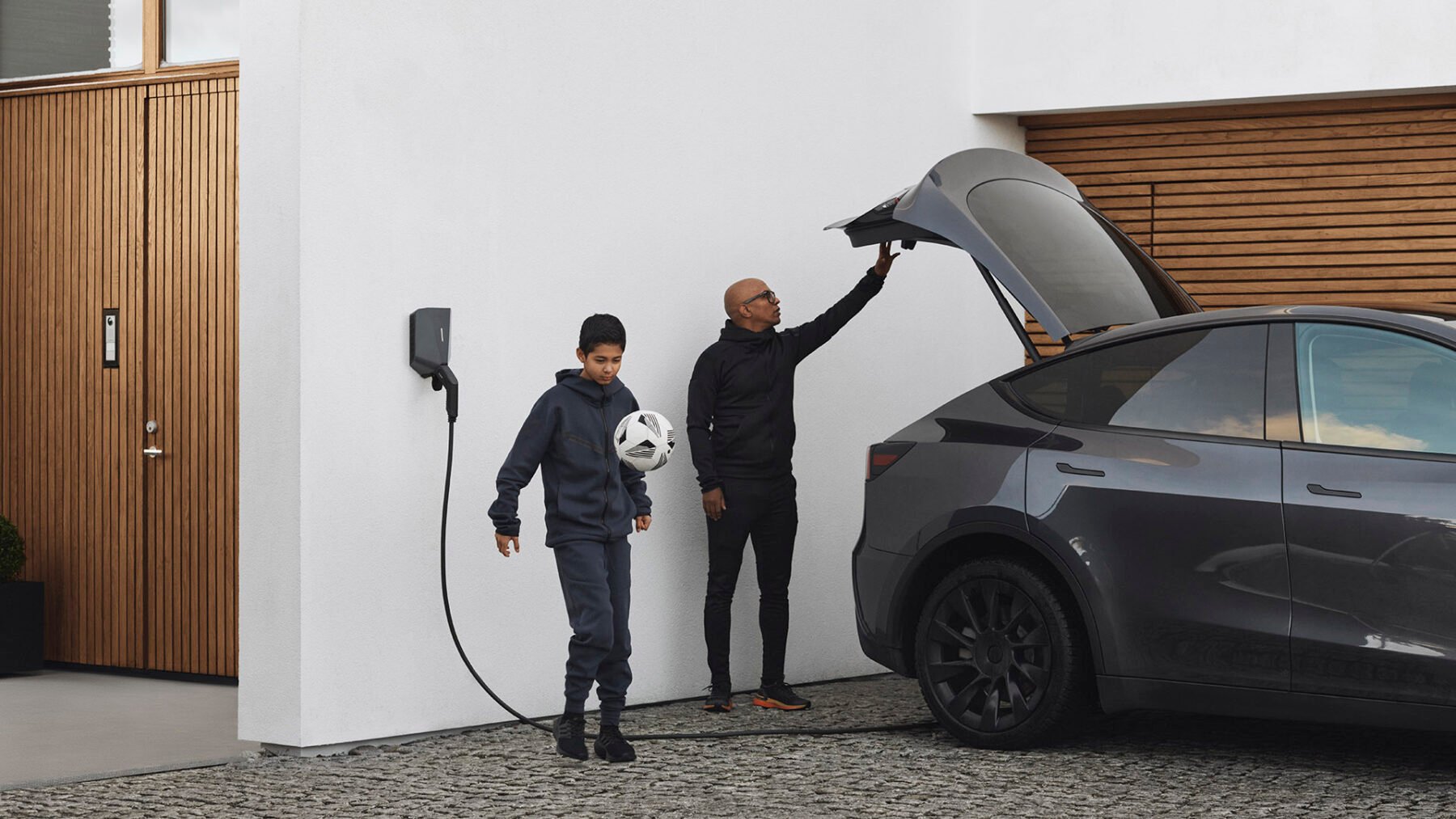
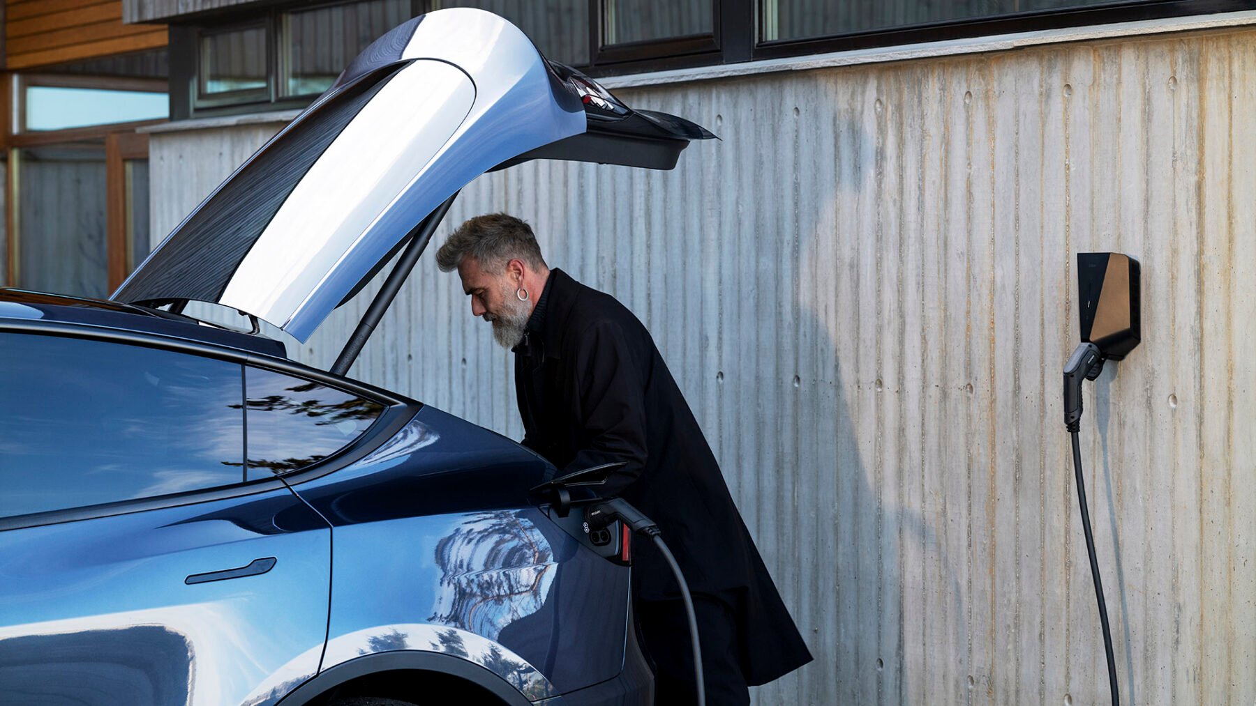
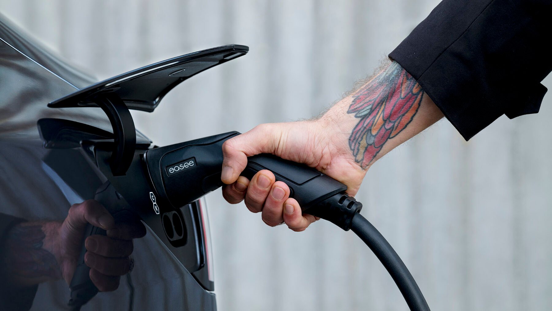
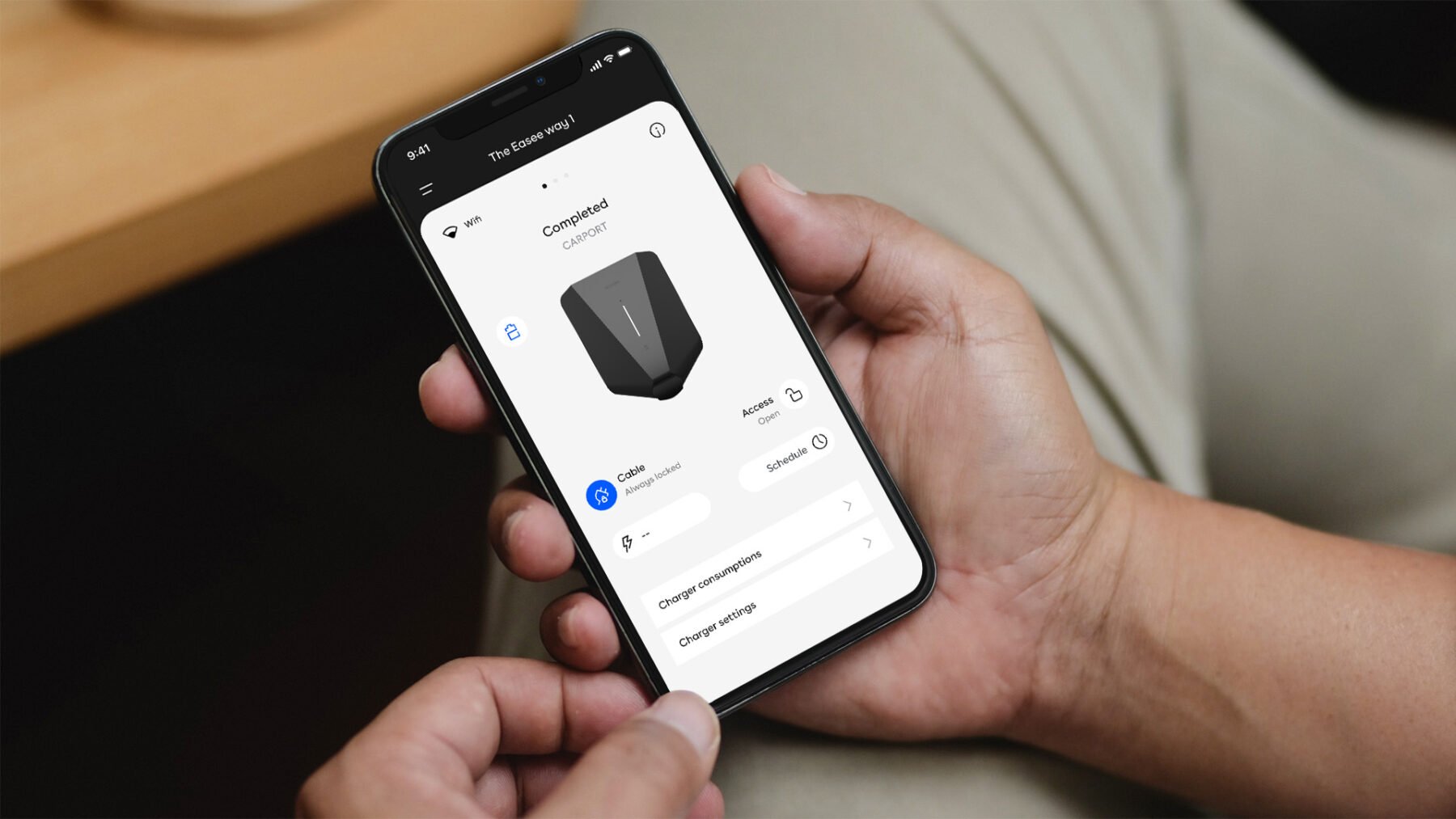
Customer/Users
- When persons are portrayed in our images, we strive for a natural and sophisticated look. Not too posing. Not too extravagant.
- The persons we select represent the modern Norwegian citizen. Healthy male or female, and from different origins.
- The clothes our persons wear are simple and contemporary. No big patterns. No sharp colours. No eye-catching details.
- Backgrounds are neutral/contextual and toned down in order to put the user interaction and product in focus.
- We use a combination of close ups and shoots taken further away, to create variation and flexibillity.
- Whenever possible use natural light, and find open and light locations where our products are present.
- Avoid shooting from unnatural angles, eye level is good.
Manufacturing
Nothing is left to chance. Everything is well thought out, down to the smallest detail, it is quality where you least expect it. Our manufacturing imagery should always convey our technical expertise and background. Expertise defined through precision, quality, safety and reliability.

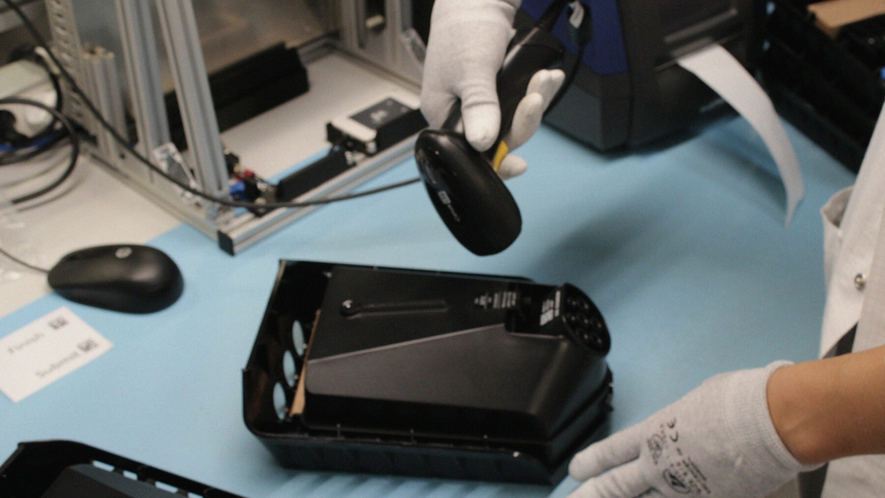
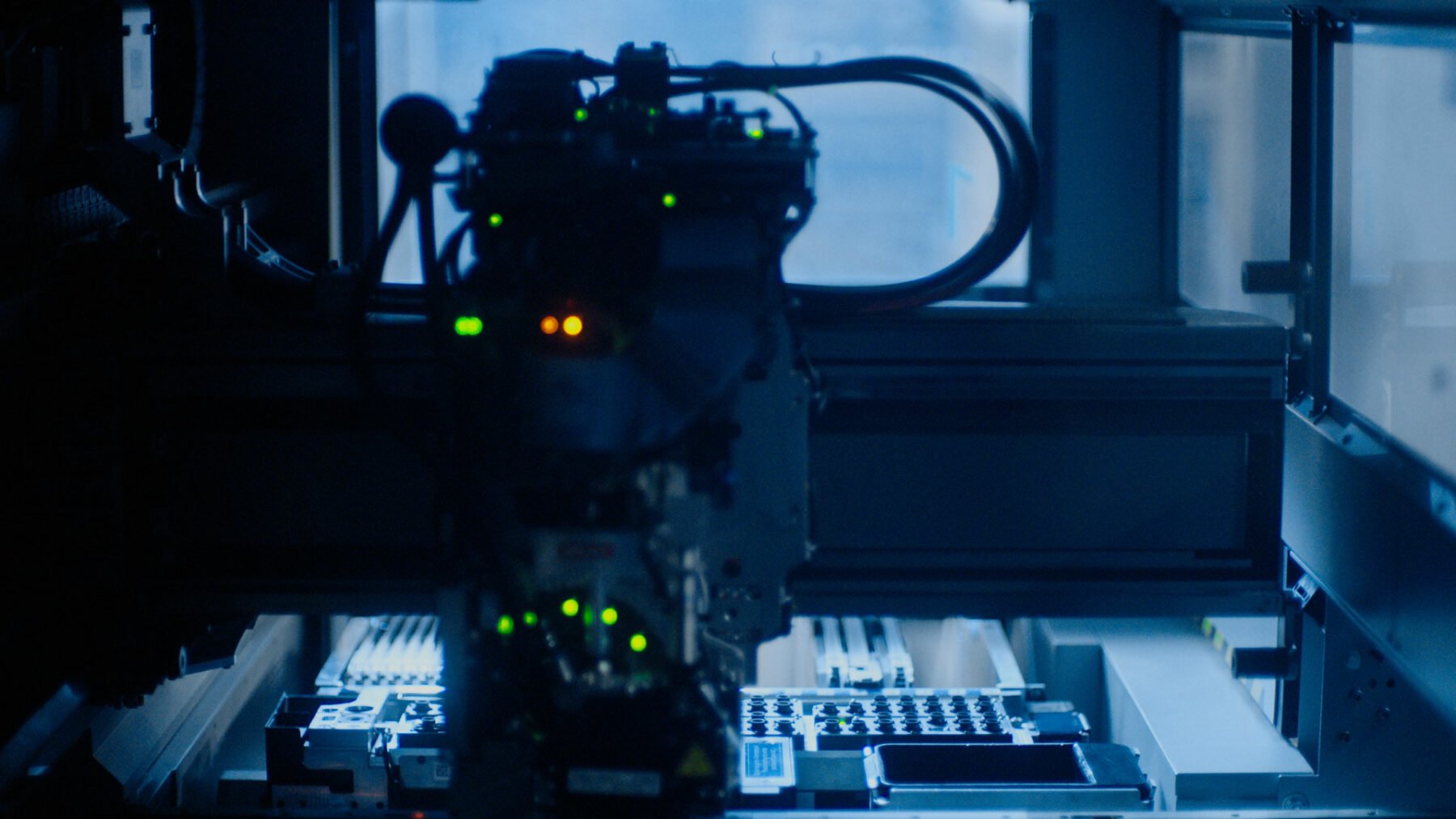
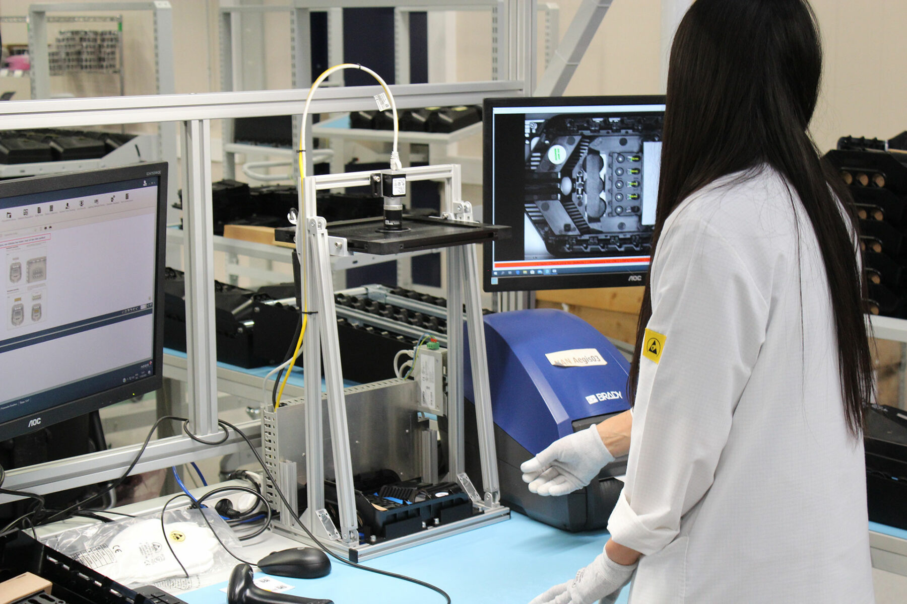
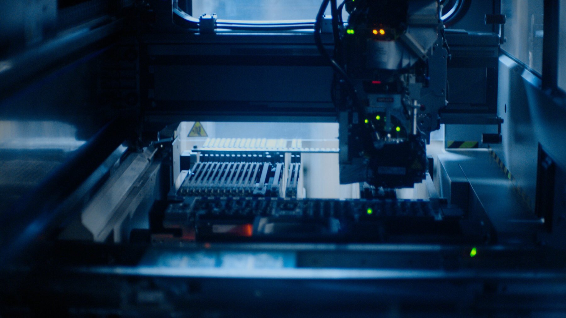
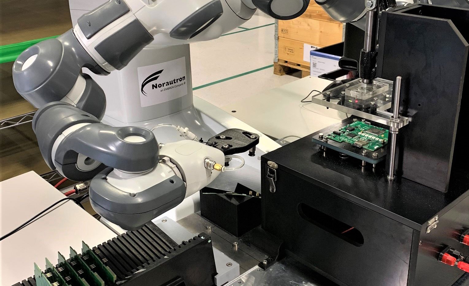
Manufacturing
- We photograph a large range of our hardware manufacturing process, ranging from production, to testing and assembling.
- We use a combination of close ups from machinery and shoots taken further away, to create variation and context.
- Images can focus on a specific action/task or activity being performed.
- People in these images should appear unaware of the camera.
- Finding interesting angles and unexpected crops creates a uniqueness to this category.
Usage
To enable images to have an impact, it is important that they are treated with care. When used correctly, images can be a powerful tool to enhance a message and build our brand.
Our Image bank will in total consist of both produced, partner and free images across all categories. It is important that we make sure these different images are applied appropriately according to situation in order to maintain consistency and quality in our communication.
1 – Branding communication

Easee images
Images photographed or produced specifically for Easee. These images strongly signals the core of our brand. These can be shared with our dealers and partners.
Usage: Web heroes, covers, campaigns, presentations, events, posters etc.
2 – Top level communication
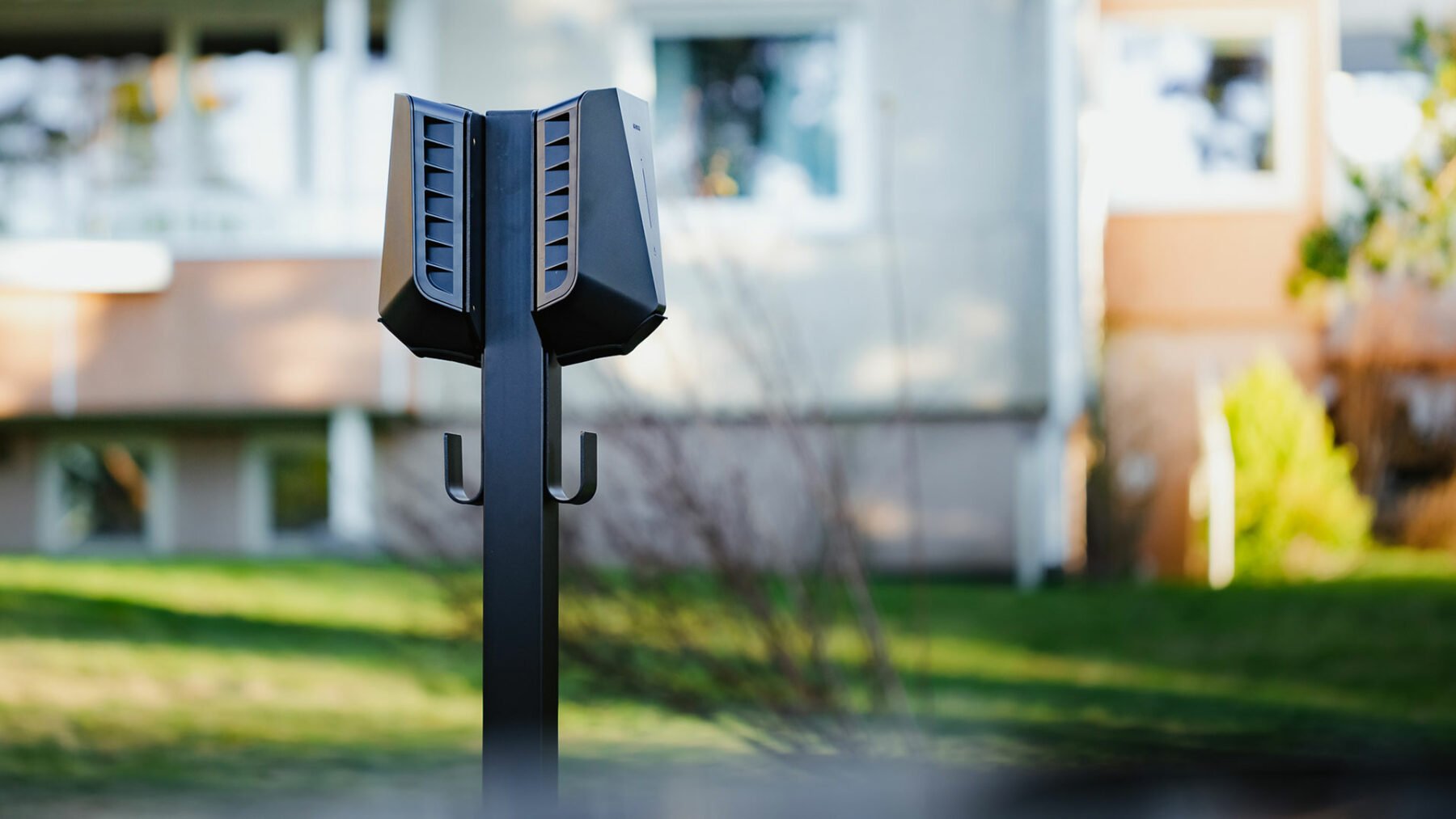
Partner images
Easee are allowed to use relevant images from our partners. These images can be used in communication close to the core of our brand, but not shared with our dealers.
Usage: Web, covers, spreads, product-sheets, presentations, social media etc.
3 – General communication
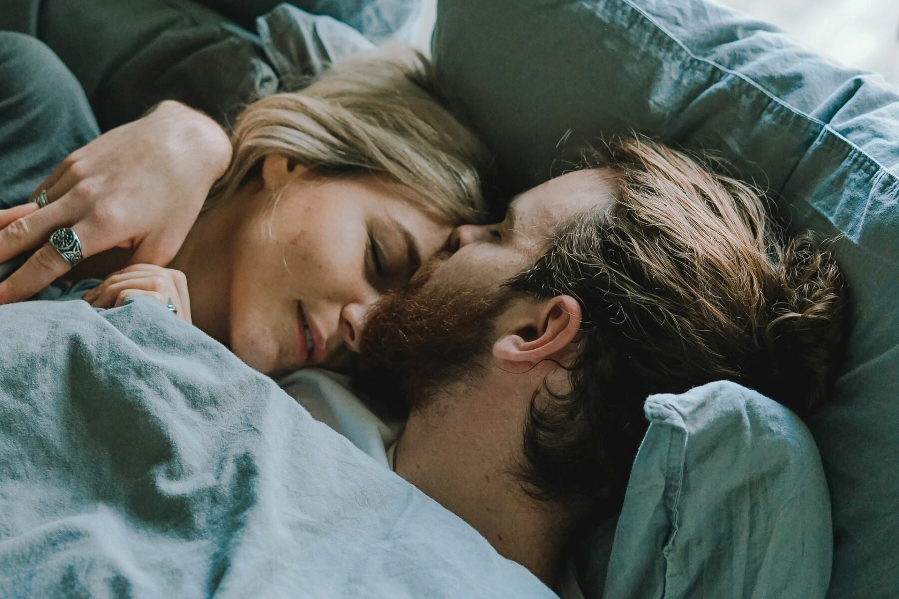
Stock/Free-to-use images
Images who signals the brand and support/represent the specific content. These images should never be used in our advertising or other communication close to the core of our brand.
Usage: Web, spreads, product-sheets, presentations
NOTICE! Partner images can not be shared with our dealers or others. These images are only to be used for Easee.
Size
Always have the final size and viewing distance in mind when selecting your image. Some images can be difficult to interpret in smaller formats (such as mobile applications) or when viewed from far away (boards).
Always choose images with clear subjects and motifs when visibility is low. Place the images with full bleed whenever possible for maximum impact. Avoid using multiple small images and collages.

Complex subjects in large formats.

Simple subjects in small formats.
Cropping
When cropping images, always strive to remove as little as possible of the original image – and make sure to maintain the central point of interest.
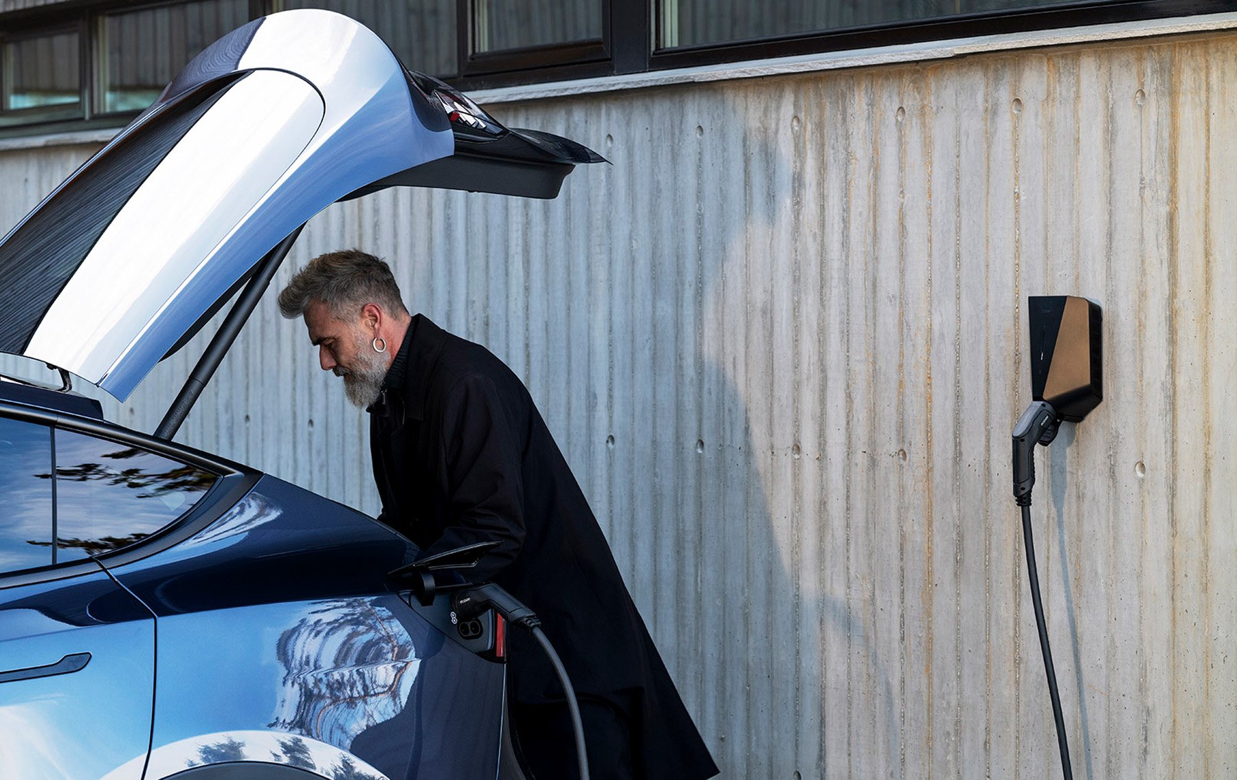
Make sure the point of interest in the image is visible.
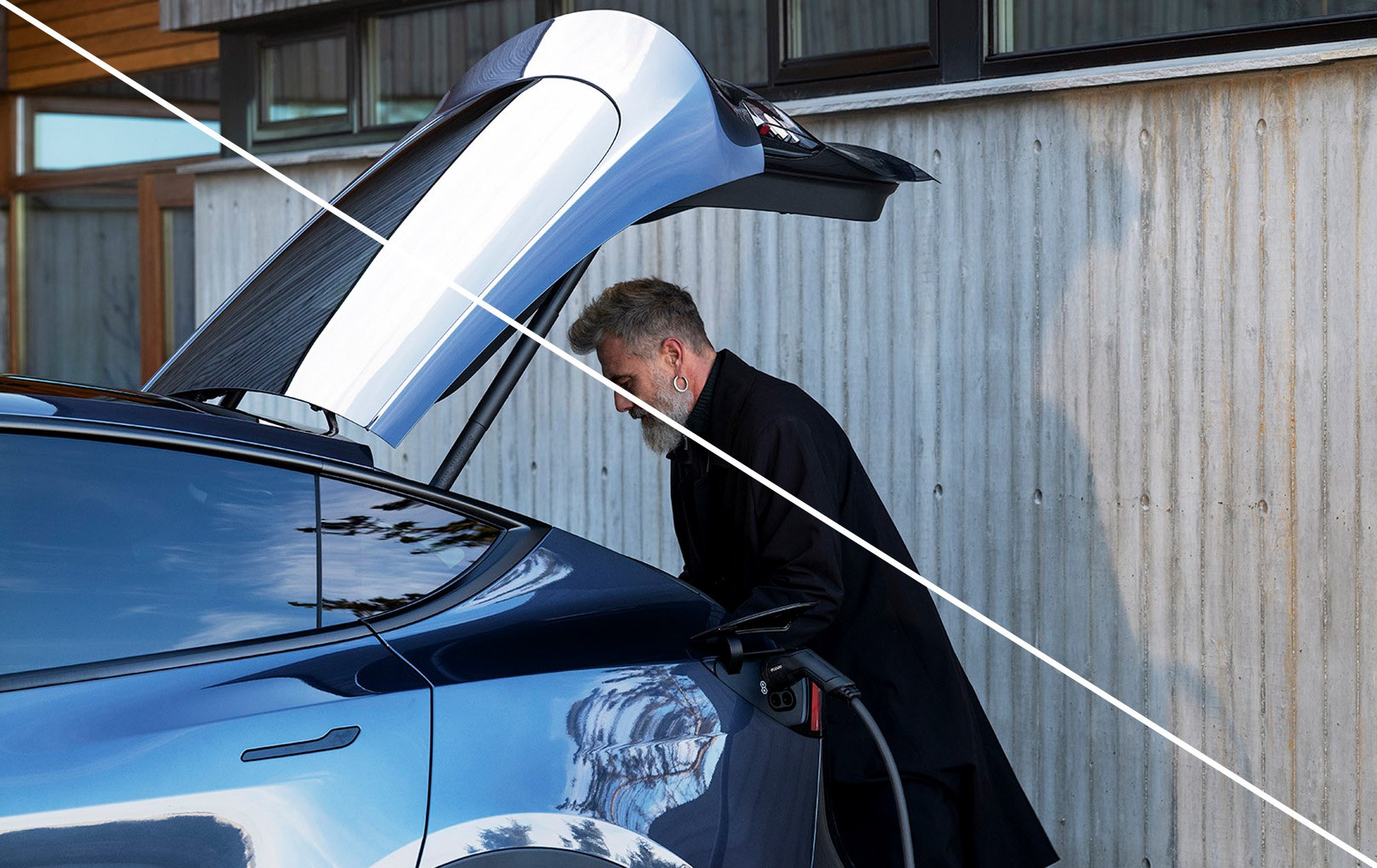
Unfortunate cropping makes a confusing photo.
Aspect ratio
Use a common 16:9, 4:3, 3:2, 2:1 or 1:1 aspect ratio unless otherwise specified for a particular format. These common aspect ratios work well as a base foundation —from our UI components to brochures. Read more about Aspect ratio here.
Zoom and rotate
When a multiple images of the similar nature exist together, it is sometimes beneficial to create variation by cropping and differentiating treatments. This helps in creating visual hierarchies and dynamic layouts. This becomes particularly relevant around product-listing and situations where similar imagery needs to be varied either to create a better visual dynamic or to achieve differentiation.
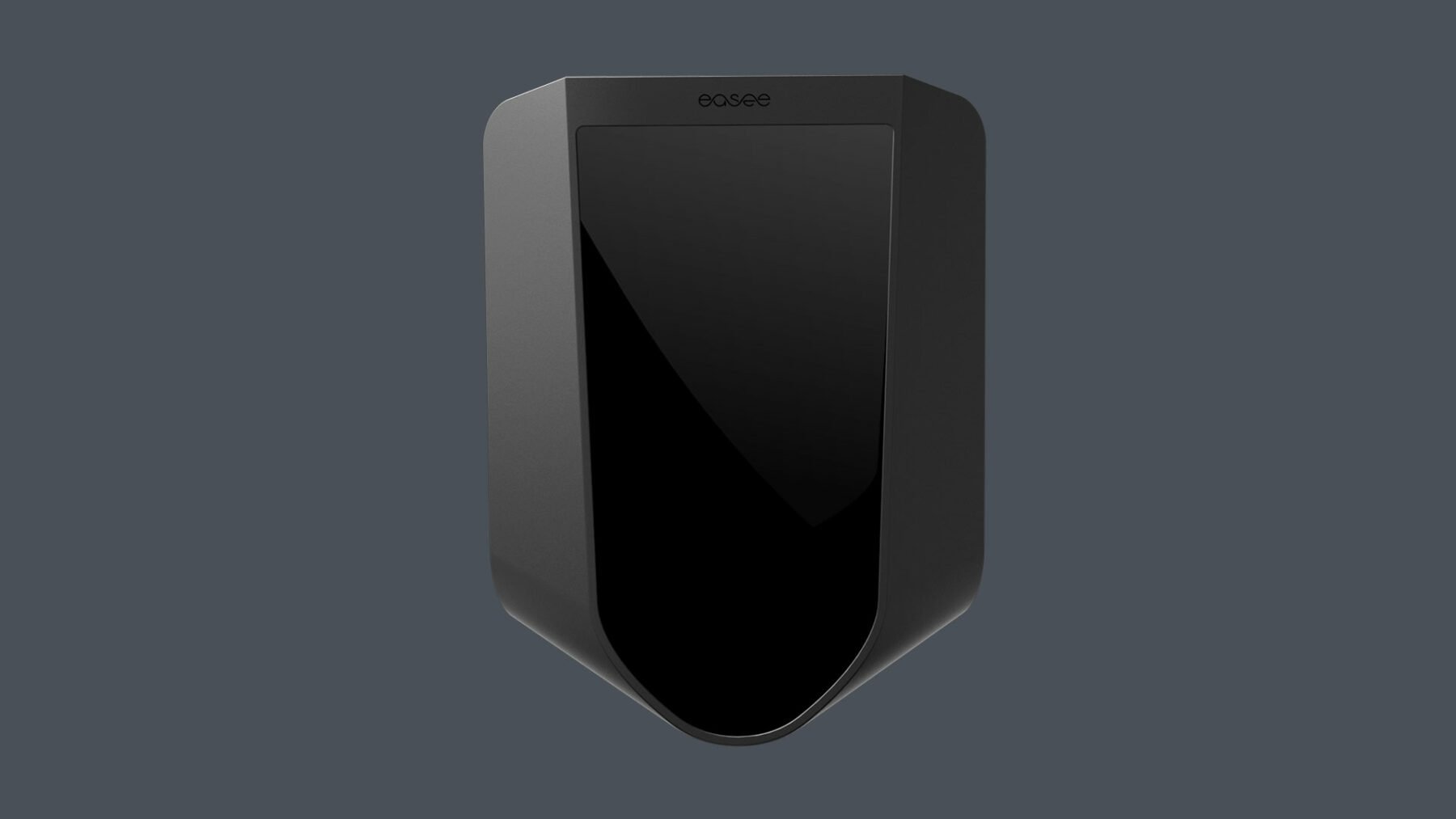
Regular
Images appear without any significant cropping or modification to it’s original appearance.
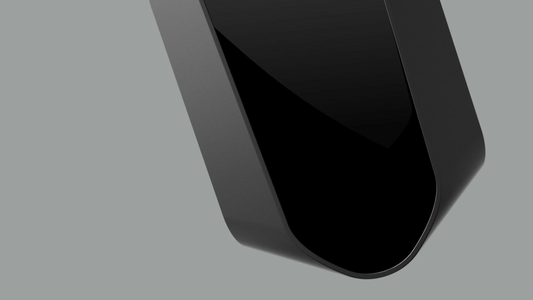
Crop, zoom and rotate
To focus on a detail or bring further attention to an image, we can create interesting imagery by zooming, cropping and deliberatly create visual angles and compositions.
Image and text
When applying text to imagery always make sure legibility and visibility is taken into consideration. Make sure that you place the text where it gives contrast to the background for maximum visibility. We are using black text on a light image. Conversely, white text is used against a dark image.
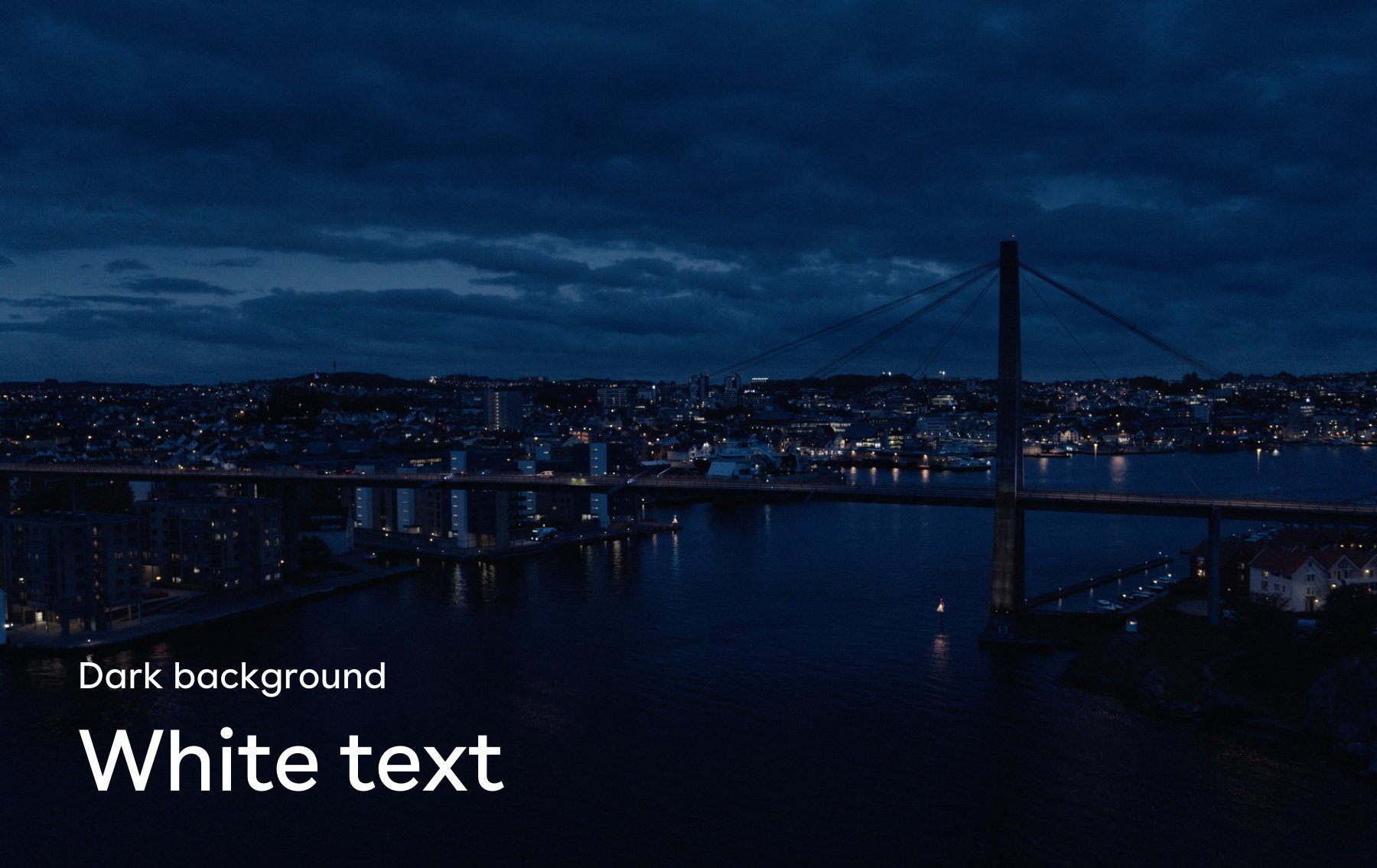
Dark background image
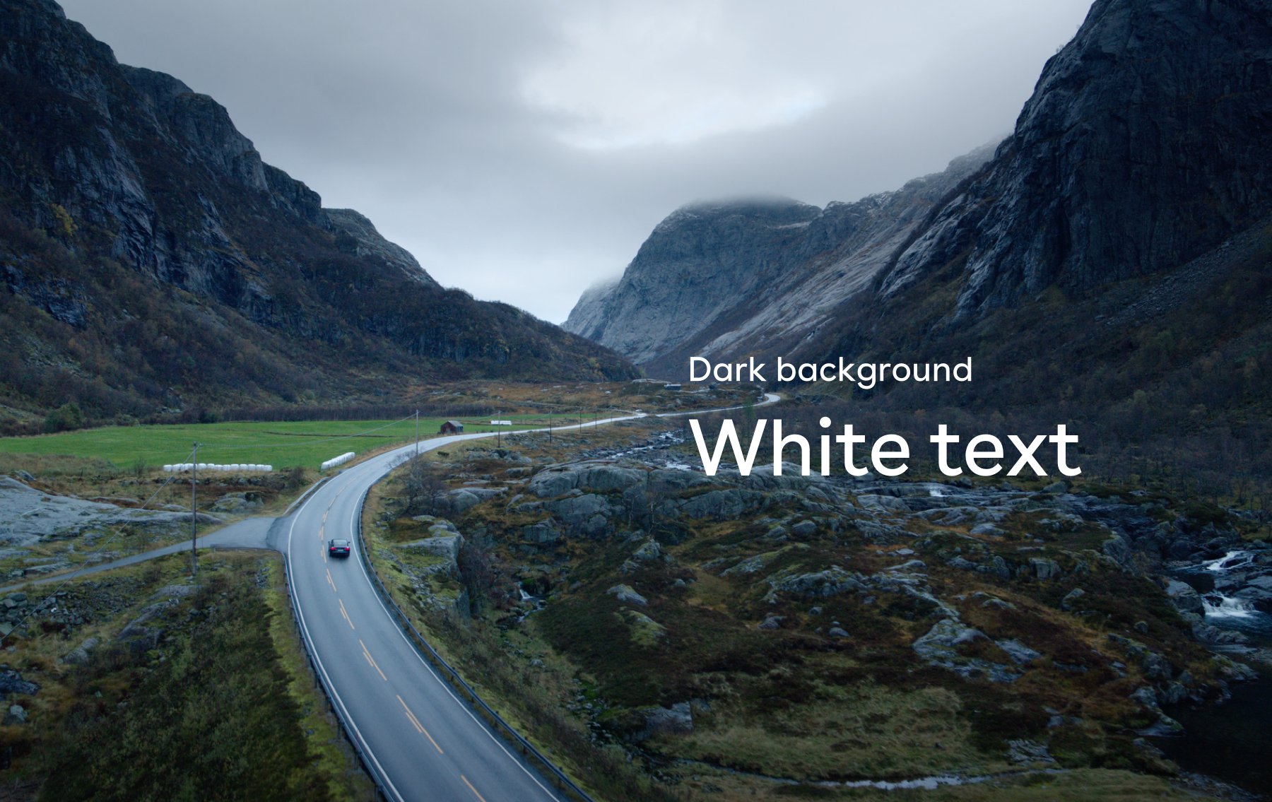
Dark background image
Whitespace
When applying text to imagery always remember to consider the layout when choosing your image. Some images have a lot of free space, allowing short message copy to be added without covering the motif. Others are more crowded, and not suitable for text.
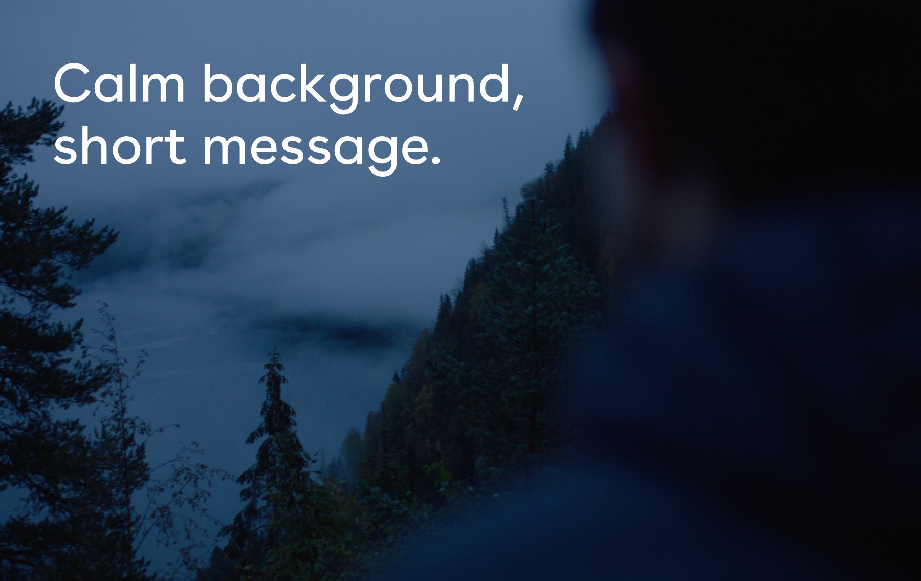
Image allowing a short message copy.
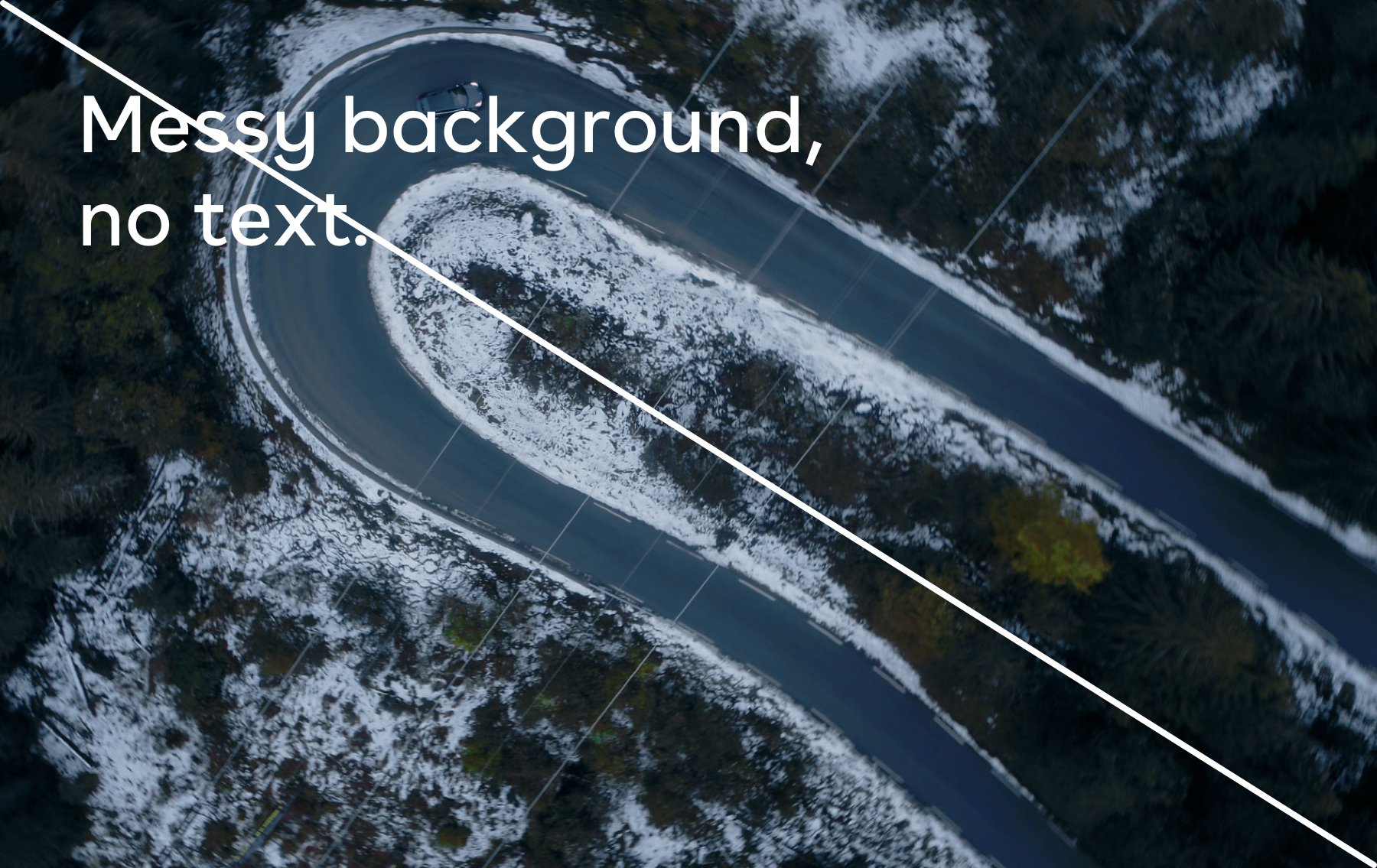
Image not suitable for text.
Dont’s
Avoid anything artificial – remember that everything communicates and our use of imagery is no exception. When choosing or shooting new images, please read through this list of things to avoid.
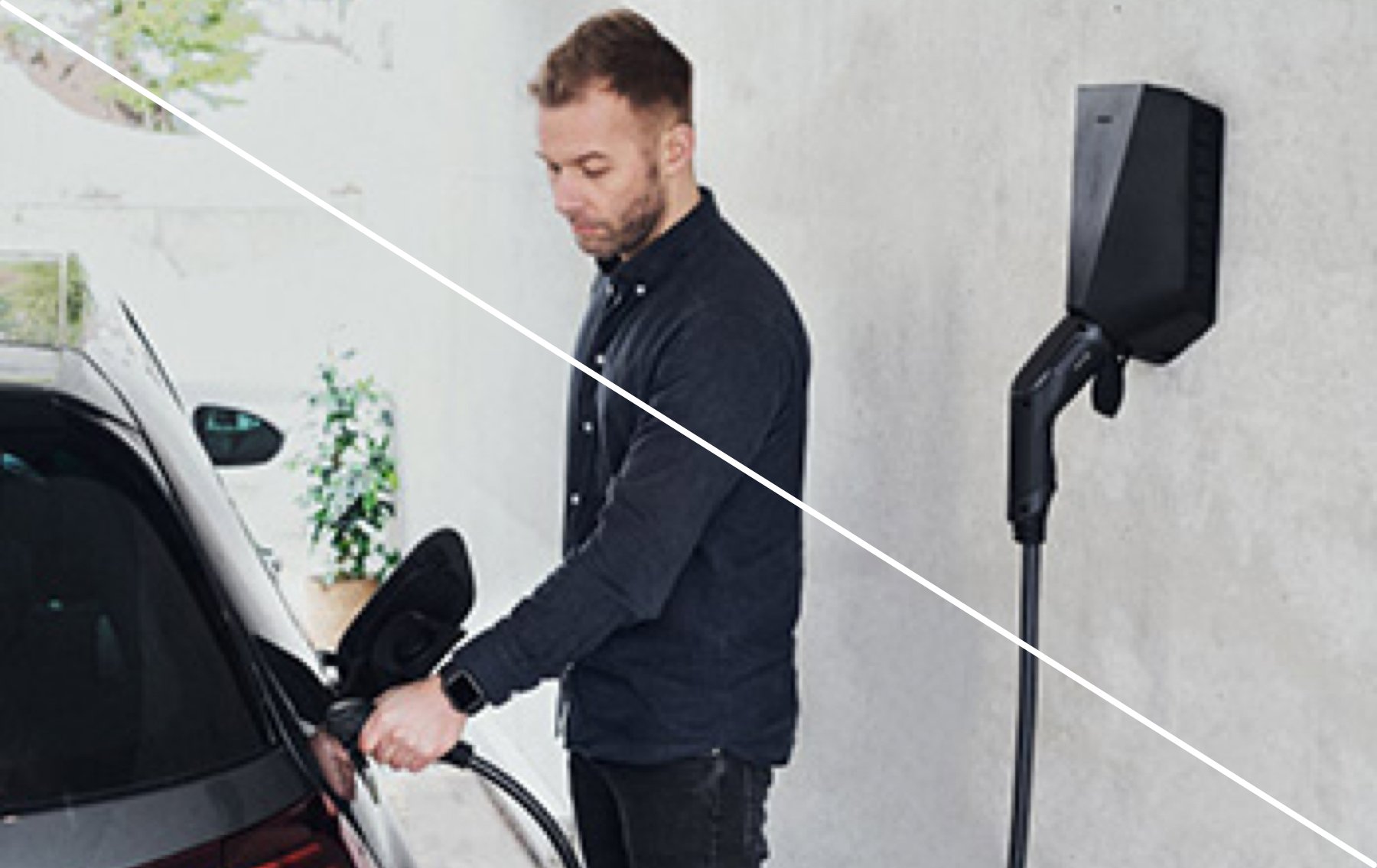
Never use low quality or resolution photographs.
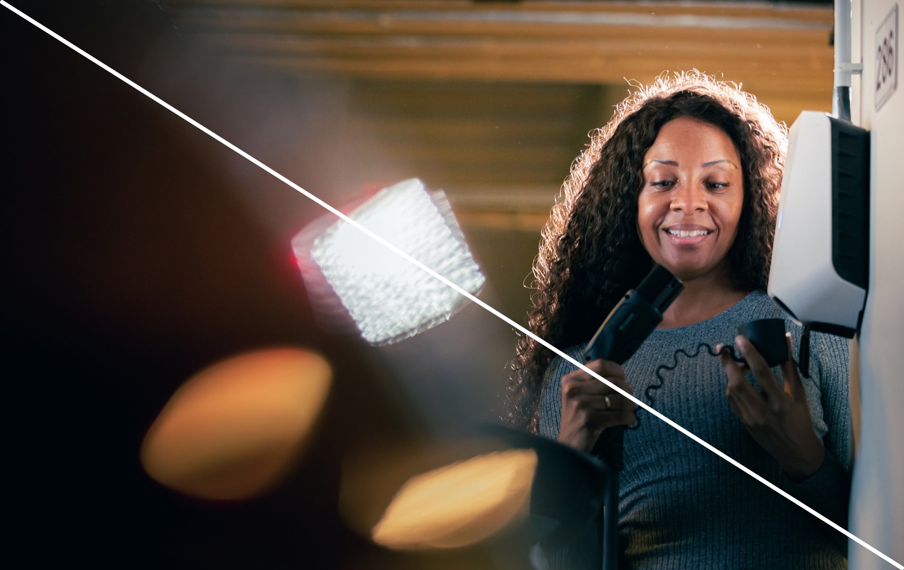
Avoid unclear objects in the foreground and perspectives that are not at a natural eye-level.
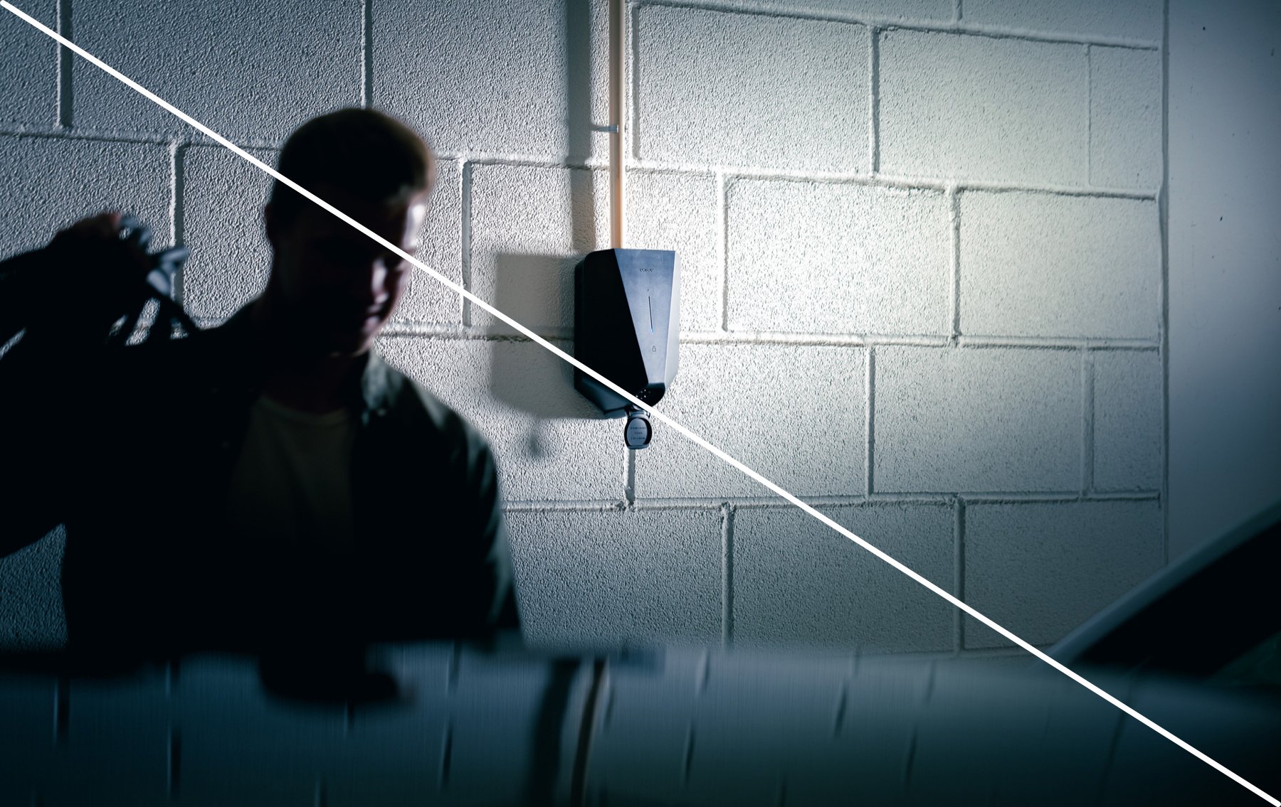
Avoid harsh shadows or lighting on the subject, along with reflections and blur that complicate the photo.
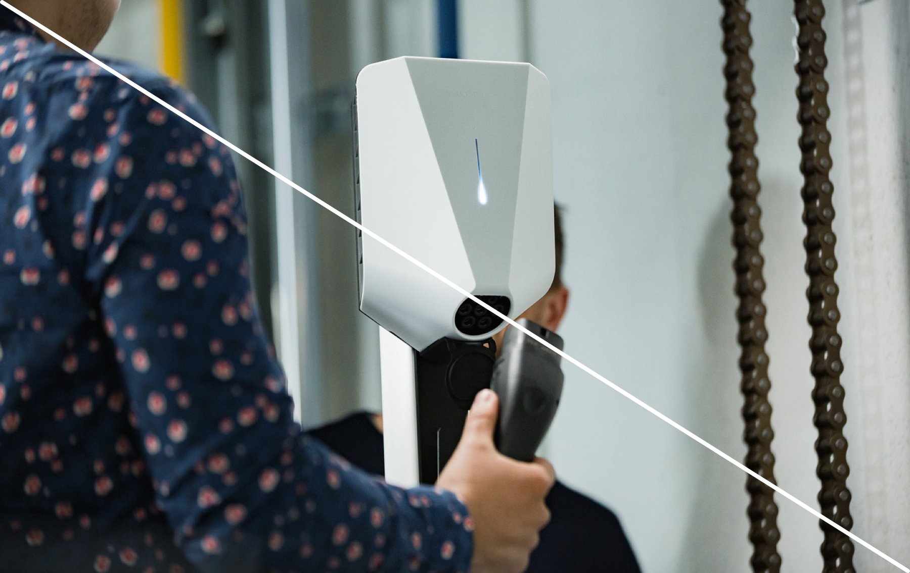
Avoid disturbing objects around the subject that complicate the photo.
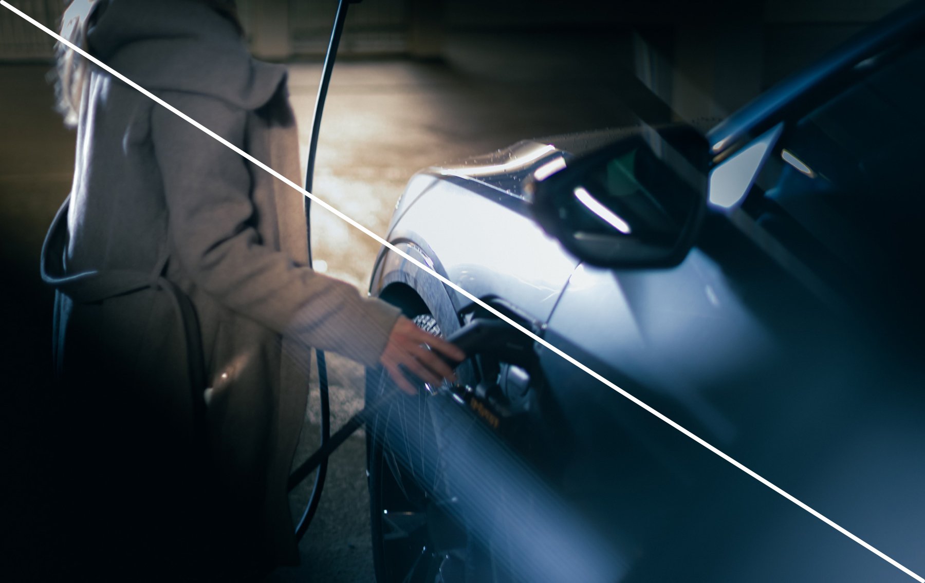
Avoid images that is out of focus.
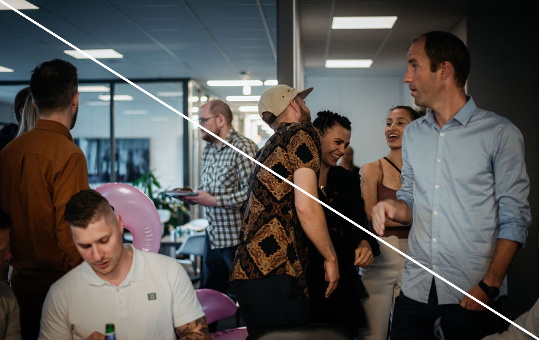
Avoid having no center of interest and focus point.

Never use staged stock photos, that portray people in unnatural ways, or express emotion that is not true to the narrative.

Avoid overly warm or glowing photographs.
