Iconography, illustration and infographics are essential tools to communicate what we do and to help guide the user. It is highly functional and a great way of visually conveying information in a quick and universal way.
Bright blue
White
Black
Pictograms
Pictograms are illustrative and expressive and can be used within a wide variety of scales and environments whether digital or physical. Use pictograms to enhance the information you are conveying across various media. Such as presentations, brochures, website, signage, events and merchandise. When used appropriately, they become an elegant addition to the Easee brand experience. All our pictograms are available for download in our Asset Bank (internal only).
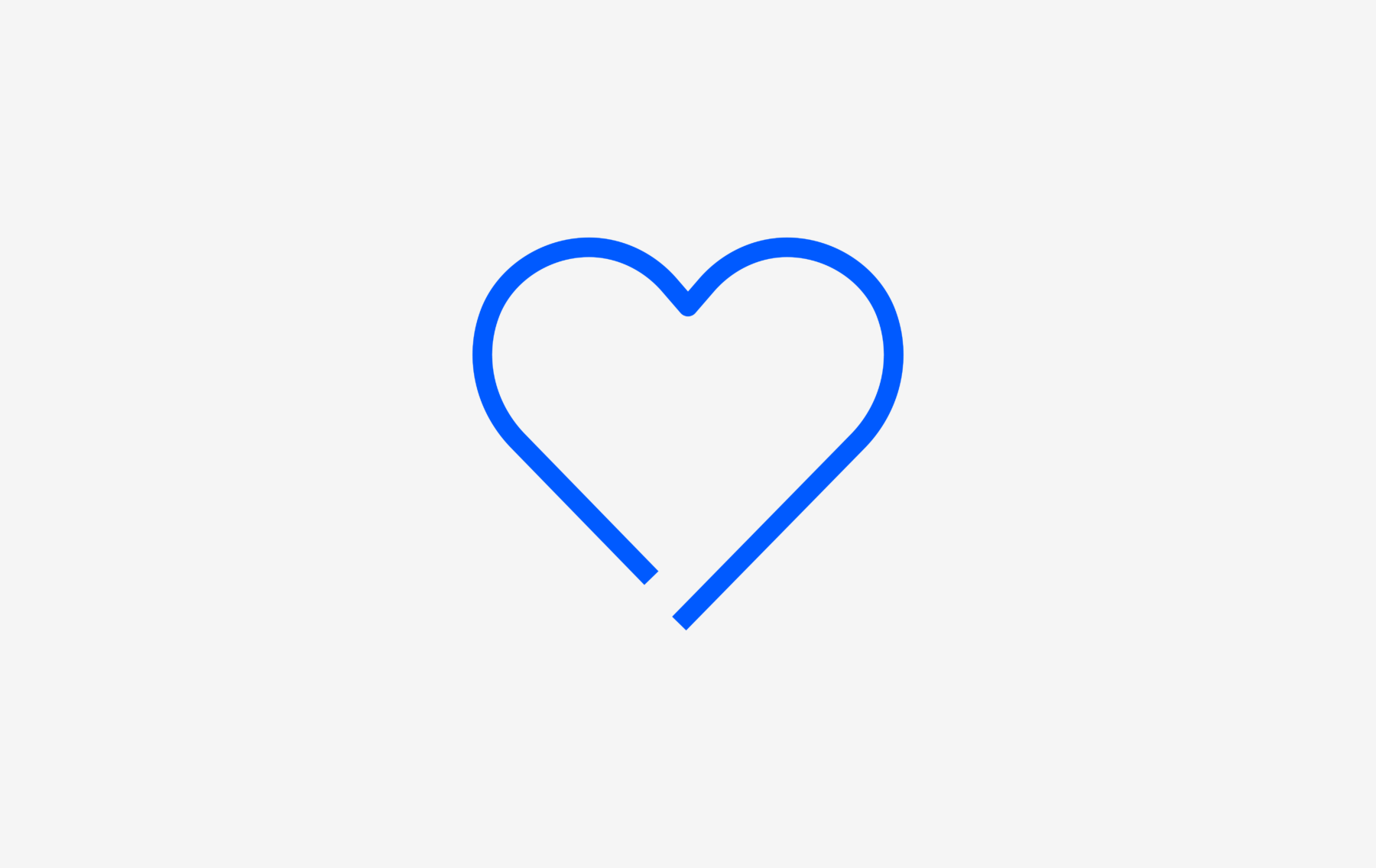
V01 – Love

V02 – Trust

V03 – Respect

V04 – Honesty

V05 – Vulnerability

V06 – Openness

01 – CircleCW

02 – CircleCheck

03 – CircleRight

04 – CircleLeft

05 – CircleTime

06 – CirclePlug

07 – LocationPin

08 – Umbrella

09 – HandStop

10 – Chat

11 – Book

12 – Receipt

13 – Battery

14 – WifiFlow

15 – Locked

16 – Unlocked

17 – Mail

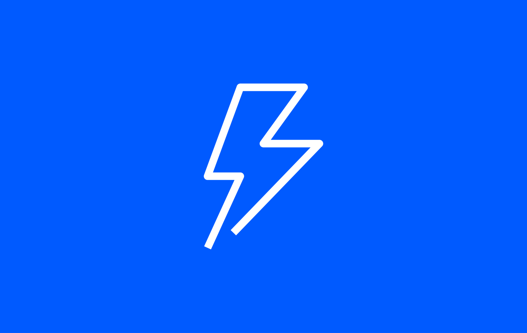
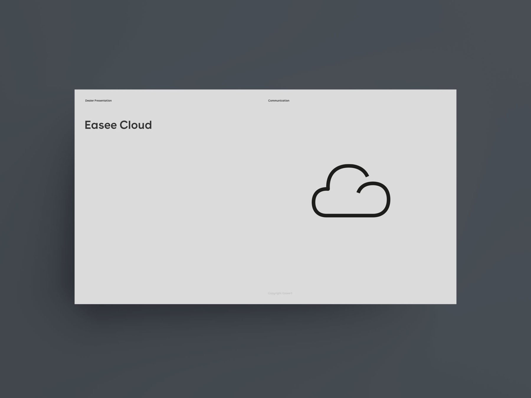
18 – Lightning

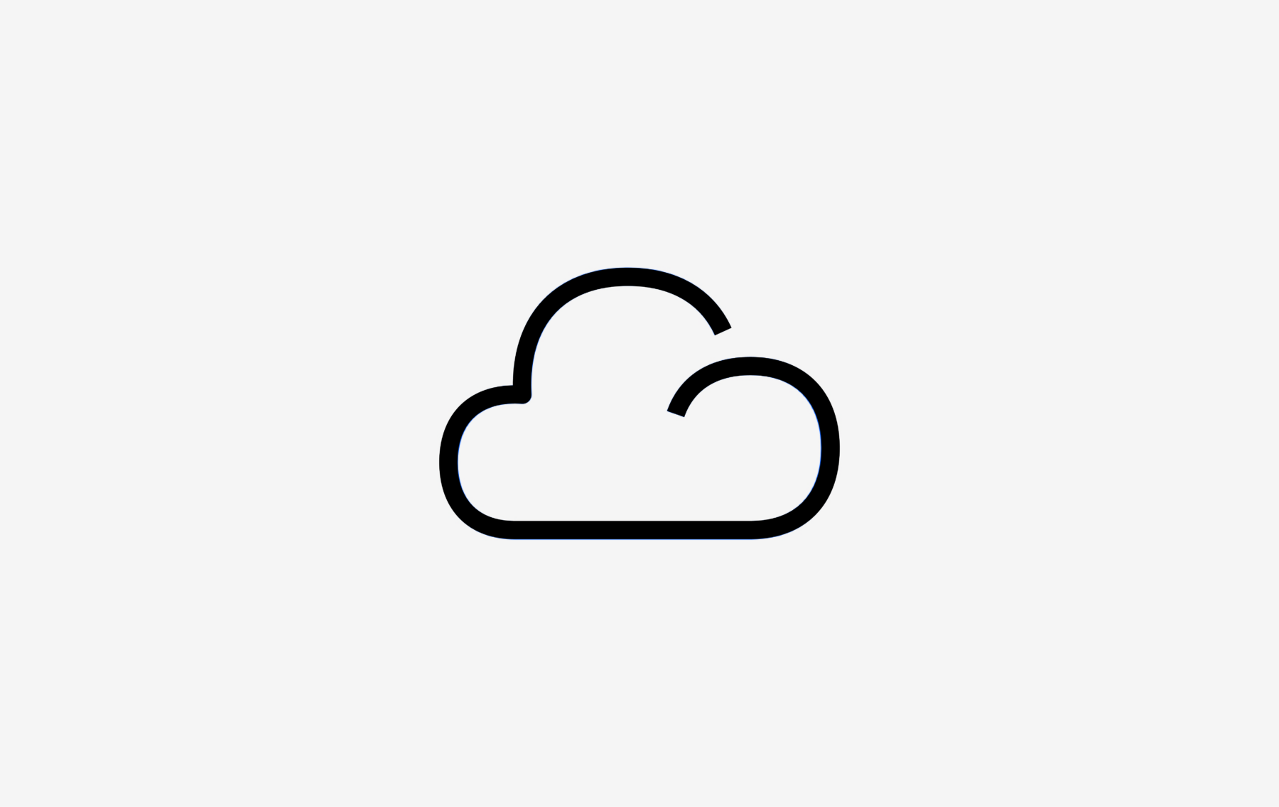
19 – Cloud

20 – MagnifyGlass

21 – PaperClip

22 – Eye

23 – House

24 – LightBulb

25 – Wrench

26 – Speedometer

27 – Card

28 – Tag

29 – Pencil

30 – PaperPlane

31 – Leaf

32 – Flag

33 – CarPlug

34 – BatteryLightning

35 – Community

36 – Smartphone

37 – HandCard

38 – Screengraph

39 – GraphUp

40 – MeshNetwork

41 – Mug

42 – Document

43 – WifiOff

44 – Storage

45 – CloudSync

46 – CloudOff

47 – RadioOn

48 – RadioOff

49 – Podcast

50 – ChargingRobot

51 – Filter

52 – CircleInfo

53 – ChargerDownload

54 – Mens

55 – Womens

56 – HC

UI icons
In our different user interfaces such as the Easee App and Portal we use our own set of icons. As visual symbols, our UI (user interface) icons represent ideas, objects or common actions. They can communicate messages at a glance, afford interactivity, and draw attention to important information.


Animation
To engage and add a sense of energy in our digital touch points, all our pictograms are animated. The animated pictograms should be used wisely and to help guide the user through the experience.
Usage
Iconography is highly functional in a user interface. When used wisely, icons become an elegant yet efficient way to communicate with and help guide a user through an experience. To maintain this functionality, it’s important to reduce cognitive load on users by employing icons sparingly and strategically throughout your designs.
Sizes
Our UI icons have been designed to work best at 24px. In some cases however it is allowed to re-size to 16px, 20px, or 32px size if needed to balance the design. Depending on usage, if you need bigger icons please use our dedicated 48px size icons or our pictograms.

16px

20px

24px

32px
Colours
Colours for icons are treated in the same way as text and should always have a solid, monochromatic color. Our Bright blue has been designated as the primary action color across all products and experiences, ensuring our color aesthetic is a part of every interaction. For more information on color usage, see Colour and text.

Depending on the function or action of the icon/pictogram you can use Bright Blue or Black on grey light backgrounds.

Use Bright blue D (dark mode) or white, when applying icon/pictogram on dark backgrounds. See Bright blue exception.

Depending on the function or action of the icon/pictogram you can use Black or Bright Blue on white backgrounds.

Depending on the function or action of the icon/pictogram you can use White on coloured or dark backgrounds.
Don’ts
The iconography should never be modified or appear in any other way than stated in these guidelines. Always make sure there is enough contrast between the iconography and the background.

Never put our logo or any other object on top of our iconography.

Always make sure there is enough clearance between the pictogram and text to allow for legibility.

Never combine pictograms in an effort to give them new meaning.

Don’t use more than one color within an icon/pictogram.

Never use different colors than specified in these guidelines. See iconography colours.

Always make sure there is enough contrast between the icon/pictogram colour and the background colour.
Examples
Below you will find applied examples of how the Easee iconography are used.
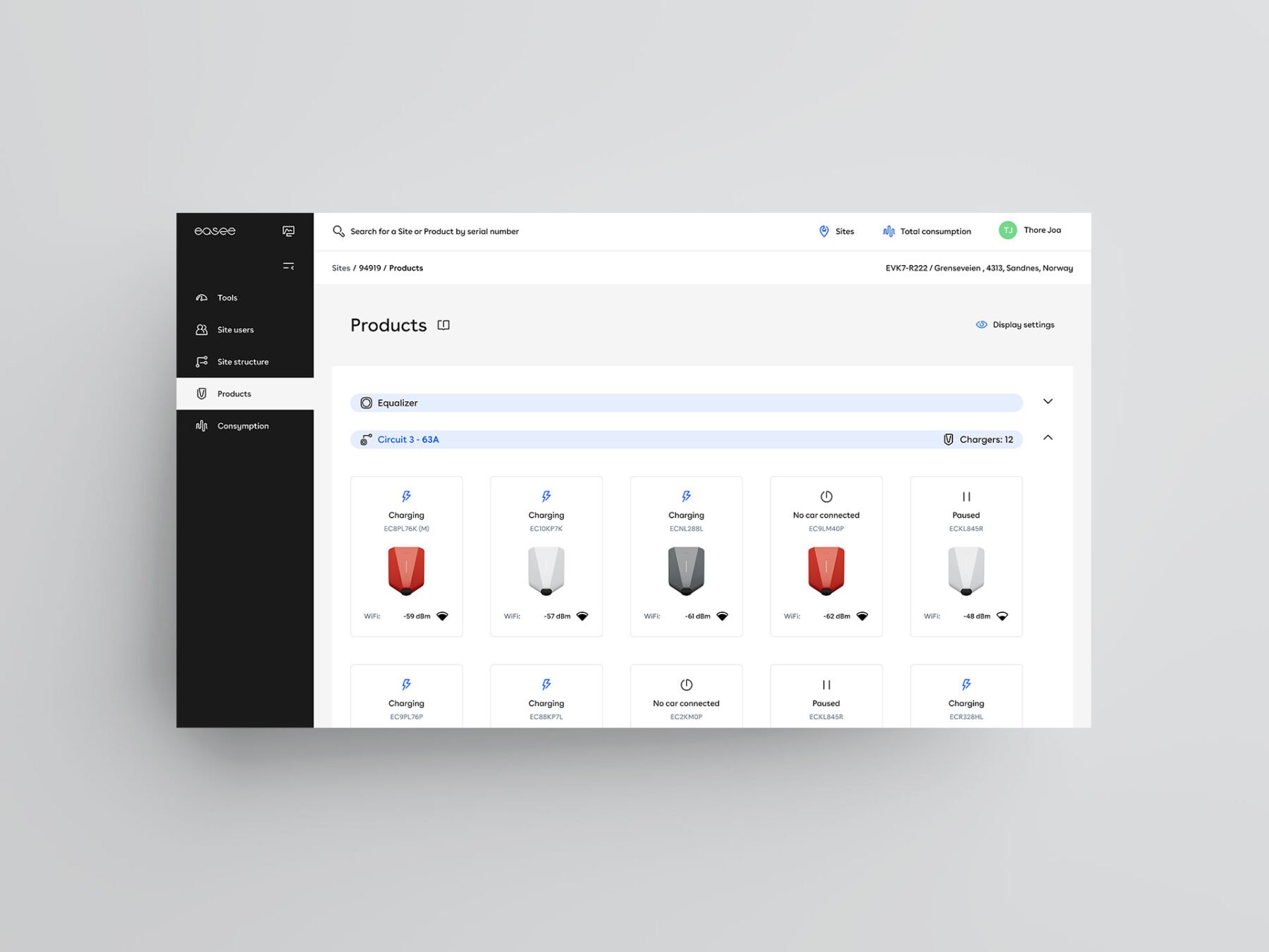
Portal
Iconography is highly functional in a user interface, it creates focus and hierarchy, but also reduce the users cognitive load and enhances the Easee brand experience.
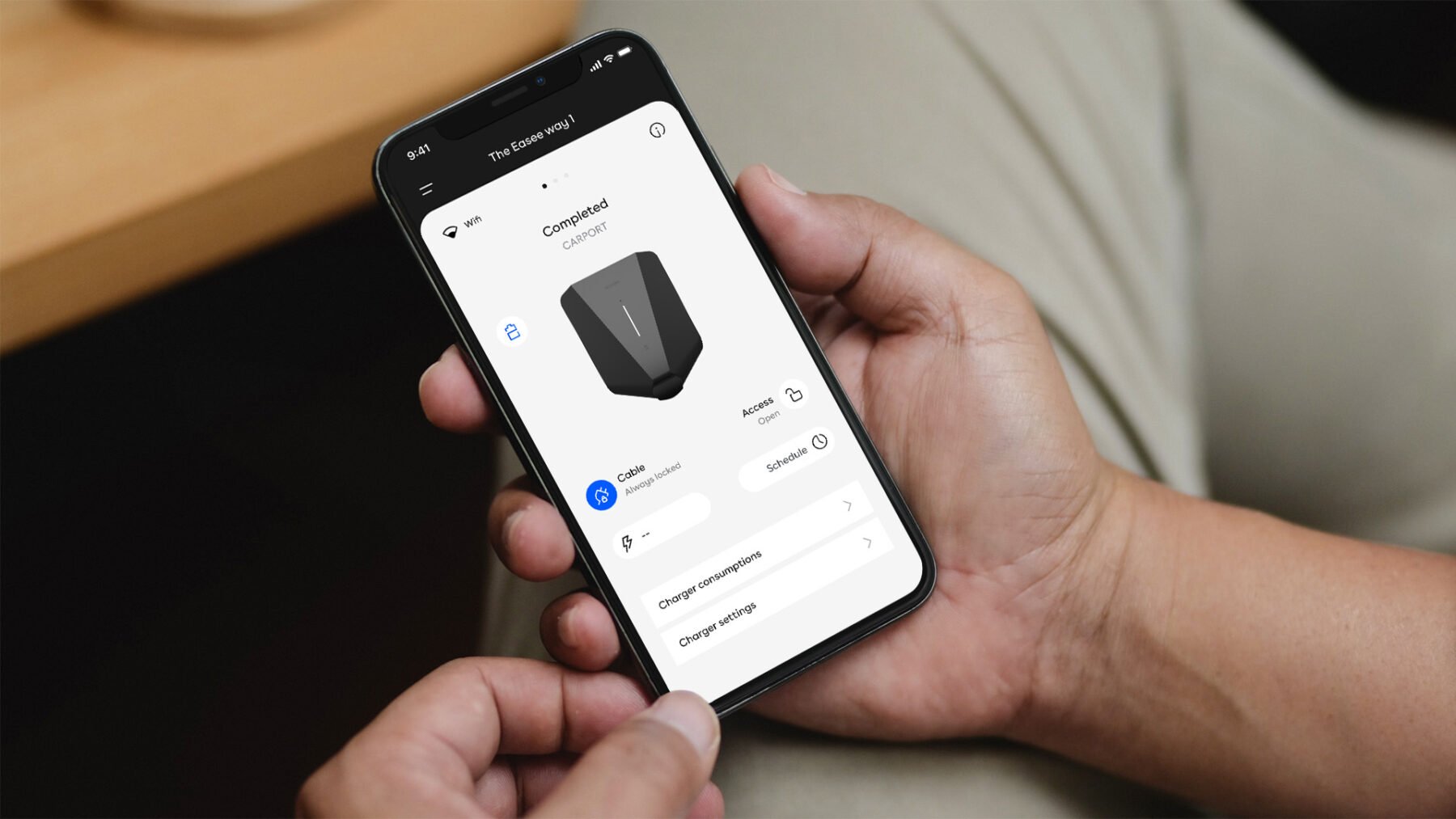
App
In the Easee App you can use our 24px icon size package which is designed especially for this product/service. If you want to emphasize an action or function use the 48px icons.
Website
To help and guide the user through the experience we use a combination of animated icons and pictograms. Both as click-able actions and efficient communication of our USPs.
Presentation
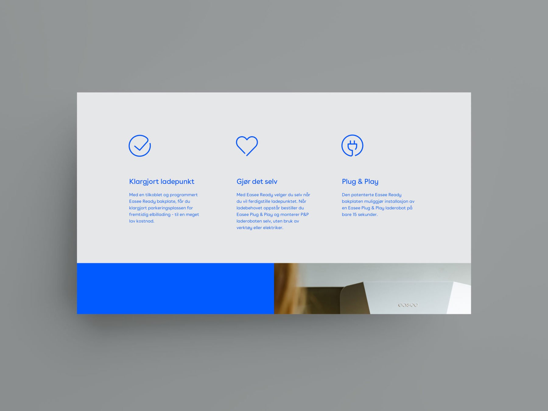
In our digital presentation you can use our pictograms to illustrate the company products and services. The animated pictograms works great to introduce our different service topics.
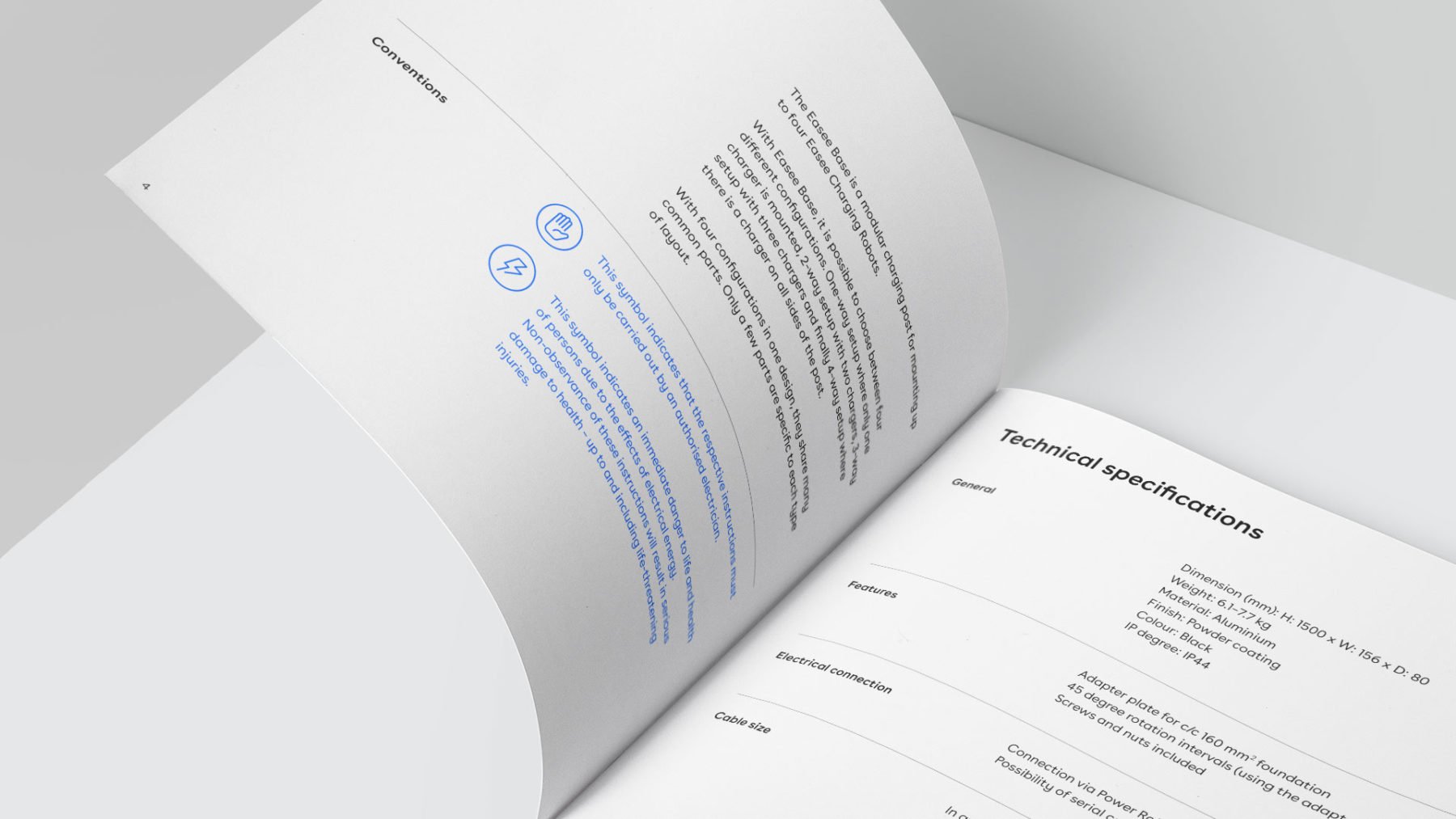
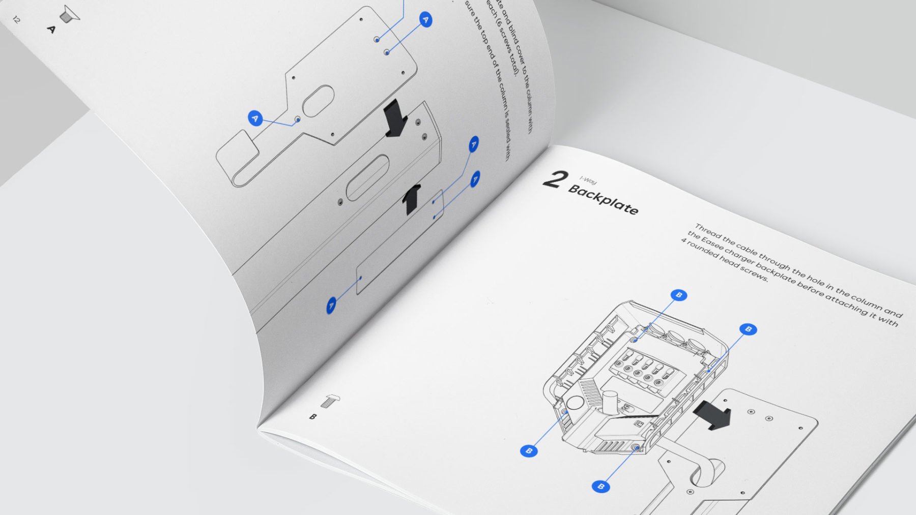
In printed matters such as our user guides we use pictograms to create focus and get attention to important information.
Use one of our many pictograms to communicate your idea or to hightlight a function or service when describing our products.
Construction
All icons should be drawn on a grid frame. Each frame includes keylines and a two pixel padding on all sides as guidance. However, it’s acceptable to go beyond the key lines if doing so improves the optical balance of the icon.

Grid frame
By using a square grid as a base line, you can maintain consistent visual proportions throughout the entire set of icons, as well as determine line thickness, proportion, shape and position. Use the grid lines as your basic guideline to snap the stroked line-work of your design elements.

Padding 2px
The grid contains 2px padding. This ensures icons will retain their desired scale and surrounding white space when exported. Don’t place any part of the icon in the padding area.
Base grid
UI icons are drawn on a pixel-based grid of 24 x 24px or 48 x 48px. Pictograms have a linearly scaled up grid of 192 x 192px. Use the grid as your basic guideline to snap the artwork in place. We recommend fine-tuning adjustments for the shape you are trying to achieve during creation.

Pictograms grid

UI Icon Grids
Keyline shapes
The icon grid establishes clear rules for the consistent, but flexible, positioning of graphic elements. Keyline shapes are the foundation of the grid. By using these core shapes as guidelines, you can maintain consistent visual proportions across icons. For a more realistic result use a shape that resembles the real shape of the object, don’t force the content to fit inside the keyshapes.

Basic shapes

Circle example

Rectangle example
Style
Easee’s iconography is minimal and clean. Each icon represents an idea reduced to its essence. All should be simple enough to ensure readability even at small sizes, which isn’t to say that icons don’t have personality. A well-designed icon is one that’s useful, friendly, and delightful.

Square end points

Rounded exteriors with 90˚ interiors
The style decisions for Easee’s icons reflect a deep understanding of the brand and its elements, sharing distinct details and characteristics found in the letterform and the logotype. Each icon is meticulously designed following the single line concept introduced in Easee’s logotype as well as the squared corners, that is embraced and expanded throughout the design system.
The icons should combine wherever possible, hard angles with 90˚ interior with rounded corners. The first one represents the pragmatic and technological side and the second brings the friendly and inviting aspects of Easee. Try to use visual metaphors similar to real life, avoid forcing the use of rounded corners if they are not necessary.
Strokes and Corners
Single line icons require special attention to detail and it is important to reduce as much as possible. Our icons use a consistent stroke width, including curves, angles, and both interior and exterior strokes.

192px Pictograms – 8px stroke

24px UI icons – 1.5px stroke
To maintain the same visual weight on the icons, use 8px stroke on 192 x 192px pictograms grid, 1.5px stroke for the 24 x 24px UI icons grid and 3px stroke for 48 x 48px UI icons grid. One icon should not look heavier or lighter than other icons at the same size.
Pictograms allow a greater level of detail compared to UI icons, and to ensure readability for smaller sizes, it is necessary to provide minimal negative space within and between the lines of the icon.
Illustration
Our illustration style should always convey our technical expertise and background. Depending on its use we use a combination of instructional drawings and simplified line style illustrations. Clean lines, one-colored, and reality give our illustrations a branded feel and make it easy to understand.
Instructional drawings
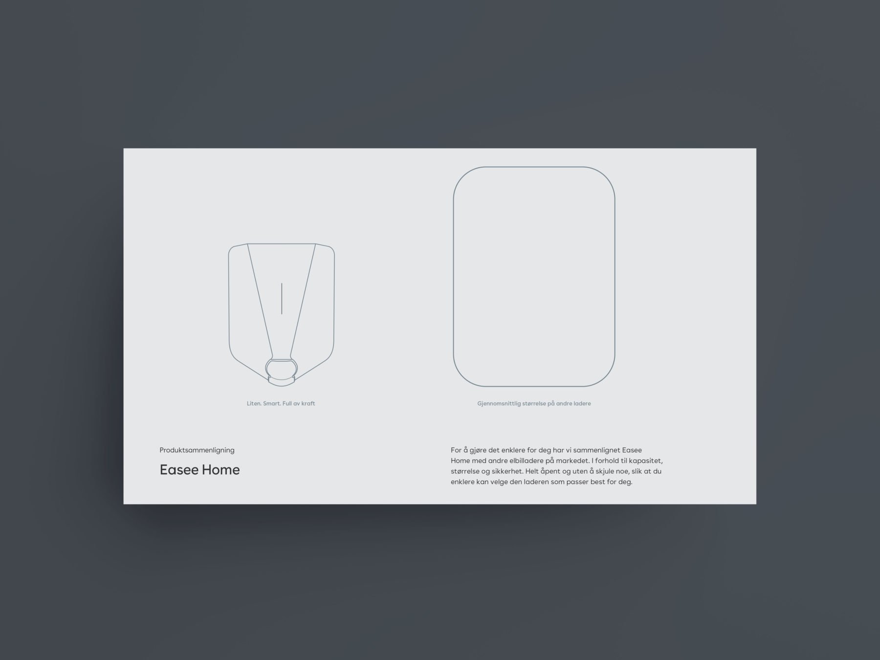
Our instructional drawings should always have a clear purpose, support content and guide a user to understand difficult concepts, products or services. Clear and simple illustrations help us provide meaningful engagement to our users. Instructional drawings are typically used in our User/Installation guides and product sheets.
Chargeberry Locking

Stroke and Views
To maintain the same visual weight on the illustrations, use 3pt stroke for outline and sharp edges, 1pt for details. Use perspective view for instructional drawings.
Stroke width
| Outline | – 3pt |
| Sharp edges | – 3pt |
| Details | – 1pt |
Views
Perspective
Line style
Line style illustrations are simple visuals that convey a sense of precision, honesty and expertise. They’re a continuation of our instructional drawings, but simplified to allow for communicating richer narratives or concepts. Line style illustrations are typically used on our product packaging and cover-pages of our User/Installation guides.
Easee Equalizer

Stroke and Views
To maintain the same visual weight on the illustrations, use 3pt stroke for outline and sharp edges, 1pt for details. Use front and side view for line style illustrations.
Stroke width
| Outline | – 3pt |
| Sharp edges | – 3pt |
| Details | – 1pt |
Views
Front and side
Examples
Below you will find applied examples of how the Easee illustrations are used.
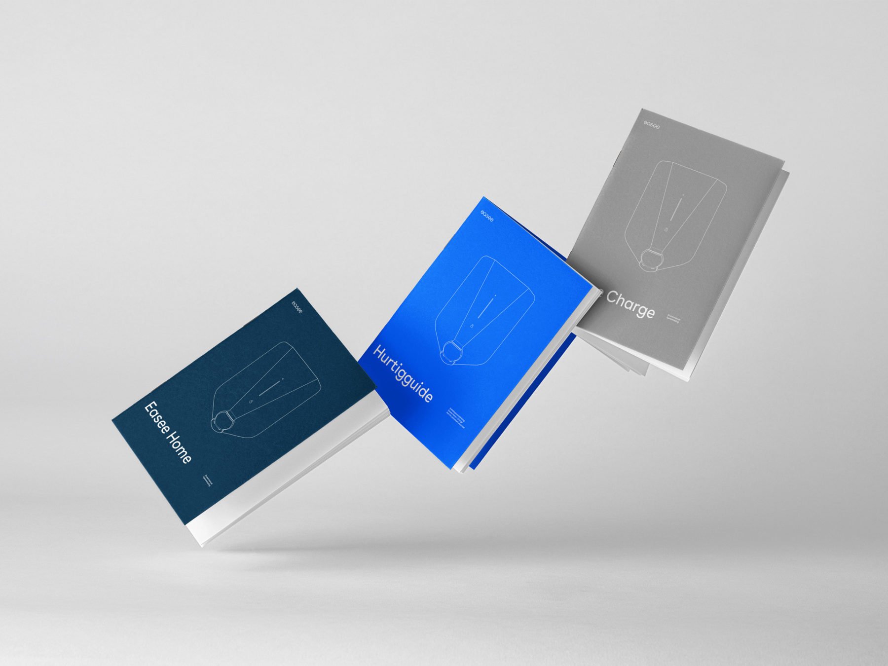
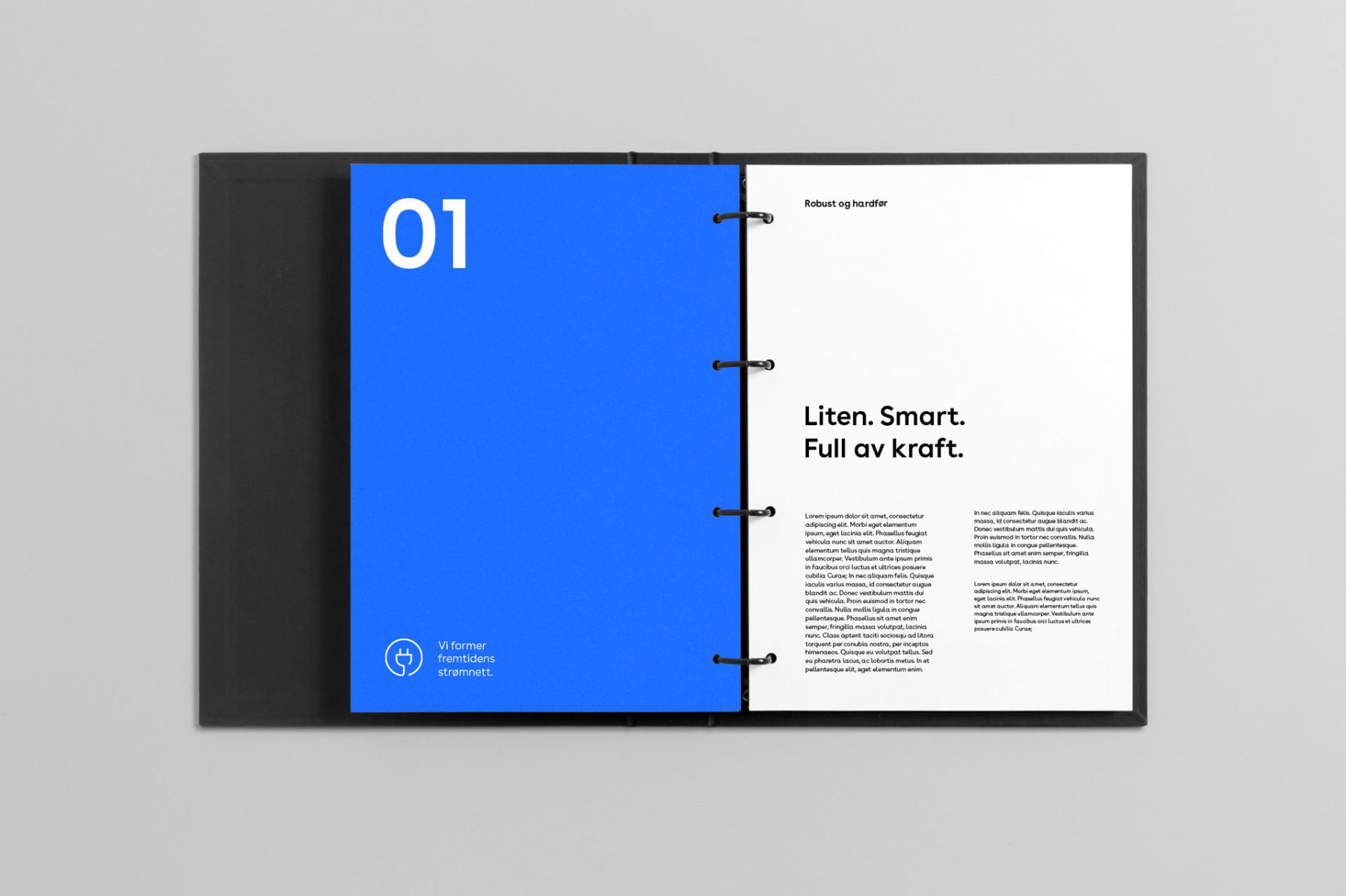
Print – Cover pages User/Installation guide
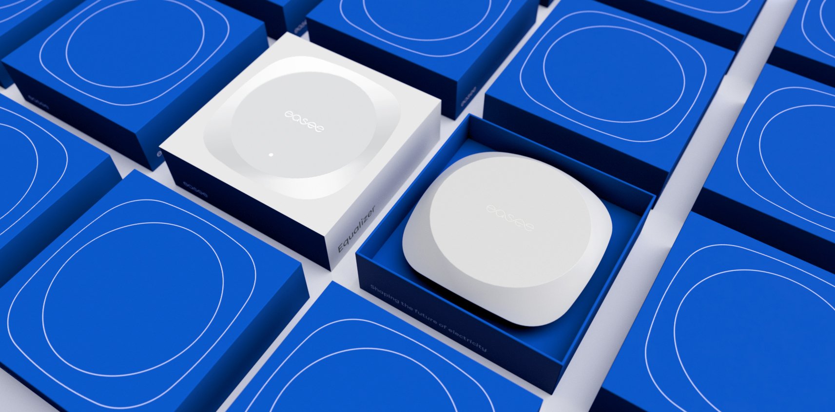
Print – Packaging
Digital – Web/Presentations
Print – Spreads User/Installation guide
Infographics
Our infographics is minimal and clean. The visualization should communicate in a clear, concise and easy-to-understand way. Avoid elements that make a visualization appear complex, distant or disjointed. You should remove anything gratuitous and avoid ambiguity or unnecessary embellishments that distract the user. Less is more.
Charts are typically divided into categories based on their goals, aesthetics or visual features. Use these best practices as you create data visualizations.
Bar charts
A bar chart presents categorical data with rectangular bars with heights or lengths proportional to the values that they represent. The bars are pill shaped (rounded cap) and can be plotted vertically, horizontally or stacked.

Bar chart 1

Bar chart 2

Bar chart 3 (two types of data)

Bar chart stacked

Horizontal stacked chart (two types of data)

Horizontal stacked chart
Slim bar charts
When space is limited you can use our alternative Slim bar charts.

Slim bar chart 1

Slim bar chart 2

Slim bar chart 3 (two types of data)

Slim bar chart stacked

Slim horizontal stacked chart (two types of data)

Slim horizontal stacked chart
Pie charts
Pie charts are used to represent the proportional data or relative data in a single chart. The concept of pie slices is used to show the percentage of particular data from the whole pie.

Pie chart 1

Pie chart 2

Pie chart 3
Line charts
Line charts represent data along with the time dimension. Use them mainly to track changes over periods of time of varying duration and scale.

Line chart 1

Line chart 2
Dark mode
Our infographics is made for dark mode/black background as an optional choice. Remember when applying Bright blue on a dark background, for maximum visibility and legibility always ensure that you use Bright blue D (dark mode) from the extended palette.

Colours
Often there is a need for multiple colours when creating charts and graphs, depending on what you want to visualize and how complex the data is. Mainly we use a combination of Bright Blue and the different grey colours. For more information on color usage, see Easee Colours.

We use a combination of Bright Blue and the different grey colours, where Bright Blue being our primary colour. Remember that care should be taken when combining our clours and alwas make sure that the contrast between the colours chosen is sufficient.

When it is needed to distinguish certain information you can use colours from our extended palette. Remember to use Bright blue D, when applying infographics on dark/black backgrounds. See Dark mode.
Bright blue
White
Black